
Thank you! Your submission has been received!
Oops! Something went wrong while submitting the form.
Get SaaSFrame Pro
Monthly
$18
Quarterly
$48
Yearly
$180
Upgrade to access this feature
Browse all screens & flows
Filter and search screens & flows
Access Figma files
Access mobile versions
Bookmark screens & flows
Join now
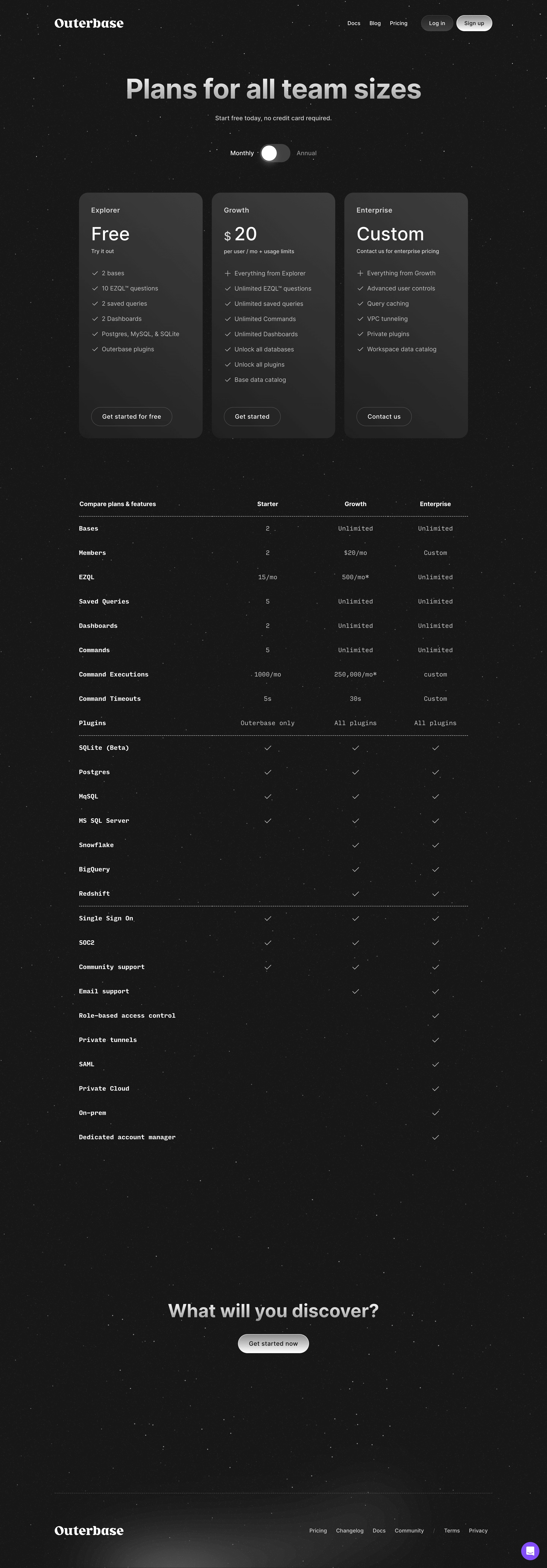

Outerbase Pricing Page

Outerbase
The interface for your database.
Designed by
No items found.

Bookmark
Bookmark

Design with AI
Thank you! Your submission has been received!
Oops! Something went wrong while submitting the form.
# Design from Reference: Outerbase Pricing Page
Create an original, high-fidelity visual design inspired by the reference. Prioritize composition, typography, colors, spacing, and component styling over technical implementation.
## Reference
- **Product:** Outerbase
- **Category:** Pricing Page
- **Screenshot:** https://cdn.prod.website-files.com/5e9dc792e1210c5325f7ebbc/6acad841b3daa04f54276216_6acad7c1a56d77db6c10c8b4_cms-87312099a130e70da2866833.webp
Analyze the screenshot first. If inaccessible, request it rather than guessing.
## Content
{{content.instructions}}
{{content.data}}
Preserve essential messaging and factual accuracy. Adapt structure and copy length for visual balance; never invent product claims.
## Visual Design
### Overall aesthetic
- **Style:** A dark pricing page uses a subtle star/grain texture, metallic-looking light typography and charcoal plan cards.
- **Character:** A white serif wordmark contrasts with modern sans-serif display type and monospaced comparison details.
### Page composition
- **Capture:** The source measures 2880 × 8254 pixels. Estimated CSS sizes below assume an unverified 2× capture.
- **Header:** Brand left and compact navigation/login/signup controls right share a centered container around 1150 pixels wide.
- **Hero:** A large centered pricing heading and short reassurance line precede a monthly/annual switch.
- **Plans:** Three equal charcoal cards form a row around 1020 pixels wide, with names, prices, descriptions, feature lists and bottom-aligned actions.
- **Comparison:** A long four-column table places feature names left and three plan columns right, with occasional dashed horizontal separators.
- **Closing:** A centered short pitch and bright capsule action sit in a large open dark region.
- **Footer:** A dashed divider separates brand and navigation links; a purple chat launcher sits bottom right.
### Information hierarchy
- **Hero title:** Large bold type is the strongest opening element.
- **Plan prices:** Free, numeric pricing and Custom receive large type beneath smaller plan names.
- **Features:** Light-gray checklist rows explain each offering, with plus markers indicating inherited features.
- **Comparison:** Bold feature names contrast with lighter monospaced values and checkmarks.
- **Conversion:** A bright metallic capsule becomes the strongest action near the bottom.
### Typography
- **Families:** Serif wordmark, neutral sans-serif headings/cards and monospaced comparison text; exact identities are unverified.
- **Hero:** Approximately 72 pixels, bold, with tight leading.
- **Prices:** Around 48 pixels, regular weight.
- **Plan names:** Around 20 pixels, semibold; descriptions around 14 pixels.
- **Feature rows:** Approximately 16 pixels with generous 40-pixel pitch.
- **Table:** Around 16 pixels monospaced; feature labels are heavier than values.
- **Closing:** Approximately 48 pixels bold; footer links around 14 pixels.
### Colors & surfaces
- **Measured base:** Near-black #171717 dominates the page.
- **Card tones:** Samples include #343434, #282828, #313131 and #393939 in the charcoal surfaces.
- **Text:** White and pale gray provide headings and copy; prices/headlines visibly use light-to-gray tonal variation.
- **Texture:** Fine gray speckles and occasional bright points cover the background.
- **Accent:** A purple chat circle is the only conspicuous saturated UI accent.
### Components
- **Billing toggle:** A roughly 80 × 48-pixel dark capsule contains a large white knob at left, between Monthly and Annual labels.
- **Plan cards:** Approximately 325 × 645 pixels, with around 24-pixel corners, 32-pixel padding and subtle vertical tonal shading.
- **Plan actions:** Thin gray outlined capsules sit near the bottom of each card.
- **Header controls:** Login uses a dark translucent capsule; signup uses a bright white/gray gradient capsule.
- **Comparison table:** No enclosing bright panel; columns align directly on the textured background, with gray checks and dashed group rules.
- **Closing button:** A bright rounded capsule around 185 × 50 pixels uses dark text.
- **Chat launcher:** A small purple circle with white conversation glyph anchors the lower-right edge.
### Visual rhythm
- **Plan alignment:** Equal card widths, heights and bottom actions establish a strong three-column rhythm.
- **Table cadence:** Consistent row spacing makes the long feature comparison scannable.
- **Whitespace:** Large gaps separate table, final pitch and footer.
- **Continuity:** The same dark texture spans every region, with card fills providing the main surface contrast.
### Responsive
- **Evidence:** Only desktop is observed; annual prices and toggle behavior are unverified.
- **Recommended plans:** Stack cards or use a clearly navigable horizontal layout on small screens.
- **Comparison:** Preserve row/column relationships with accessible horizontal scrolling or a plan selector.
- **Typography:** Reduce the hero toward 40–48 pixels and maintain readable feature text.
- **Texture:** Keep background grain subtle enough to preserve contrast at smaller sizes.
### Adaptation guidance
- **Preserve:** Keep the textured dark canvas, charcoal cards, monospaced table and bright capsule actions.
- **Build:** Use shared plan data for cards and comparison rows to maintain consistency.
- **Content fidelity:** Captured plan names, limits and prices are historical visual content, not verified current pricing.
- **Interaction:** Define billing selection, signup and chat behavior explicitly; only the monthly-looking state is observed.
- **Assets:** Recreate texture and tonal highlights without introducing unrelated colorful decoration.
Use this context to reproduce the reference's visual language: layout, typography, colors, spacing, borders, radii, and distinctive elements. The screenshot takes priority if descriptions conflict.
## Direction
{{preferences.fidelityInstructions}}
## Output
{{output.instructions}}
Deliver a polished, cohesive design with precise alignment, hierarchy, and spacing. Produce the requested visual artifact, not just a description. If unsupported, explain the limitation.


Category
Patterns
Tech Stack
No items found.
Added on
October 30, 2023
Similar screens


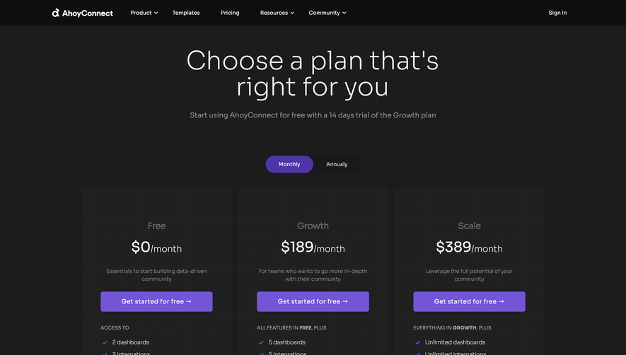

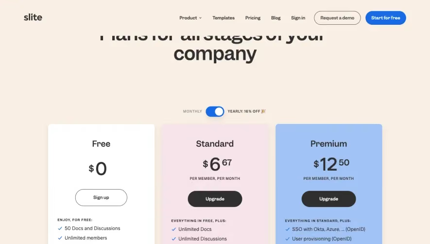

Upgrade to SaaSFrame Pro now to see similar examples.
Monthly
$18 /month
Billed $18 monthly
Browse all screens & flows
Filter and search screens & flows
Search text in screenshots
Access Figma files
Access mobile versions
Join now
Quarterly
$16 /month
Billed $48 quarterly
Browse all screens & flows
Filter and search screens & flows
Search text in screenshots
Access Figma files
Access mobile versions
Join now
Yearly
$15 /month
Billed $180 yearly
Browse all screens & flows
Filter and search screens & flows
Search text in screenshots
Access Figma files
Access mobile versions
Join now