Design with AI
Generate a new design based on this screen using your own content.
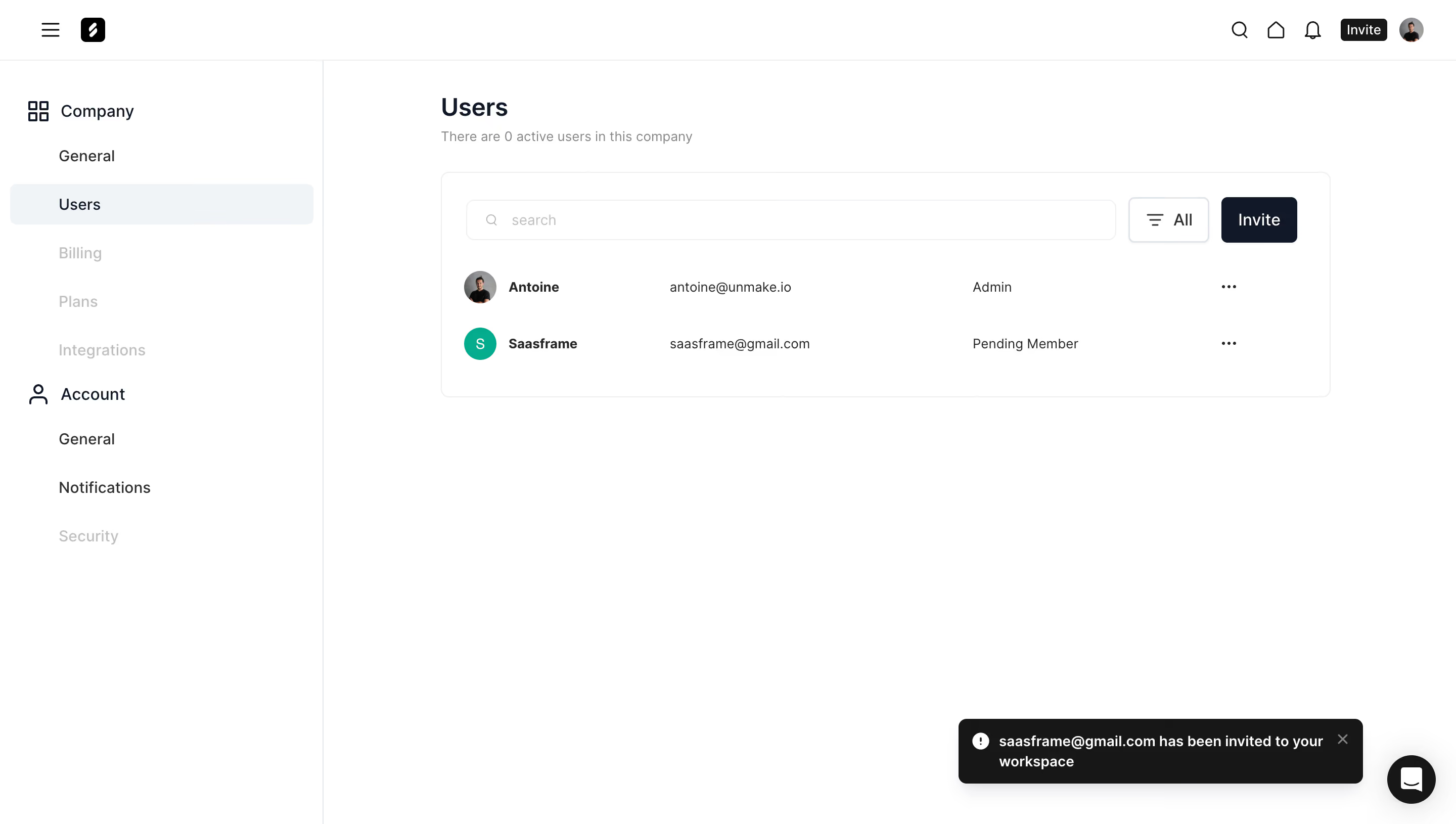
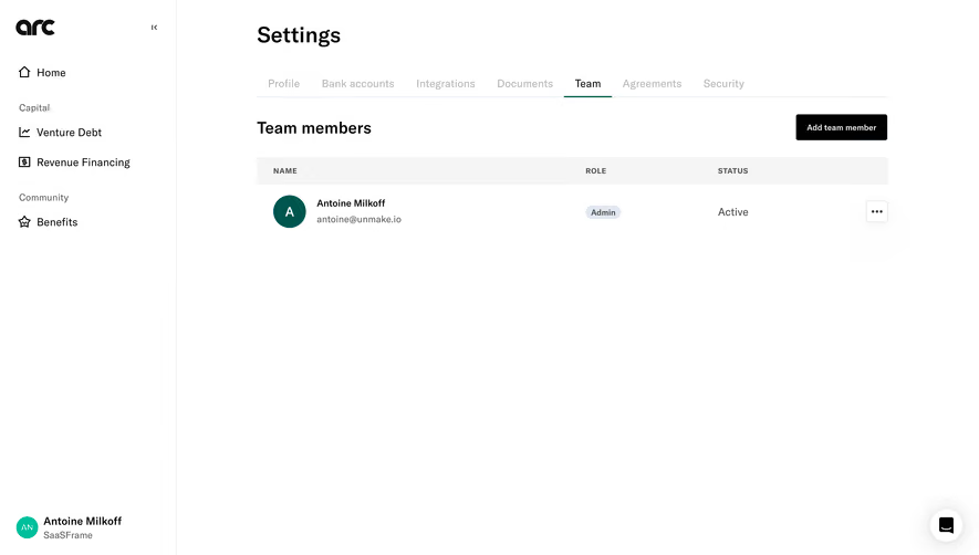
# Design from Reference: Frame Invite Team Members
Create an original, high-fidelity visual design inspired by the reference. Prioritize composition, typography, colors, spacing, and component styling over technical implementation.
## Reference
- **Product:** Frame
- **Category:** Team Members
- **Screenshot:** https://cdn.prod.website-files.com/5e9dc792e1210c5325f7ebbc/6acad9c6a43009b06fe6bffc_6acad9508abe3f93125d1184_cms-44d3a7915ac13867de664bab.webp
Analyze the screenshot first. If inaccessible, request it rather than guessing.
## Content
{{content.instructions}}
{{content.data}}
Preserve essential messaging and factual accuracy. Adapt structure and copy length for visual balance; never invent product claims.
## Visual Design
### Overall aesthetic
- **Style:** Minimal, white SaaS administration interface with a quiet neutral palette.
- **Character:** Thin dividers, restrained rounded corners, dark navy actions, and ample unused canvas.
- **State:** Company user management after an invitation, with a bottom-right confirmation toast.
### Page composition
- **Canvas:** 2880 × 1630 image px; CSS estimates assume an unverified 2× capture.
- **Header:** Approximately 60 CSS px tall, spanning the viewport; menu and logo at left, utility icons and profile at right.
- **Sidebar:** Approximately 320 CSS px wide with a thin right divider; Company and Account navigation groups.
- **Main column:** Begins near x=436 CSS px; user panel approximately 880 CSS px wide.
- **Panel:** Approximately 880 × 223 CSS px, positioned below the page title and muted activity summary.
- **Panel toolbar:** Wide search field, compact All filter, and dark Invite button.
- **Rows:** Two user rows with avatar, name, email column, role, and trailing ellipsis.
### Information hierarchy
- **Primary:** Users heading, then searchable membership list.
- **Action:** Dark Invite button at the panel's upper right.
- **Navigation:** Users selected through a pale blue-gray full-width highlight.
- **Feedback:** Dark invitation confirmation toast above the circular help control.
- **Roles:** Secondary role text distinguishes administrator and pending membership without badges.
### Typography
- **Family:** Neutral sans serif; exact identity is unverified.
- **Page heading:** Approximately 24 CSS px, weight 600, line-height 32px.
- **Navigation headings:** Approximately 16 CSS px, weight 500–600.
- **Navigation items:** Approximately 16 CSS px, regular to medium.
- **Table content:** Approximately 14 CSS px, regular; names appear semibold.
- **Summary and toast:** Approximately 13–14 CSS px; toast uses stronger weight.
- **Precision:** Font metrics and CSS dimensions are visual estimates under the assumed 2× scale.
### Colors & surfaces
- **Canvas and panel:** #FFFFFF.
- **Dark toast and compact header action:** #171717.
- **Primary heading and main Invite button:** Approximately #0F1829.
- **Selected navigation:** #F0F4F7.
- **Panel border:** Approximately #EEEEEE.
- **Input outlines:** Approximately #EEEFF1.
- **Text:** Near #262626 for body labels; secondary and disabled text use lighter neutral grays.
- **Shape:** Panel corners approximately 8px; input/button corners approximately 6px.
- **Shadow:** Primarily under the toast and help bubble; the membership panel is largely flat.
- **Color precision:** Hex values were sampled from screenshot pixels after embedded-profile conversion where present.
### Components
- **Search input:** Approximately 642 × 40 CSS px, magnifying-glass icon and pale placeholder.
- **Filter:** Approximately 80 × 44 CSS px, outline, filter icon, and All label.
- **Invite button:** Approximately 76 × 44 CSS px, navy fill and white text.
- **Avatars:** Approximately 32 CSS px diameter; photo and initial variants.
- **Rows:** Approximately 56 CSS px vertical pitch, without strong row separators.
- **Toast:** Approximately 400 × 64 CSS px, dark fill, white message, status icon, and close control.
- **Help bubble:** Approximately 48 CSS px diameter at bottom right.
- **Sidebar items:** Approximately 40 CSS px tall, with a selected rounded background.
### Visual rhythm
- **Main top spacing:** Heading begins approximately 36 CSS px below the header.
- **Panel gap:** Approximately 26 CSS px between summary and panel.
- **Panel padding:** Approximately 24 CSS px.
- **Alignment:** Search, rows, and avatars share a consistent left inset; roles and menus form separate columns.
- **Whitespace:** Most of the lower canvas remains empty, keeping focus on a short member list.
### Responsive
- **Observed:** Desktop only.
- **Recommendation:** Collapse the sidebar, preserve the heading and Invite action, and let search occupy a separate full-width row.
- **Rows:** Stack role and secondary details under names if horizontal space is limited.
- **Feedback:** Keep toast width within viewport margins and avoid overlapping the help control.
### Adaptation guidance
- **Preserve:** White canvas, quiet panel outline, dark primary action, pale selected navigation, and simple member rows.
- **Content:** Use supplied users and roles; do not transfer personal details from the reference.
- **Scale:** Start with 24px panel padding, 40–44px controls, and 32px avatars under the assumed 2× reconstruction.
- **State:** Include invitation feedback only when the intended flow calls for it.
- **Behavior:** The screenshot shows a static success state; menu and filter behavior are not verified.
Use this context to reproduce the reference's visual language: layout, typography, colors, spacing, borders, radii, and distinctive elements. The screenshot takes priority if descriptions conflict.
## Direction
{{preferences.fidelityInstructions}}
## Output
{{output.instructions}}
Deliver a polished, cohesive design with precise alignment, hierarchy, and spacing. Produce the requested visual artifact, not just a description. If unsupported, explain the limitation.