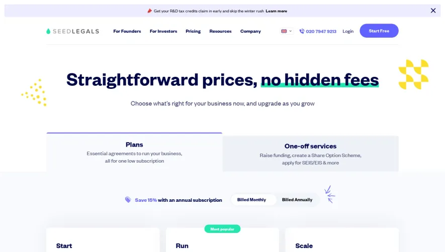
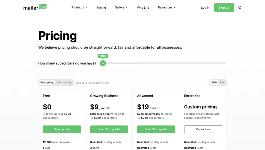
Generate a new design based on this screen using your own content.
Thank you! Your submission has been received!
Oops! Something went wrong while submitting the form.
# Design from Reference: Folio Pricing Page
Create an original, high-fidelity visual design inspired by the reference. Prioritize composition, typography, colors, spacing, and component styling over technical implementation.
## Reference
- **Product:** Folio
- **Category:** Pricing Page
- **Screenshot:** https://cdn.prod.website-files.com/5e9dc792e1210c5325f7ebbc/6acb67fbc08cd859ff8693b2_6acb66db5391d62536b5a783_cms-3cd98164ccf415cf07b08a60.webp
Analyze the screenshot first. If inaccessible, request it rather than guessing.
## Content
{{content.instructions}}
{{content.data}}
Preserve essential messaging and factual accuracy. Adapt structure and copy length for visual balance; never invent product claims.
## Visual Design
Use this context to reproduce the reference's visual language: layout, typography, colors, spacing, borders, radii, and distinctive elements. The screenshot takes priority if descriptions conflict.
## Direction
{{preferences.fidelityInstructions}}
## Output
{{output.instructions}}
Deliver a polished, cohesive design with precise alignment, hierarchy, and spacing. Produce the requested visual artifact, not just a description. If unsupported, explain the limitation.
Folio’s pricing page embraces a modern, minimalist vibe that feels both refined and welcoming. The design uses ample white space and clean lines, resulting in a calming and professional atmosphere. This restraint creates a sense of clarity and focus, letting visitors breathe and engage without visual clutter.
Layout and Structure
The page is structured in clear horizontal blocks: a concise hero introducing the pricing context, followed by side-by-side pricing plans, a user-friendly FAQ accordion, and a compact, well-branded footer. Each section is visually distinct but flows naturally, guiding the visitor’s eye from high-level overview down to actionable details.
Visual Elements
Abstraction and simplicity reign—custom icons add personality beside plan features, while minimal linework and accent illustrations bring gentle movement. Instead of distracting imagery, subtle vector accents support the product’s creative roots, all aligned for a cohesive visual story.
Color Palette and Typography
A gentle grayscale base is energized by a vibrant blue accent, used for buttons and highlights. The typography leans on modern, rounded sans-serif fonts, establishing a sense of warmth and approachability. Large headings create an immediate hierarchy, while secondary text remains legible and light.
User Experience Patterns
Navigation is sticky and persistent, ensuring users don't lose their way. CTAs—like “Start Free” buttons—are bold, consistently placed, and encourage trial without pressure. Interactive FAQs and micro-animations make the experience feel lively but never overwhelming.
Unique or Notable Design Choices
Folio’s pricing toggle instantly reveals annual savings—an elegant, animated switch that encourages users to explore options. The absence of glaring promotional banners amplifies trust, and concise plan descriptions eliminate ambiguity. The overall tone radiates creativity and transparency, delivered with a refreshing sense of calm.