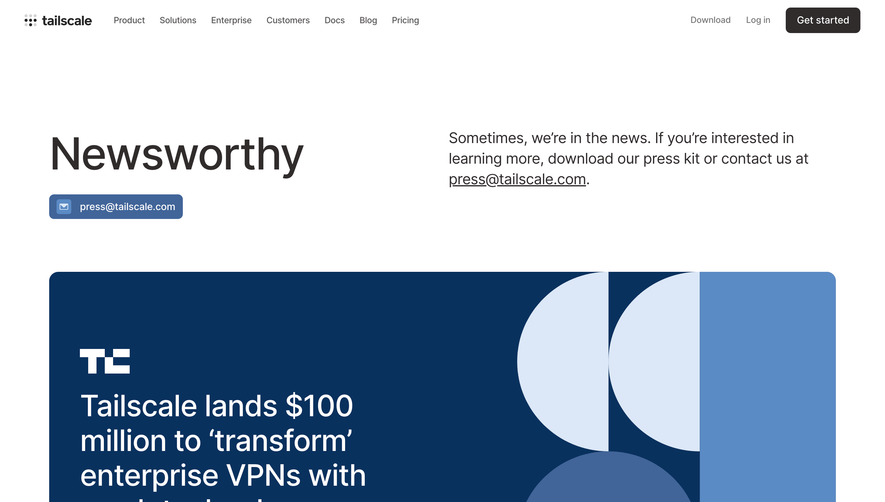
Overall Style and Aesthetic
The Checkout.com Newsroom page exudes a polished, ultra-modern vibe, prioritizing clarity and professionalism. Clean lines, generous white space, and subtle accent colors combine to create a calming, easily navigable atmosphere. Despite its rich content, the interface feels lightweight and uncluttered, transmitting a sense of sophistication and authority fitting for a global fintech leader. Layout and Structure
The information architecture is intuitive: a prominent, visually impactful hero section welcomes visitors, quickly orienting them with a concise headline and elegant background. Beneath, content is segmented into tidy blocks — recent news, press releases, media resources — all spaced with ample padding. Sticky sidebars, search, and filtering ensure visitors can quickly access what they need, while a robust footer consolidates navigation. Visual Elements
Photography of people, offices, and events injects authenticity, while occasional logo motifs and subtle UI animations lend motion and life to the experience. Spotlight articles feature generous header images, and media assets are showcased with crisp previews, balancing visuals and text for digestibility. Color Palette and Typography
A foundation of white and cool greys is accented by signature blues and teals, reinforcing trust and innovation. Headlines utilize a bold, contemporary sans-serif, establishing hierarchy, while body copy employs a lighter weight for easy scanning. The visual hierarchy is clear, guiding the eye naturally through headings, summaries, and resource links. User Experience Patterns & Unique Choices
Navigation is frictionless — sticky menus, filterable content, and logical categorization enhance usability. CTAs appear minimally but with high contrast, inviting engagement without overwhelming. Notable is the seamless blend of corporate gravitas with a welcoming, human touch, inviting both media professionals and curious visitors to explore. This page perfectly balances modernity with trust, serving as a model for SaaS newsroom design.