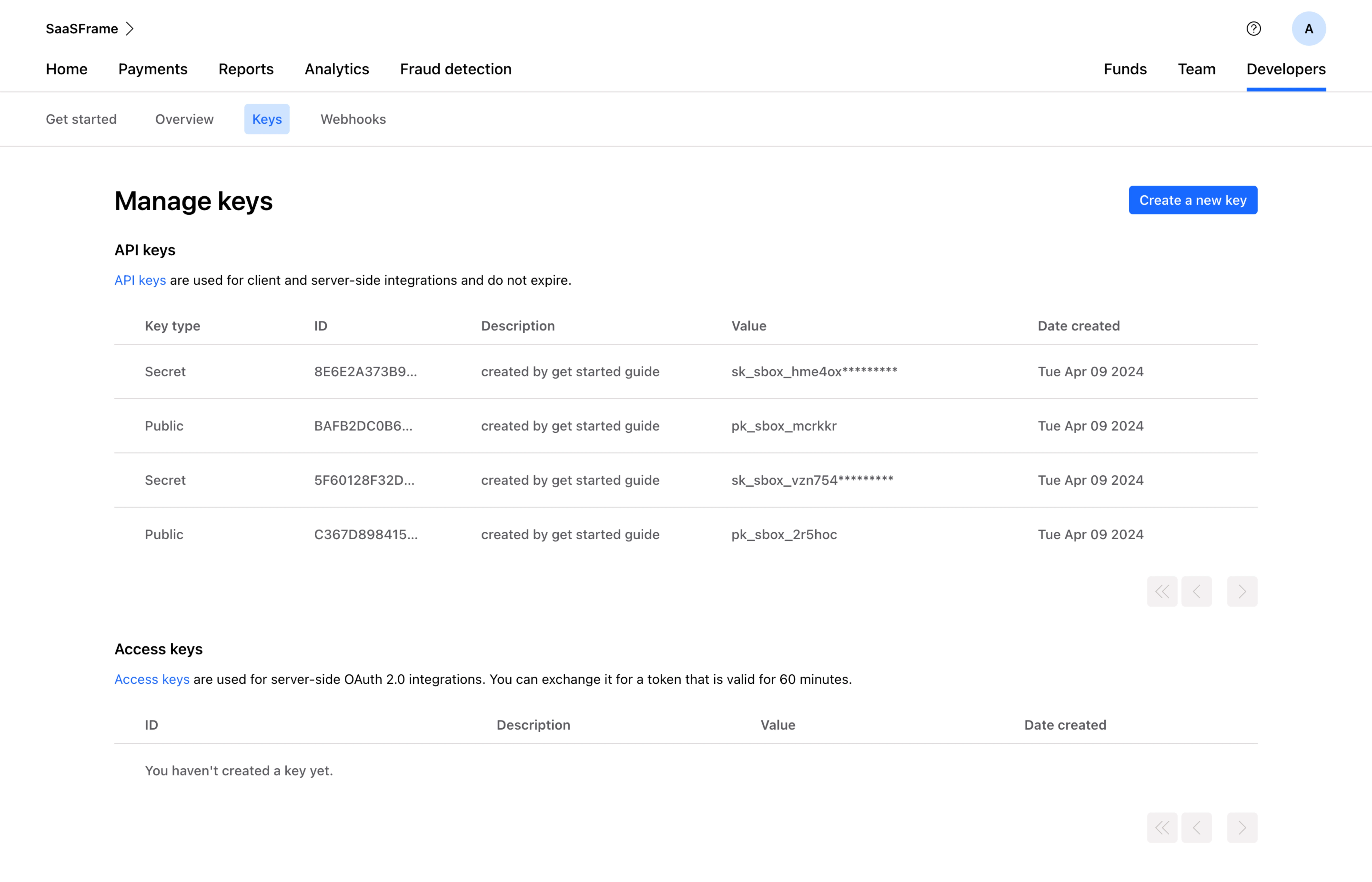
Generate a new design based on this screen using your own content.
Thank you! Your submission has been received!
Oops! Something went wrong while submitting the form.
# Design from Reference: Checkout.com Manage API Keys
Create an original, high-fidelity visual design inspired by the reference. Prioritize composition, typography, colors, spacing, and component styling over technical implementation.
## Reference
- **Product:** Checkout.com
- **Category:** Empty
- **Screenshot:** https://cdn.prod.website-files.com/5e9dc792e1210c5325f7ebbc/6acad4c31025e911ae518458_6acad3d7857335a2ffbe0ffc_cms-502c143494f3b33c79a664c5.webp
Analyze the screenshot first. If inaccessible, request it rather than guessing.
## Content
{{content.instructions}}
{{content.data}}
Preserve essential messaging and factual accuracy. Adapt structure and copy length for visual balance; never invent product claims.
## Visual Design
Use this context to reproduce the reference's visual language: layout, typography, colors, spacing, borders, radii, and distinctive elements. The screenshot takes priority if descriptions conflict.
## Direction
{{preferences.fidelityInstructions}}
## Output
{{output.instructions}}
Deliver a polished, cohesive design with precise alignment, hierarchy, and spacing. Produce the requested visual artifact, not just a description. If unsupported, explain the limitation.
This is Stripe's key management page and it's a masterclass in making dense technical content feel approachable. The blue "Create a new key" button pops immediately against all that white space. Smart hierarchy there.
Structure That Just Works
Two clear sections: API keys and Access keys. The table layout is dead simple with five columns that give you exactly what you need. Key type, ID, description, value, date created. No fluff. The partially masked secret keys (those asterisks) are a small but thoughtful security touch. Public keys stay fully visible. That distinction matters and they handle it without any extra UI noise.
Typography and Color Restraint
The type is small but readable. Monospace-style values for the key strings feel right for a developer audience. Color usage is minimal. Blue for the active "Keys" tab and the CTA button, everything else stays neutral. The sub-nav with Get started, Overview, Keys, and Webhooks keeps navigation tight without overwhelming the top bar. It's functional design that respects the user's time and technical literacy. Nothing competes for attention unnecessarily.