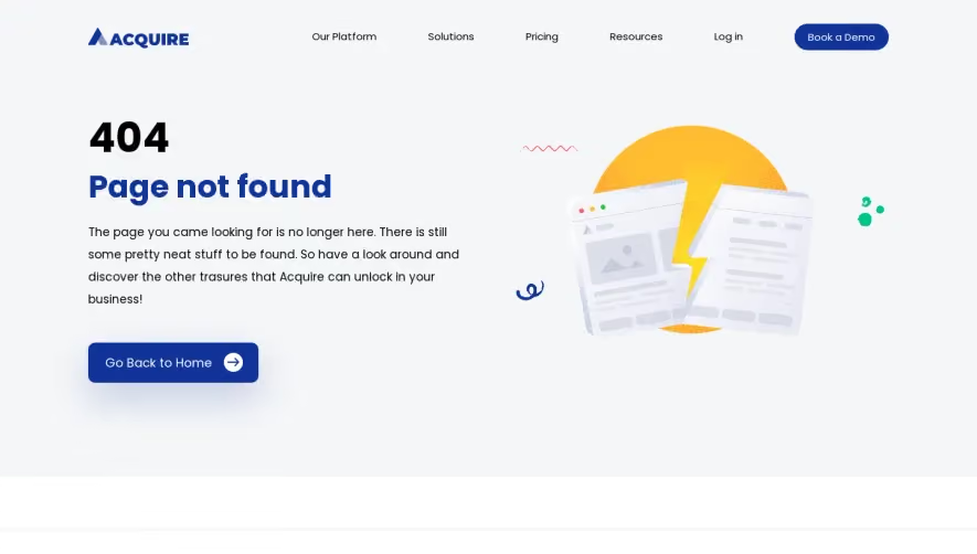
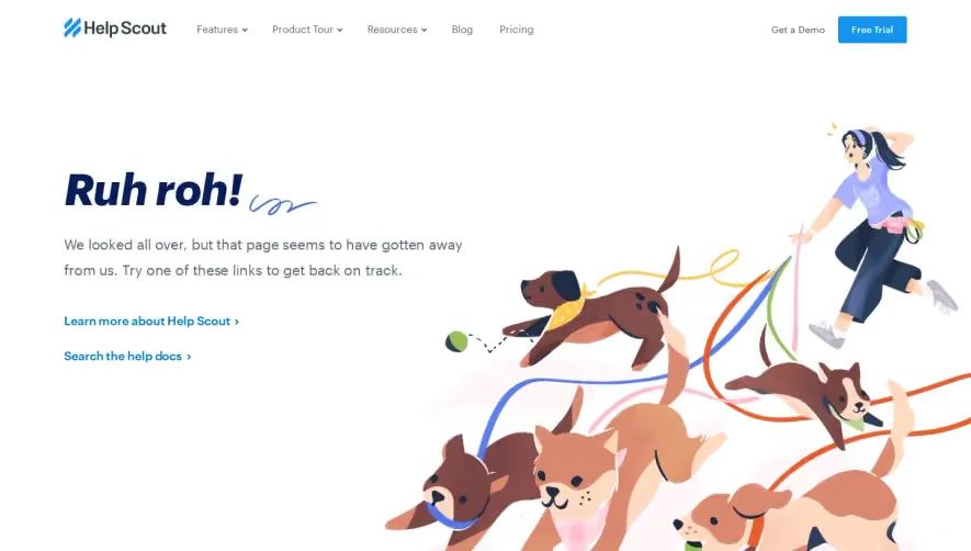
Generate a new design based on this screen using your own content.
Thank you! Your submission has been received!
Oops! Something went wrong while submitting the form.
# Design from Reference: Asana 404 Page
Create an original, high-fidelity visual design inspired by the reference. Prioritize composition, typography, colors, spacing, and component styling over technical implementation.
## Reference
- **Product:** Asana
- **Category:** 404 Page
- **Screenshot:** https://cdn.prod.website-files.com/5e9dc792e1210c5325f7ebbc/62ec9c6dbf75bb7437ce6cba_1659621499891-screenshot-device-49b6fcaaeed5825588d16ef369ede2a1-1659601134859.webp
Analyze the screenshot first. If inaccessible, request it rather than guessing.
## Content
{{content.instructions}}
{{content.data}}
Preserve essential messaging and factual accuracy. Adapt structure and copy length for visual balance; never invent product claims.
## Visual Design
Use this context to reproduce the reference's visual language: layout, typography, colors, spacing, borders, radii, and distinctive elements. The screenshot takes priority if descriptions conflict.
## Direction
{{preferences.fidelityInstructions}}
## Output
{{output.instructions}}
Deliver a polished, cohesive design with precise alignment, hierarchy, and spacing. Produce the requested visual artifact, not just a description. If unsupported, explain the limitation.
Asana’s 404 page radiates a playful yet professional vibe, blending modern minimalism with bursts of color. The design embraces whitespace, letting the cheerful visual elements and clear messaging stand out without clutter—an approach well-suited for SaaS brands seeking both approachability and credibility.
Layout and Structure
The page is single-column and highly focused. A large hero illustration dominates the center, immediately drawing the eye. Concise, empathetic headline text addresses the error, followed by a brief explanation and a prominent call-to-action button that leads users back to the homepage. There’s no navigation bar or footer to reduce cognitive load and keep attention on recovery options.
Visual Elements
A whimsical, custom illustration—featuring Asana’s unmistakable dot motif and friendly, abstract characters—injects charm and positivity into what could otherwise be a frustrating dead-end. The lack of stock photography or generic icons helps reinforce brand identity and makes the experience memorable.
Color Palette and Typography
Key Asana brand colors—corals, sky blues, and soft purples—create a subtle gradient background, making the illustration pop. Typography is clean and approachable; headlines are bold and easy to scan, while supporting text is lighter for a clear hierarchy.
User Experience Patterns
Navigation is purposefully minimal, focused solely on helping users recover from an error. The primary button is visually prominent, guiding users’ next steps. There are no forms or complex interactions, keeping the experience frictionless.
Unique and Notable Design Choices
Turning a 404 into a positive micro-moment, Asana transforms frustration into delight through friendly visuals and empathetic copy. The combination of brand-centric illustration and minimal distraction exemplifies thoughtful, user-first SaaS design.
Tone and Feel
Overall, the tone is warm, inviting, and innovative—evoking trust while making users feel cared for, even when they’re lost. This page is a standout example of how SaaS brands can infuse personality at every touchpoint.