Overall Style and Aesthetic
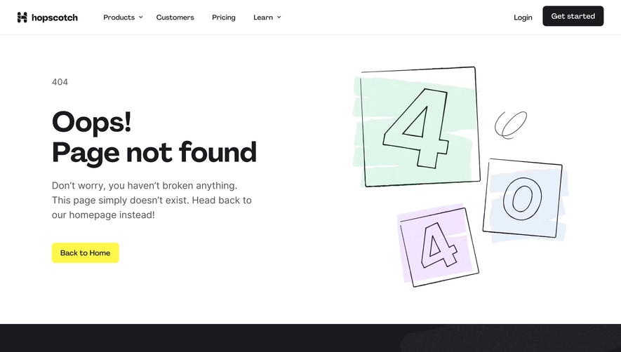
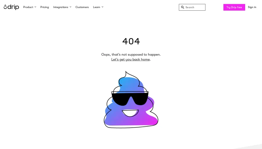
Acquire.io’s 404 page channels a modern, minimalist ethos with playful undertones. The visual approach is clean and uncluttered, utilizing generous white space that draws attention to key elements without overwhelming the visitor. Subtle brand accents and concise copy maintain an air of professionalism while also diffusing the disappointment often associated with error pages. Layout and Structure
The layout is vertically centered, immediately focusing user attention on the main message. There’s a prominent hero illustration, a headline, supportive text, and a clear call-to-action leading back to the homepage—all arranged for effortless comprehension. A sticky or accessible navigation ensures users can easily explore the rest of the product, while the footer preserves brand consistency and offers secondary links. Visual Elements
The standout illustration features a friendly, custom character interacting with tech objects, infusing warmth and personality into the error experience. The absence of photographic elements and the use of smooth, vector-style imagery contribute both to a cohesive brand identity and faster page performance. Soft animated effects on illustration elements add a dynamic yet calming energy. Color Palette and Typography
Acquire.io employs a tasteful, harmonious palette: bright highlights (sky blue and soft teal) contrast with deep charcoal and gentle grays, projecting clarity and approachability. Typography is simple and legible, with a subtle hierarchy—a bold, friendly headline font paired with open, readable body text. User Experience Patterns
Navigation is intuitive, with direct CTAs (like “Go Home”) and unobtrusive menus guiding users to value quickly. Microinteractions and hover states invite engagement, while prominent links prevent dead ends, transforming frustration into opportunity. Unique or Notable Design Choices
Transforming a standard error page into a delightful, branded touchpoint, Acquire.io’s 404 demonstrates empathy through illustration, purposeful layout, and welcoming copy. The tone is confident yet approachable, making even lost visitors feel cared for—an outstanding example of turning a setback into a memorable experience.