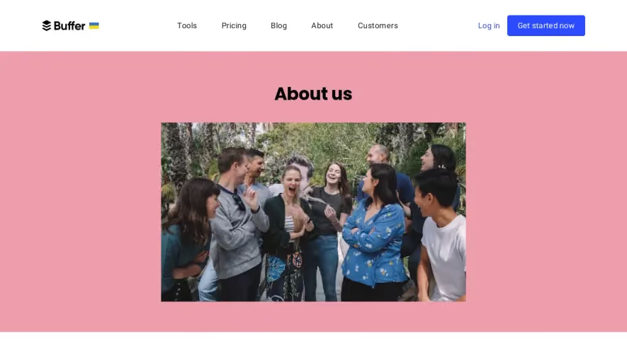
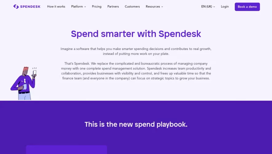
Generate a new design based on this screen using your own content.
Thank you! Your submission has been received!
Oops! Something went wrong while submitting the form.
# Design from Reference: Qovery About Page
Create an original, high-fidelity visual design inspired by the reference. Prioritize composition, typography, colors, spacing, and component styling over technical implementation.
## Reference
- **Product:** Qovery
- **Category:** About Page
- **Screenshot:** https://cdn.prod.website-files.com/5e9dc792e1210c5325f7ebbc/62f272e1523cfa85e776ae1a_1660054811005-230dbc73-070a-4124-ab26-d6bb46709ac2-name%3DQoveryAboutPage.webp
Analyze the screenshot first. If inaccessible, request it rather than guessing.
## Content
{{content.instructions}}
{{content.data}}
Preserve essential messaging and factual accuracy. Adapt structure and copy length for visual balance; never invent product claims.
## Visual Design
Use this context to reproduce the reference's visual language: layout, typography, colors, spacing, borders, radii, and distinctive elements. The screenshot takes priority if descriptions conflict.
## Direction
{{preferences.fidelityInstructions}}
## Output
{{output.instructions}}
Deliver a polished, cohesive design with precise alignment, hierarchy, and spacing. Produce the requested visual artifact, not just a description. If unsupported, explain the limitation.
Qovery’s team page exemplifies a crisp, modern aesthetic, fusing minimalism with a splash of vibrancy. The interface feels professional yet approachable, balancing white space with succinct content blocks. Visual consistency pervades, driven by clarity and a subtle playfulness that’s appealing without distracting from core messaging.
Layout and Structure
The page opens with a concise hero section, featuring a bold headline and subtext that frame the team’s mission. Content flows vertically, with well-defined segments: an introductory statement, dynamic grid-based team profiles, and a sleek footer. Every section feels comfortably spaced, allowing users to focus and explore at their own pace.
Visual Elements
Team member photos are showcased in soft, rounded-corner frames, adding warmth and humanity. Micro-animations enliven interactions—such as gentle hover effects on profiles—creating a sense of sophistication. Playful geometric accents and tasteful SVG icons punctuate the layout, lending visual rhythm and cohesion.
Color Palette and Typography
The color scheme centers on deep navy, airy whites, and blue-violet gradients, peppered with energetic accent hues. Primary CTAs stand out in electric blue. Typography combines a slender, modern sans-serif for headings and legible body text, using varied font weights and sizes to establish clear hierarchy and effortless readability.
User Experience Patterns & Unique Choices
Navigation is instantly accessible via a sticky top bar, while smooth scroll behaviors guide users intuitively. Clickable profile cards invite deeper team exploration. Notably, the “Join Us” CTA is persistent, underscoring openness and momentum. The blend of professional polish and friendly warmth makes the SaaS brand both trustworthy and inviting—prime inspiration for teams seeking a human-centric, high-impact design.