Flowrite’s About page embraces a modern, ultra-minimalist design that radiates professionalism with a subtle hint of playfulness. Ample white space creates an airy, open feel, while sharp edges and finely-tuned visual balance keep the aesthetic crisp and mature. The unfussy layout and restrained visual flourishes reinforce clear communication and a trusted company image.
Layout and Structure
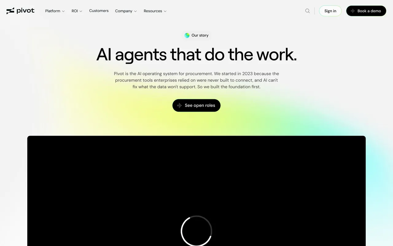
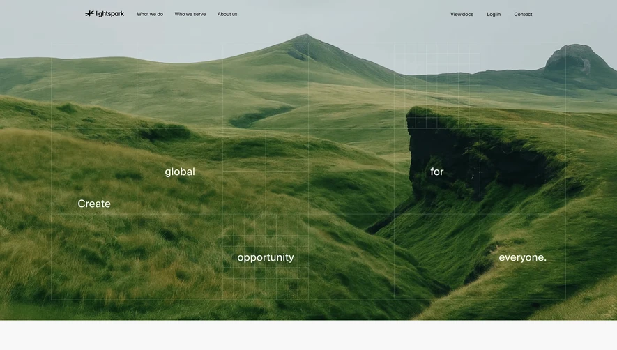
This page is thoughtfully structured around a linear scroll experience. It opens with a hero section featuring a concise, impactful statement and founder imagery, instantly humanizing the brand. The main body flows between succinct company narrative, team photos laid out in an inviting grid, mission and values statements, and a gentle call to join the team. There are no disruptive, sales-driven elements—just honest storytelling.
Visual Elements
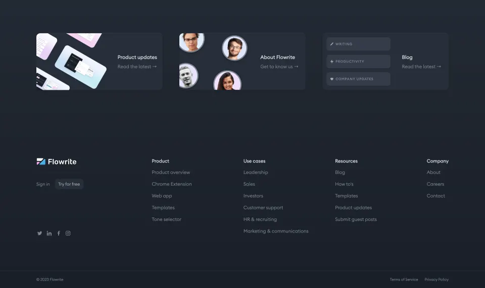
Clean, friendly photography—primarily candid shots of team members—serves as the primary visual language. Subtle micro-animations on hover and minimal iconography add polish without clutter. The design avoids heavy illustrations or video, staying true to its direct, personal approach.
Color Palette and Typography
The palette centers on pure white, soft grays, and a signature electric blue for accents and clickable elements. Headings use a bold sans-serif font, instantly readable and modern, while body copy is lighter, supporting the visual hierarchy and easy skimming.
User Experience Patterns
Navigation stays sticky and lightweight, while primary calls to action are few but highly visible, reinforcing a focused user journey. Smooth scrolling, gentle content fades, and interactive team bios offer delightful moments of engagement.
Unique or Notable Design Choices
The “About” page stands out through its people-first imagery, transparency, and omission of typical SaaS sales content. Every element feels deliberate—built to establish trust and forge a human connection, all while exemplifying contemporary SaaS design sensibilities.
 SaaSFrame