Prompt 1,263 words Copy
# Design from Reference: Guru About Page

Create an original, high-fidelity visual design inspired by the reference. Prioritize composition, typography, colors, spacing, and component styling over technical implementation.

## Reference

- **Product:** Guru
- **Category:** About Page
- **Screenshot:** attached to this message (also available at https://media.saasframe.io/o/79b73d98486f41b1c0f0.webp)
- **Source:** https://www.getguru.com/about

Analyze the attached screenshot first. If no image is attached, open the screenshot link; if neither is accessible, ask for it rather than guessing.

## Visual Design Context

### Overall aesthetic
- **Character:** A friendly company/careers page with bold black typography, mint-green geometry, colorful portraits and surreal collage artwork.
- **Editorial personality:** Clean navigation and spacious sections coexist with offset borders, hand-drawn arrows and playful value illustrations.

### Page composition
- **Capture:** The source measures 1440 × 7878 image pixels; all six readable portions were inspected. A 1× CSS scale is plausible but unverified.
- **Hero:** A horizontal navigation sits above a two-column introduction: headline, mission copy and two black actions at left, large mint geometric artwork at right.
- **People and values:** Nine circular leadership portraits appear in two centered rows, followed by six investor logos. A pale values region uses a staggered three-column collage layout and continues into diversity copy and employee-group marks.
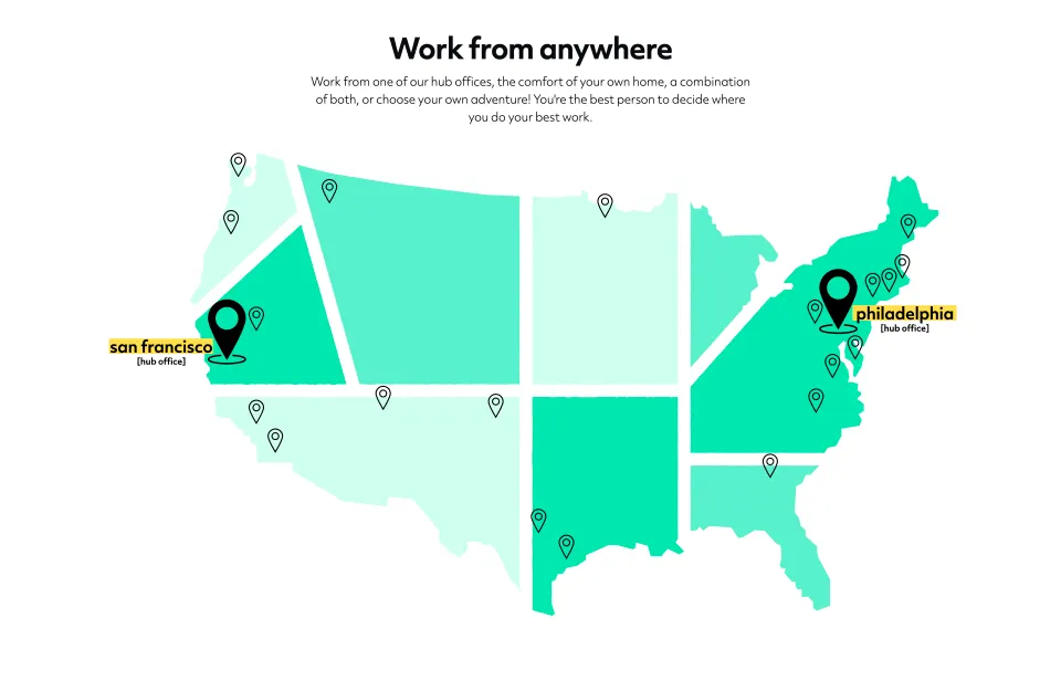
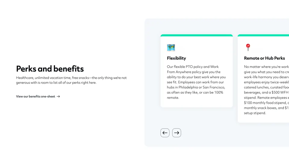
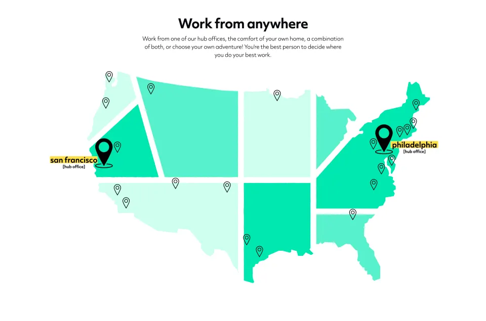
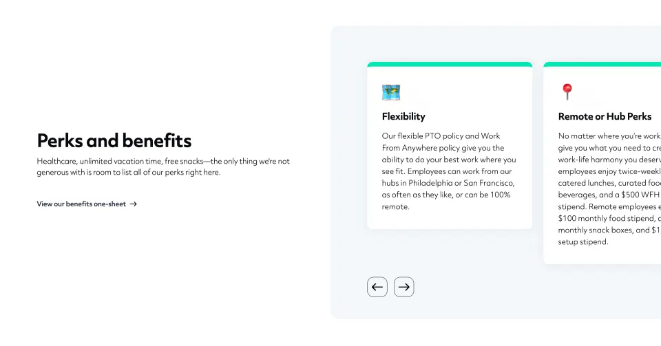
- **Workplace:** A large mint map of the United States marks two hub offices and distributed locations. A split perks section pairs copy at left with a partially clipped card carousel at right.
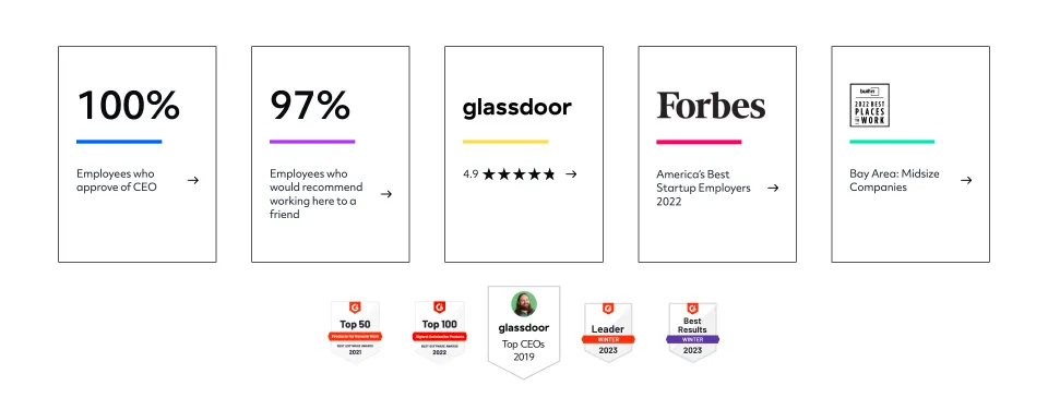
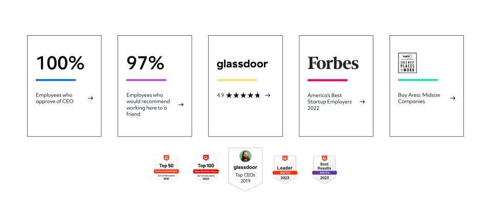
- **Evidence and resources:** Five outlined rating/recognition panels and smaller badges precede an eight-card editorial grid.
- **Ending:** A mint careers CTA leads to a multi-column footer, blog/signup block, legal strip, floating event banner, chat launcher and bottom cookie bar.

### Information hierarchy
- **Introduction:** “Hi, we're Guru.” is the largest opening text, with a wave emoji, mission paragraph and careers/benefits actions.
- **People:** A centered leadership heading leads to portraits, bold names and muted roles. These are captured personnel details, not verified current leadership.
- **Values:** Each value has a bold title, italic serif supporting sentence and colorful collage. The diversity statement and group logos follow within the same pale region.
- **Work and proof:** The map and perks precede employment ratings and awards; these establish the captured recruiting narrative.
- **Final conversion:** The large “Interested in joining the team?” block repeats a black careers action before the resource-heavy footer.

### Typography
- **Family pairing:** Most content uses a rounded geometric sans serif; value descriptions and some editorial accents use an italic serif. Exact font identities are unverified.
- **Major headings:** Hero and final CTA are around 48–52 image pixels, very bold; section headings are approximately 40 pixels with tight line spacing.
- **Cards and roles:** Resource/value titles are around 24–28 pixels, bold; portrait names are roughly 16 pixels, bold, with lighter roles beneath.
- **Body:** Main paragraphs are about 18–20 pixels with 28-pixel line height; footer links are about 14 pixels with comfortable vertical spacing.

### Colors & surfaces
- **Measured palette:** ICC-aware sRGB sampling identifies white #FFFFFF, pale blue-gray #F5F7FB, pale mint #DAFFEE, mint #86EFCE and brighter green #4BE5B3.
- **Secondary samples:** #D9FFF0 supports other light mint areas, #005EFF appears in saturated blue artwork and #EAEEF2 in neutral image regions.
- **Contrast:** Black headings and buttons anchor the colorful visual system. Pink, yellow, purple and blue distinguish portraits, collages and rating accents.
- **Edges:** Most sections are borderless; editorial and recognition cards use thin black outlines, while benefit cards use rounded white surfaces and soft shadows.

### Components
- **Hero artwork:** Simple circle, semicircle, square, rounded blob and triangle shapes cluster within a pale mint arch.
- **Portrait grid:** Five circular portraits occupy the first row and four the centered second row, each about 190 image pixels across.
- **Values collage:** Five illustrated value cards stagger across three columns, combining cutout brains, hands, shoe, sculpture and heart imagery with bright flat backgrounds.
- **Map:** A segmented mint US silhouette uses outlined location pins and two oversized black hub markers with yellow-highlighted labels.
- **Benefits carousel:** White cards with mint top accents sit inside a pale rounded region; outlined arrow buttons appear beneath, and the next card is clipped by the viewport.
- **Editorial grid:** Eight cards form four columns and two rows, each with an offset duplicate outline, black category tab, title, arrow link and image.
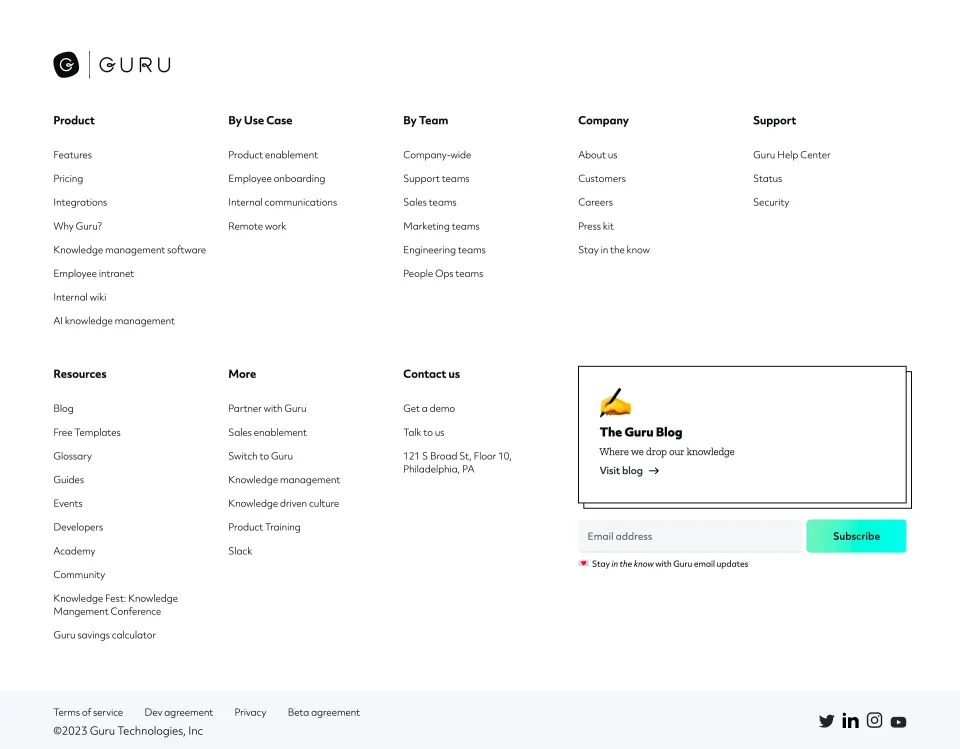
- **Footer utilities:** A bordered blog callout sits above an email field and mint-to-cyan Subscribe button. A blue dismissible event bar and gray cookie strip overlap the lower edge in this captured state.

### Visual rhythm
- **Spacing:** Wide section gaps around 100–140 image pixels preserve breathing room despite the long page.
- **Grid variation:** Symmetric portraits give way to staggered values, a full-width map, split benefits and a dense four-column resource grid.
- **Repetition:** Bold headings, black actions and arrow links unify otherwise varied illustration styles.
- **Color pacing:** White sections alternate with pale blue-gray and mint fields, with vivid artwork concentrated inside specific modules.

### Responsive
- **Recommendation:** Stack hero columns, reduce portrait rows to two or three columns and reorganize staggered values into a clear reading order.
- **Recommendation:** Scale the map with a readable text alternative, and make the benefits carousel operable without relying on clipped content alone.
- **Recommendation:** Reduce editorial cards to two and then one column, collapse footer groups and prevent event/cookie overlays from obscuring controls. Only desktop is captured.

### Adaptation guidance
- **Preserve:** Retain the bold typography, mint brand field, circular portraits and distinctive collage/offset-border vocabulary.
- **Build:** Use reusable people, value, recognition and article components with consistent alignment and spacing.
- **Content integrity:** Treat team names, employment ratings, awards and location policies as historical screenshot content rather than current verified facts.
- **Accessibility:** Pair map/illustration content with readable text, label carousel controls and ensure overlapping bottom notices remain dismissible and legible.

## Content

**Instructions:**

Generate realistic example content that fits the selected design reference.

Create appropriate headlines, descriptions, labels, buttons, and supporting copy based on the type of interface being designed.

If a product or business description is provided, use it to guide the content.

Otherwise, invent a plausible fictional SaaS product appropriate for the reference.

Keep the content concise, coherent, and visually balanced.

Do not present fictional statistics, customer names, or testimonials as verified facts.

## Design Direction

**Instructions:**

Use the reference screenshot as the main source of visual inspiration rather than a strict layout template.

Preserve its most distinctive design characteristics, such as typography, visual rhythm, color relationships, component treatments, and overall aesthetic.

Feel free to modify section arrangements, proportions, spacing, and individual components to better suit my content.

Introduce original design decisions where they improve usability, composition, or brand consistency.

The result should clearly reflect the reference's visual language without looking like a direct reproduction.

Follow the visual identity of the reference design.

Use its typography, color palette, component styling, and overall aesthetic as the primary design direction.

Do not introduce an unrelated visual identity.

## Output

**Instructions:**

Generate a high-fidelity visual mockup of the requested interface.

Present the design as a polished, realistic website or product UI screenshot.

Prioritize visual composition, typography, spacing, colors, alignment, and component details.

Use the available image-generation or visual-design capabilities.

Do not replace the mockup with source code, a written design specification, or a textual description.

If direct visual generation is unavailable, clearly explain the limitation.

## Constraints

- Use the actual screenshot as the primary visual reference.
- Preserve essential messaging and factual accuracy.
- Prioritize visual quality and consistency.
- Do not invent unsupported product claims.
- Adapt structure and copy length for visual balance.
Reference image Long pages get scaled down: a section works better. Open in ChatGPT ↗ Open in Claude ↗
Build it in Lovable ↗ v0 ↗ Figma Make ↗
Opening a tool copies the screenshot so you can paste it with your prompt.
 SaaSFrame