Request Permissions
15
Navigate browser and system access with SaaS Permission Request patterns. See how to explain why your app needs access to a camera, microphone, or location for better UX.

A permission request asks a user to give a product access to a capability or resource. Camera, microphone, notifications, and location are familiar examples. The interface has to explain why access is useful before another system, such as the browser or operating system, asks the user to make the final decision.
The strongest request connects access to an action the person is trying to complete. It also explains what happens if they decline. A permission screen becomes much harder to trust when it appears before the feature has a purpose, suggests that refusal breaks everything, or promises more control than the product actually provides.
There are two distinct surfaces in many permission flows. The product can explain the feature, prepare the user, and offer a route into the request. The browser or operating system may then present its own permission interface. Design both parts of the journey, while acknowledging which part the product controls.
The explanatory screen should answer three questions: what resource is being requested, which immediate feature needs it, and what the person can do after allowing or declining. Those answers should be concrete. “Enable a better experience” does not tell someone why a microphone is relevant to joining a workshop.
Keep the explanation accurate across supported environments. A screenshot of one browser prompt is not a promise that every user will see the same labels or placement. If the product uses a visual cue to direct attention to the prompt, test that cue in the contexts the product supports instead of assuming a single layout.
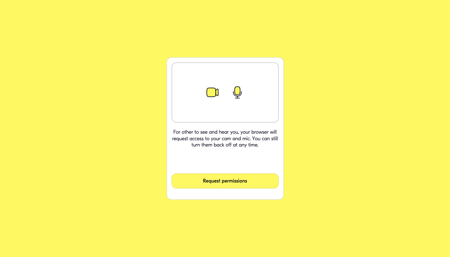
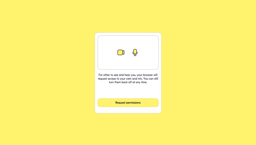
The Butter screenshot shows a white card on a bright yellow background. Camera and microphone icons sit above an explanation connecting access with being seen and heard by other people. A “Request permissions” button follows that explanation. The copy also tells users that they can turn the devices off afterward.
The useful detail is the relationship between the resource and the task. Camera and microphone access are introduced as part of participation in a meeting, rather than as an unexplained onboarding requirement. The button announces that another request is about to happen. It does not claim that clicking it has already granted access.
The reassurance about turning devices off addresses a likely concern, but it also creates a product obligation. Your own interface needs a discoverable way to control device activity. Access permission and an active camera or microphone are different states; users should be able to understand both during the meeting.
The screenshot demonstrates the preparatory screen. It does not establish how Butter handles every denial, remembered decision, device failure, or supported browser. Use the visible copy and hierarchy as evidence for the explanation pattern, then evaluate your own complete flow separately.
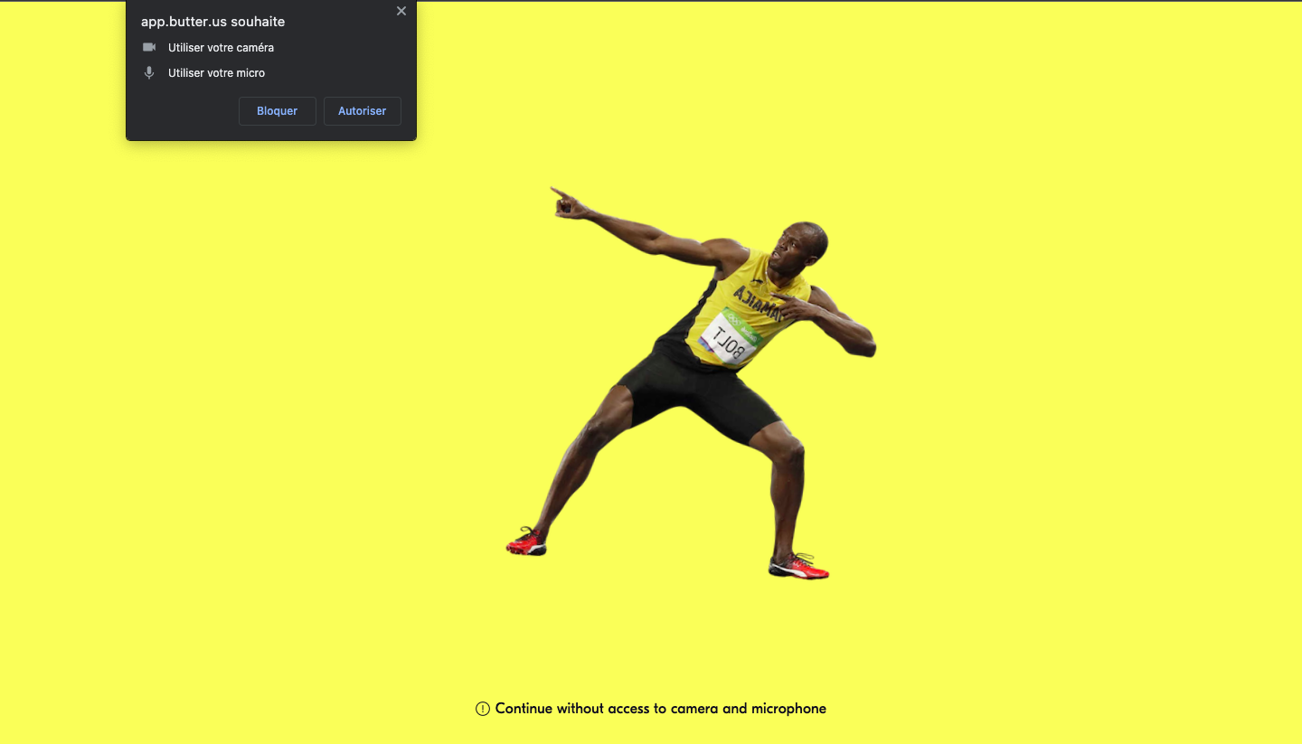
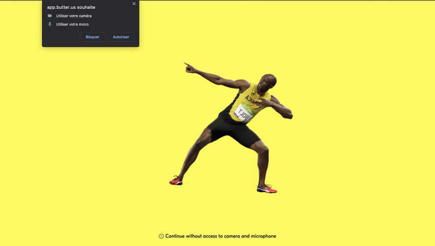
The second Butter screenshot captures a browser permission prompt asking to use the camera and microphone, with blocking and allowing choices. The background uses a person pointing toward the prompt. Near the bottom of the page, a link offers to continue without access to the camera and microphone.
That alternative changes the meaning of the request. The interface presents access as a decision with a fallback, rather than a hidden prerequisite for completing any part of onboarding. Whether the fallback is suitable depends on the product: a participant may be able to listen, read, or explore without broadcasting audio or video.
Explain the practical limitation next to the alternative when it is not obvious. “Continue without a microphone” should lead to a coherent experience in which microphone-dependent actions remain understandable. A fallback that immediately returns to the same demand undermines the choice the interface just offered.
The pointing figure is distinctive, but the transferable lesson is attention management. A native prompt can appear outside the product’s main content area. An explanation can help users recognize it, yet the page must also work if its placement, language, or visual appearance differs from the captured example.
Permission timing should follow intent. A person preparing to speak in a meeting can understand why a microphone is needed. A person browsing an unfamiliar dashboard may have no reason to allow notifications yet. Tie the request to the moment when the user has enough context to weigh the benefit.
Some setup flows need access before a feature can be tested. In that case, explain the upcoming test: checking microphone input, previewing a camera, or demonstrating a relevant notification. The explanation should describe what the product will do next, rather than merely listing a resource it wants to access.
Avoid collecting unrelated permissions in one undifferentiated step. Each request should have a clear purpose and its own consequence. If camera and microphone access are needed together for a meeting, explain the shared use. If notification access serves a later feature, it may deserve a different moment in the journey.
Use familiar resource names. “Microphone” is more understandable than a technical capability label. The benefit should be immediate enough to picture: speak to participants, share a live camera view, or receive an alert about a specific event. Broad claims about productivity are too remote from the decision.
Be precise about scope. Do not describe a one-time action as ongoing monitoring, or imply that a permission decision is a setting for the whole team when it belongs to the individual’s environment. If the resource enables sensitive activity, the interface should make that activity visible where it happens.
Control language must map to actual controls. If copy says that users can turn their microphone off, the meeting interface should expose that action clearly. If permission can be reconsidered later, provide an appropriate route from the feature or settings area. Avoid promises of reversibility without designing the return path.
Document the outcomes the product needs to represent. The user may grant access, decline, dismiss the prompt, or already have a remembered decision. The necessary resource may also be unavailable even when access is allowed. A single “success or failure” screen is often too vague to support useful recovery.
Distinguish an access decision from a device problem. “Microphone unavailable” and “Microphone access not allowed” suggest different next steps. Present the most relevant recovery action in plain language. If the product cannot reliably distinguish the cause, state the observed problem without pretending to know why it happened.
After access is granted, move the person into the promised feature or test. Do not leave them on a permission screen wondering whether anything changed. For audio or video setup, a clear preview or status indicator can help confirm readiness, provided it reflects the actual device state.
A declined request is a user decision, not automatically an error. Preserve any feature that can work without the requested access. Explain disabled actions at the point where people encounter them, with a way to revisit the decision when they have a new reason to do so.
Recovery instructions should fit the observed environment. A generic paragraph containing several browser menus can overwhelm a person who only needs one action. If your product provides browser-specific instructions, maintain and verify them as part of the supported flow. Do not publish instructions copied from an old screenshot without checking them.
Repeated requests need a reason. A person clicking “Turn on microphone” has expressed fresh intent. A prompt that returns whenever they open an unrelated page is harder to justify. Keep request frequency connected to actions, and measure whether people actually recover rather than simply dismiss the same explanation again.
The product’s explanatory interface should work with keyboard navigation, readable text, meaningful headings, and a clear focus order. A decorative illustration should not carry the only instruction. The Butter example’s visual direction is memorable, but a textual explanation is still necessary for users who cannot rely on that image.
Allow people time to understand what they are being asked. Avoid timers that force a decision before the user has located the browser prompt. If an asynchronous request is waiting, explain the waiting state without trapping users behind a screen they cannot leave.
Test localized copy and the combination of product language with system language. The captured Butter page includes an English interface and a French browser prompt. A real flow needs to remain understandable when those surfaces do not share a language or identical terminology.
An acceptance rate can describe one step of the funnel, but it does not prove that the request is good. People may grant access and still fail to join, discover the wrong device, or abandon the feature. Track the next useful outcome alongside the decision itself.
For a meeting flow, useful questions include whether users reach a working setup, whether they can continue after declining, and whether they can later enable a device when they choose. Review support issues for confusion between permissions, device selection, and activity controls. Those problems often need different interface fixes.
Only when the onboarding task provides a clear reason to make the decision. If the resource serves a feature the user has not encountered, requesting it at the moment of use may give the person better context.
Explain the resulting limitation and keep any available alternative usable. If the requested feature genuinely cannot work without access, say which capability is blocked and offer a relevant way to revisit the decision.
The product can design the explanation and the surrounding flow. Treat the native decision interface as an external surface, and verify the experience in the environments you support instead of depending on a single screenshot.
Browse permission request examples on SaaSFrame to compare how SaaS products explain access, prepare users for system prompts, and provide paths after a decision.