
Thank you! Your submission has been received!
Oops! Something went wrong while submitting the form.
Get SaaSFrame Pro
Monthly
$18
Quarterly
$48
Yearly
$180
Upgrade to access this feature
Browse all screens & flows
Filter and search screens & flows
Access Figma files
Access mobile versions
Bookmark screens & flows
Join now
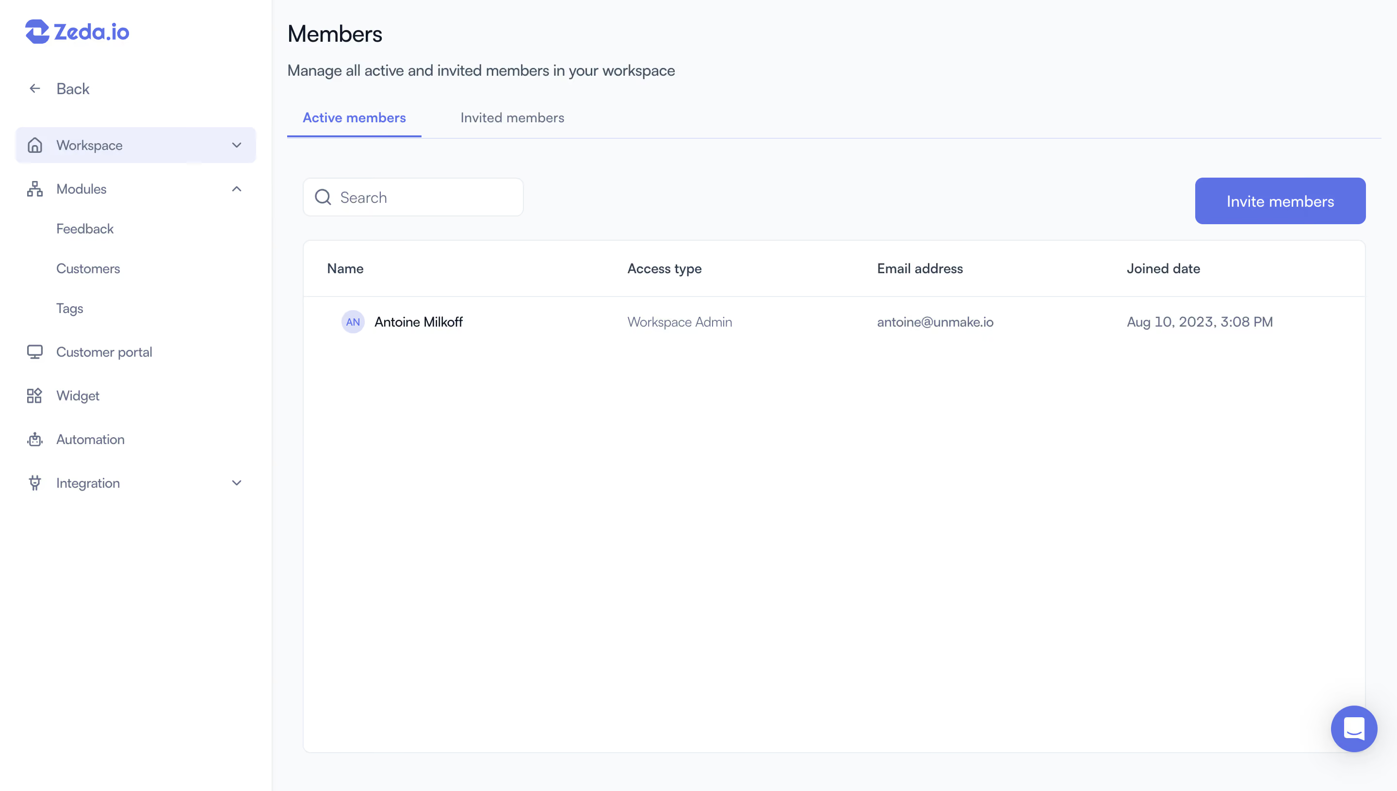
Zeda.io Team Members

Zeda.io
AI-powered product discovery and strategy software
Designed by
No items found.

Bookmark
Bookmark

Design with AI
Thank you! Your submission has been received!
Oops! Something went wrong while submitting the form.
# Design from Reference: Zeda.io Team Members
Create an original, high-fidelity visual design inspired by the reference. Prioritize composition, typography, colors, spacing, and component styling over technical implementation.
## Reference
- **Product:** Zeda.io
- **Category:** Team Members
- **Screenshot:** https://cdn.prod.website-files.com/5e9dc792e1210c5325f7ebbc/6acadc4f5c79bb17f221afda_6acadba91fe7916e41b174e1_cms-a0c0657b5c651d9c86feaea2.webp
Analyze the screenshot first. If inaccessible, request it rather than guessing.
## Content
{{content.instructions}}
{{content.data}}
Preserve essential messaging and factual accuracy. Adapt structure and copy length for visual balance; never invent product claims.
## Visual Design
### Overall aesthetic
- **Character:** A light workspace-administration screen uses a white sidebar, pale gray content area, blue-violet accents, and a large white member table.
- **Tone:** The design is clean and functional, with small line icons, restrained borders, and generous unused table space.
- **Observed scale:** The source measures 2880 × 1630 pixels. CSS estimates assume a 2× capture, roughly 1440 × 815; actual pixel ratio is unverified.
### Page composition
- **Sidebar:** A roughly 280-pixel white rail contains Zeda.io branding, Back, a selected Workspace row, an expanded Modules group, and additional product/settings destinations.
- **Main heading:** Members appears near the upper-left of the content area, followed by a one-line management explanation.
- **Tabs:** Active members and Invited members sit above a thin rule. Active members has blue text and underline.
- **Toolbar:** A compact search field aligns left above the table, while a blue-violet Invite members button aligns right.
- **Table:** A broad white rounded bordered panel contains four columns: Name, Access type, Email address, and Joined date. One member row is visible.
- **Support:** A circular blue-violet message launcher sits near the lower-right corner.
### Information hierarchy
- **Page purpose:** The title and subtitle establish member management rather than an invitation form.
- **Status division:** Tabs separate active and invited users, with active users currently selected.
- **Primary action:** Invite members is the strongest filled control.
- **Member identity:** A small initial avatar and darker name lead the row. Role, email, and joined date use muted text.
- **Scope limit:** No invitation dialog, invited-member list, role editor, or search results are visible.
- **Privacy:** Captured names, email, and dates are contextual account data and should not be copied into reusable examples.
### Typography
- **Typeface appearance:** A neutral sans-serif is used throughout. Exact family is unverified.
- **Title:** Approximately 24–26 CSS pixels, regular/medium weight, with a line-height near 32 pixels.
- **Subtitle:** Around 16 pixels, regular, in slate text.
- **Tabs and table:** Approximately 14 pixels; active tab and headers use medium weight.
- **Navigation:** Sidebar labels are around 14 pixels with compact line-height.
- **Button/search:** Approximately 15–16 pixels, with white action text and muted search prompt.
### Colors & surfaces
- **Measured base:** #FFFFFF forms sidebar and table; #F9FAFB supplies the pale main background.
- **Measured accent:** #5972EC appears in the blue-violet action family.
- **Measured selection:** #ECF0FD and #DBE1FB support pale selected/initial-avatar treatments.
- **Measured borders:** #E8ECF0 supplies light outlines and rules.
- **Measured secondary text:** #647087 contributes to muted slate labels.
- **Flat depth:** The table relies on a fine border and small corner radius rather than a strong shadow. The support launcher has more visible elevation.
### Components
- **Brand lockup:** A blue-violet geometric mark precedes Zeda.io text.
- **Workspace row:** A pale blue rounded navigation item combines a home icon, label, and dropdown chevron.
- **Modules group:** A small hierarchy icon and upward chevron introduce three indented child links.
- **Other destinations:** Customer portal, Widget, Automation, and Integration use line icons; Integration has a dropdown chevron.
- **Search field:** A white outlined rounded rectangle around 228 × 40 CSS pixels contains a magnifying glass and prompt.
- **Invite control:** A blue-violet rounded rectangle approximately 176 × 48 pixels carries centered white text.
- **Table header:** Four labels align across the panel, separated from the row by one horizontal rule.
- **Member row:** A small pale circular initial avatar sits beside the name, with role/email/date in aligned columns.
- **Chat launcher:** A roughly 48-pixel filled circle contains a white message symbol.
- **Unshown states:** Hover, focus, row selection, invitation submission, role changes, and pagination are not established.
### Visual rhythm
- **Clear left boundary:** A thin vertical separation distinguishes the sidebar from the content region.
- **Header grouping:** Title, subtitle, tabs, and toolbar form a compact sequence before the table.
- **Wide columns:** The table uses generous horizontal spacing for identity, role, email, and date.
- **Sparse data:** One row occupies a tall panel, leaving substantial white space below.
- **Accent restraint:** Blue-violet marks selected navigation, active tab, invitation, avatar, and support.
### Responsive
- **Evidence limit:** Only a desktop member-management screen is captured. Mobile behavior is unverified.
- **Recommended sidebar:** Collapse navigation into a drawer on narrow screens.
- **Recommended table:** Preserve header relationships through horizontal scrolling or a labeled stacked member layout.
- **Recommended toolbar:** Stack search and invitation action if needed while maintaining clear priority.
- **Recommended identity:** Allow long names/emails to wrap or truncate accessibly without hiding row actions.
- **Recommended accessibility:** Provide semantic tabs/table headers, current-state labels, focus visibility, and descriptive icon controls.
### Adaptation guidance
- **Preserve management structure:** Separate active/invited status, search, invitation entry point, and member details.
- **Define invitation separately:** The visible button does not establish the form, permissions, or delivery behavior.
- **Use safe data:** Replace captured account identifiers and dates with approved sample or live values.
- **Support real list states:** Design empty, loading, no-results, error, larger-team, and pending-invitation views from actual requirements.
- **Build from measured tokens:** White, pale gray, slate text, thin borders, and blue-violet accents provide the core system.
- **Validate authorization:** Role visibility and member-management actions should follow actual product permissions.
Use this context to reproduce the reference's visual language: layout, typography, colors, spacing, borders, radii, and distinctive elements. The screenshot takes priority if descriptions conflict.
## Direction
{{preferences.fidelityInstructions}}
## Output
{{output.instructions}}
Deliver a polished, cohesive design with precise alignment, hierarchy, and spacing. Produce the requested visual artifact, not just a description. If unsupported, explain the limitation.


Category
Tech Stack

Added on
August 10, 2023
Similar screens
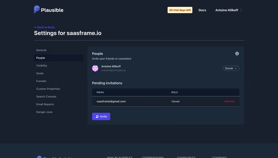






Upgrade to SaaSFrame Pro now to see similar examples.
Monthly
$18 /month
Billed $18 monthly
Browse all screens & flows
Filter and search screens & flows
Search text in screenshots
Access Figma files
Access mobile versions
Join now
Quarterly
$16 /month
Billed $48 quarterly
Browse all screens & flows
Filter and search screens & flows
Search text in screenshots
Access Figma files
Access mobile versions
Join now
Yearly
$15 /month
Billed $180 yearly
Browse all screens & flows
Filter and search screens & flows
Search text in screenshots
Access Figma files
Access mobile versions
Join now