Generate a new design based on this screen using your own content.
Thank you! Your submission has been received!
Oops! Something went wrong while submitting the form.
# Design from Reference: Wise Search Transfer Recipient
Create an original, high-fidelity visual design inspired by the reference. Prioritize composition, typography, colors, spacing, and component styling over technical implementation.
## Reference
- **Product:** Wise
- **Category:** Add & Edit
- **Screenshot:** https://cdn.prod.website-files.com/5e9dc792e1210c5325f7ebbc/6aca27e7aca7079066e8e7ac_6aca2706d4674c1a37e2b1eb_cms-319f2fb19a9b15a677c2749e.webp
Analyze the screenshot first. If inaccessible, request it rather than guessing.
## Content
{{content.instructions}}
{{content.data}}
Preserve essential messaging and factual accuracy. Adapt structure and copy length for visual balance; never invent product claims.
## Visual Design
Use this context to reproduce the reference's visual language: layout, typography, colors, spacing, borders, radii, and distinctive elements. The screenshot takes priority if descriptions conflict.
## Direction
{{preferences.fidelityInstructions}}
## Output
{{output.instructions}}
Deliver a polished, cohesive design with precise alignment, hierarchy, and spacing. Produce the requested visual artifact, not just a description. If unsupported, explain the limitation.
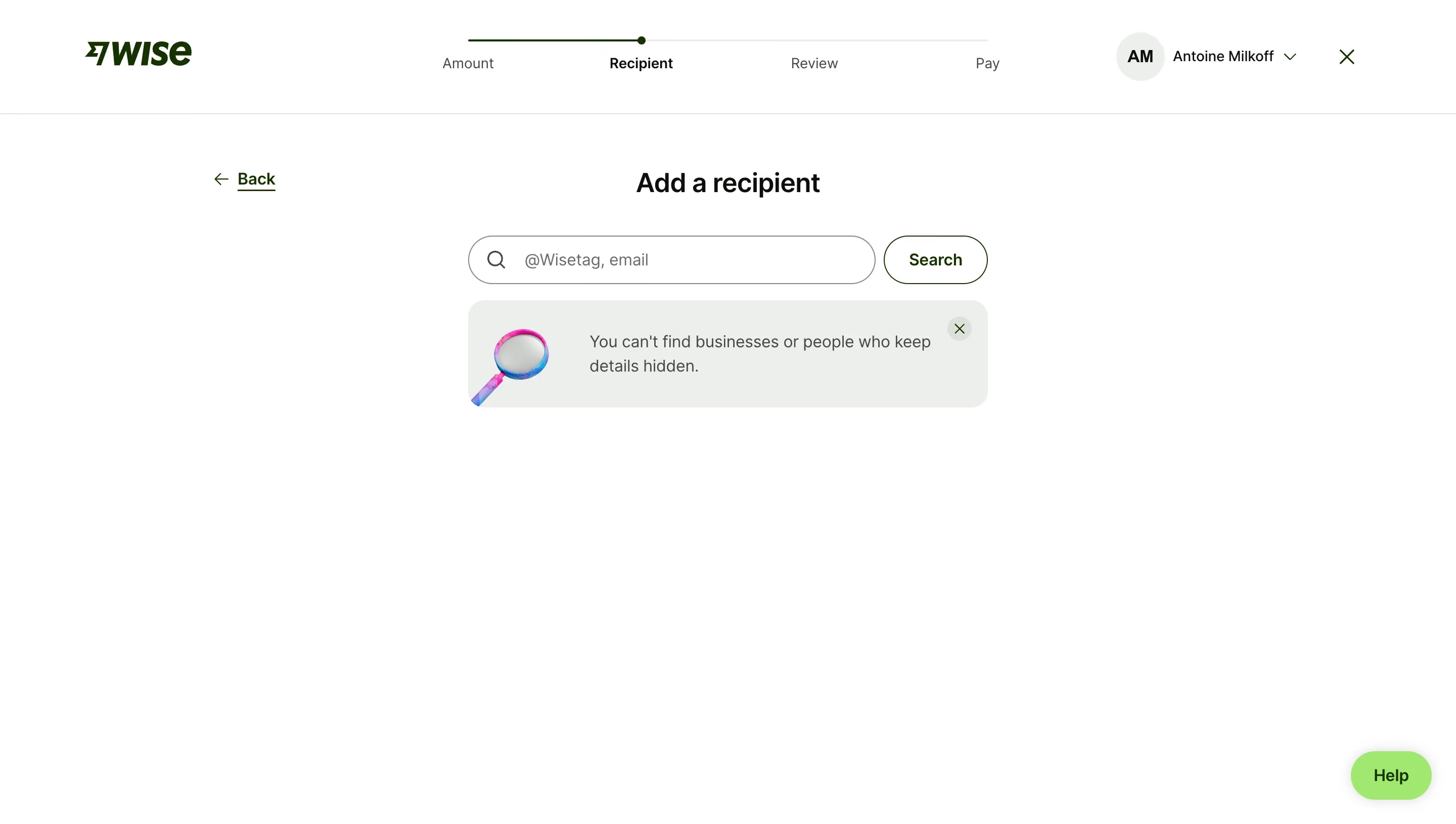
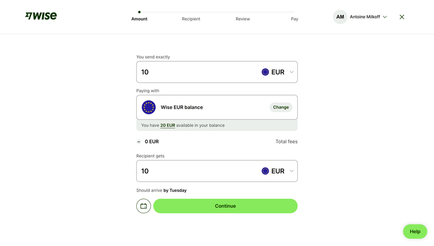
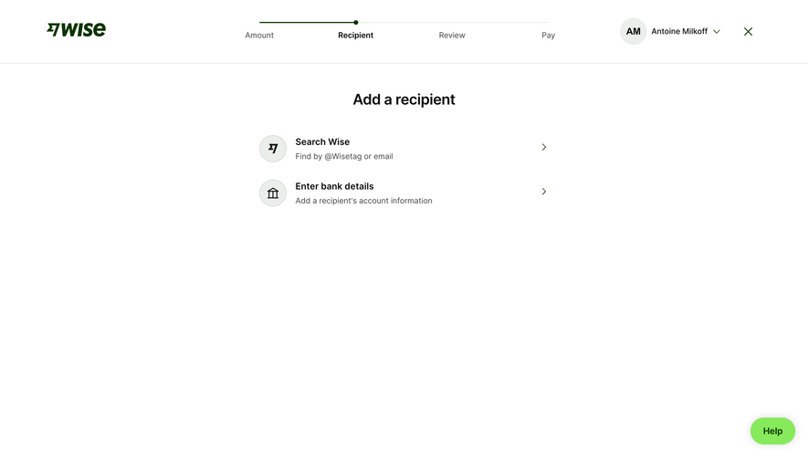
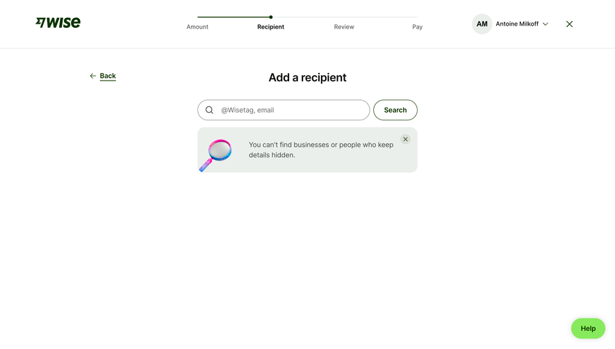
This is Wise doing what Wise does best. Stripping everything down to the essentials. The four-step progress bar at the top (Amount, Recipient, Review, Pay) immediately tells you where you are and what's left. No guessing. The "Recipient" label is bold and active while the others fade back. Smart hierarchy.
Typography That Stays Out of the Way
Big, centered "Add a recipient" heading in a hefty serif-adjacent weight. The search field is generous, with a subtle magnifying glass icon and placeholder text that tells you exactly what to type. That rounded "Search" button sits right beside it. Everything feels intentional and unhurried.
The Info Banner Does the Heavy Lifting
Love that soft gray callout box with the illustrated magnifying glass. "You can't find businesses or people who keep details hidden." It's honest, upfront, and saves users from confusion before it happens. The little X to dismiss it is a thoughtful touch. The warm white background and minimal palette keep your eyes locked on the one task that matters. No distractions. Just do the thing.