Design with AI
Generate a new design based on this screen using your own content.
# Design from Reference: Visitors Signup ID
Create an original, high-fidelity visual design inspired by the reference. Prioritize composition, typography, colors, spacing, and component styling over technical implementation.
## Reference
- **Product:** Visitors
- **Category:** Signup
- **Screenshot:** https://cdn.prod.website-files.com/5e9dc792e1210c5325f7ebbc/697b75a0cf9cb012bdc57453_1Tf_obF6CtVqswDzuloLUT9dBbUB5sv5pIHYwWaa1cw.avif
Analyze the screenshot first. If inaccessible, request it rather than guessing.
## Content
{{content.instructions}}
{{content.data}}
Preserve essential messaging and factual accuracy. Adapt structure and copy length for visual balance; never invent product claims.
## Visual Design
### Overall aesthetic
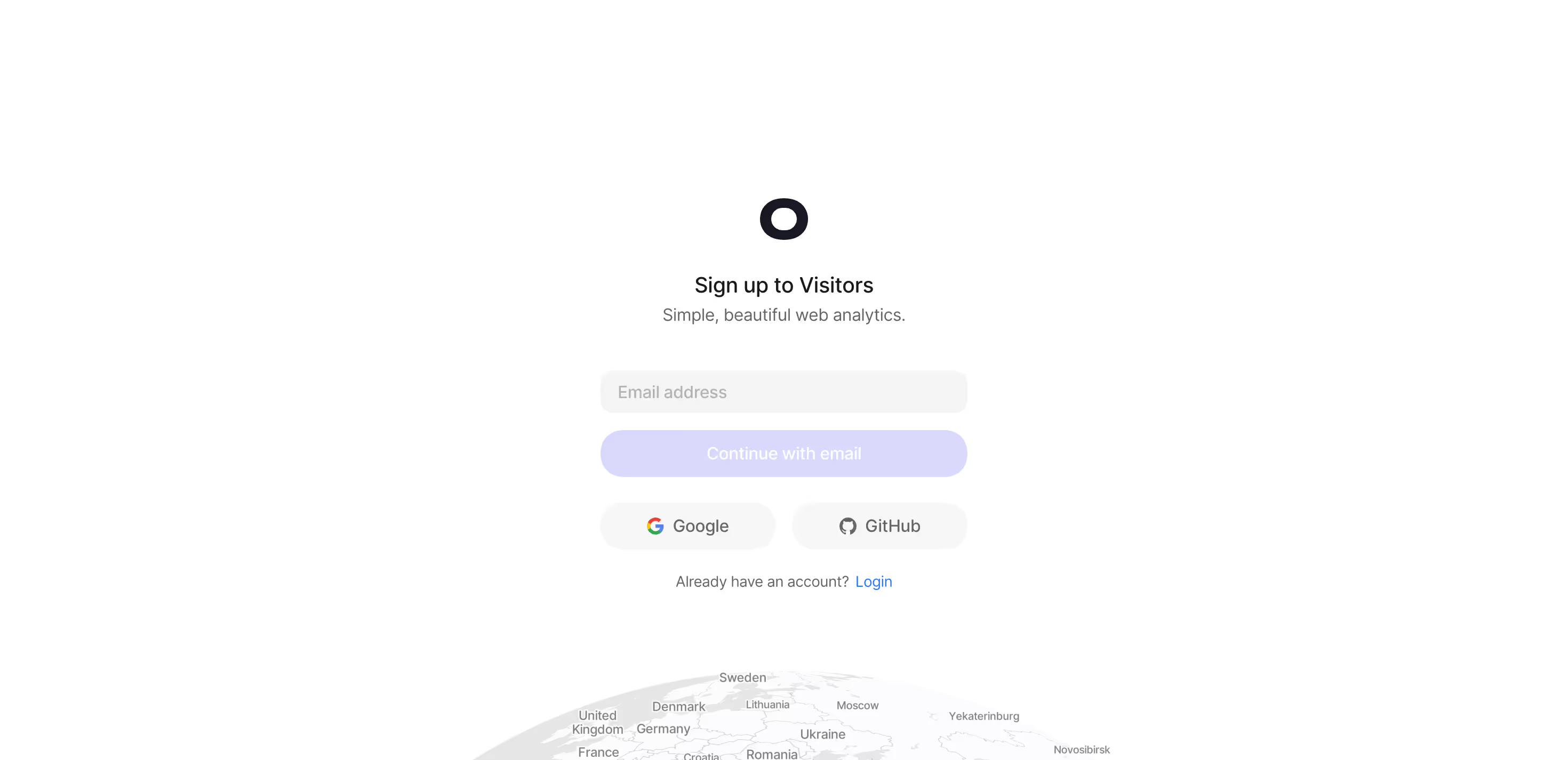
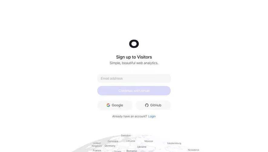
- **Character:** A minimal signup page uses a white canvas, dark circular mark, soft gray controls, pale lavender primary action and a faint globe at the bottom.
- **Evidence:** The source is 2940 × 1426 pixels. CSS dimensions assume an unverified approximately 2× capture density; the inspection image is scaled to 1400 pixels wide.
### Page composition
- **Central stack:** Logo, signup title and short analytics tagline sit above a narrow form.
- **Actions:** Email field and continuation button precede two side-by-side social options and a login link.
- **Decoration:** A pale geographic globe is partially cropped by the lower image edge.
### Information hierarchy
- **Task:** Sign up to Visitors is the primary text; the tagline is lighter.
- **Primary route:** Email entry and a full-width lavender action lead the form.
- **Alternatives:** Google/GitHub and existing-account login form secondary paths.
### Typography
- **Title:** Approximately 21–22 CSS pixels, medium weight.
- **Body/actions:** Around 16 pixels, with a smaller approximately 14-pixel account prompt.
- **Identity:** A neutral sans-serif is visible; exact family is unverified.
### Colors & surfaces
- **Measured base:** ICC-to-sRGB sampling identifies #FFFFFF as canvas and #FCFCFD as a near-white variation.
- **Measured controls:** #DAD9FC supplies the pale lavender action; #F5F5F5 and #F7F7F7 are light control surfaces, with #E6E6E6 supporting neutral details.
- **Contrast:** Dark navy/black defines the mark/title; supporting text is gray and login is bright blue.
- **Treatment:** Soft rounded controls have no strong borders or shadows.
### Components
- **Mark:** A small thick dark ring sits above the heading.
- **Email/action:** Approximately 344-pixel-wide controls are around 40–44 pixels tall, with broad rounded corners.
- **Social row:** Two equal pale-gray pills pair provider icons with labels.
- **Globe:** Very low-contrast land/label detail serves as decoration rather than a primary interactive map.
### Visual rhythm
- **Centering:** All functional content follows one narrow vertical axis.
- **Spacing:** Short title/tagline spacing contrasts with a larger gap before the email field.
- **Whitespace:** Broad margins keep the form isolated; the globe adds a subtle lower anchor.
### Responsive
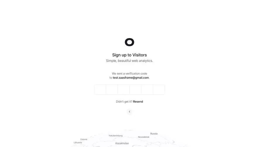
- **Observed scope:** One desktop empty-email state is visible; continuation behavior and validation are not shown.
- **Recommended layout:** Use a fluid max-width form with padded edges and keep social options readable.
- **Recommended contrast:** Confirm enabled/disabled action styling and sufficient text contrast rather than assuming the pale action is disabled.
### Adaptation guidance
- **Signup pattern:** Combine a short product promise, email route and two social alternatives.
- **Visual restraint:** Keep the globe decorative and avoid adding unsupported navigation or fields.
- **Implementation:** Verify fonts/density and define focus, validation and authentication feedback.
Use this context to reproduce the reference's visual language: layout, typography, colors, spacing, borders, radii, and distinctive elements. The screenshot takes priority if descriptions conflict.
## Direction
{{preferences.fidelityInstructions}}
## Output
{{output.instructions}}
Deliver a polished, cohesive design with precise alignment, hierarchy, and spacing. Produce the requested visual artifact, not just a description. If unsupported, explain the limitation.