Design with AI
Generate a new design based on this screen using your own content.
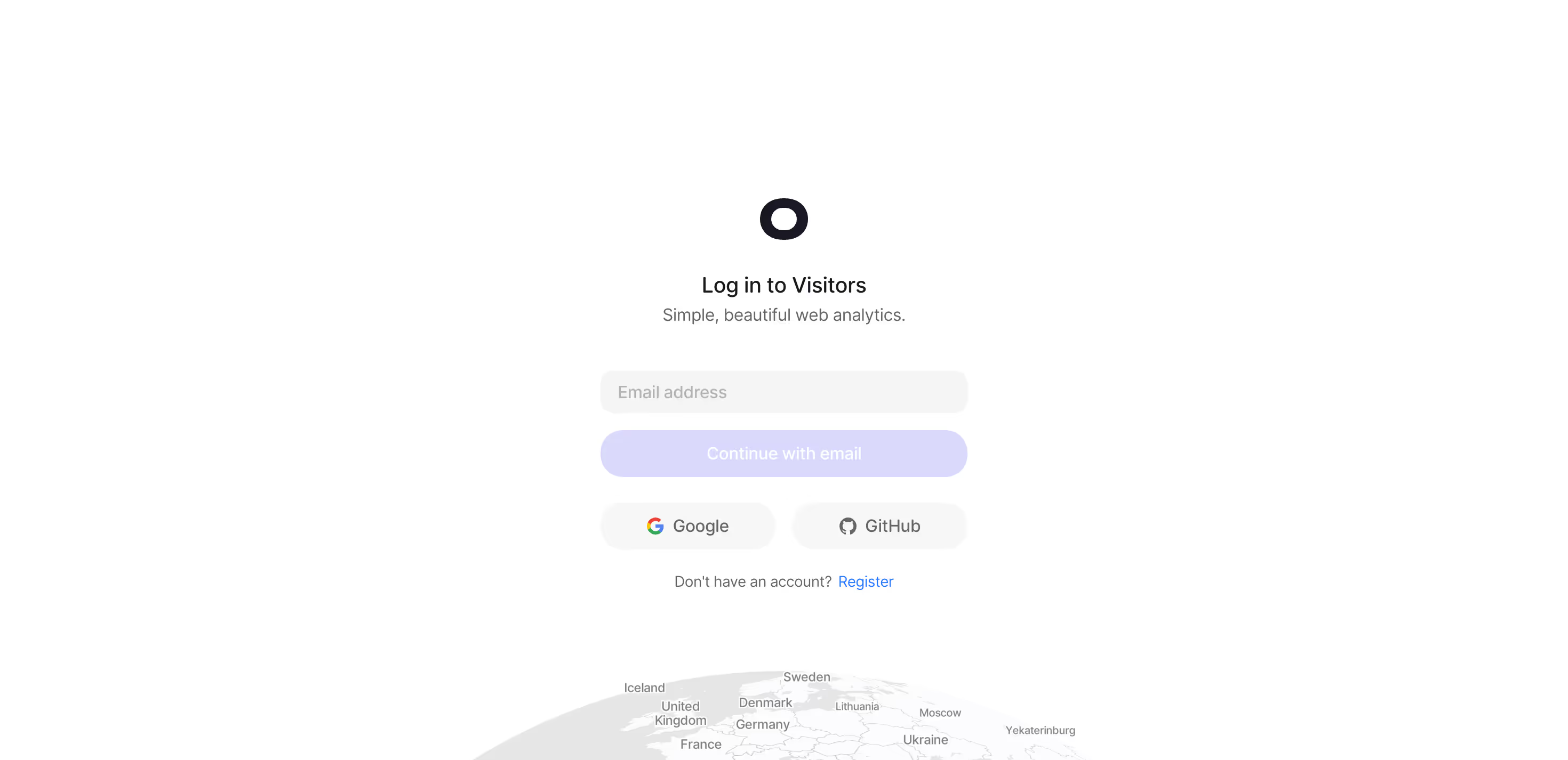
# Design from Reference: Visitors Login
Create an original, high-fidelity visual design inspired by the reference. Prioritize composition, typography, colors, spacing, and component styling over technical implementation.
## Reference
- **Product:** Visitors
- **Category:** Login
- **Screenshot:** https://cdn.prod.website-files.com/5e9dc792e1210c5325f7ebbc/697b75cf83a3c28b4dbfccbe_Vw34B8W94CPY2CPmjcl3Bw5X9v5huY8mUXrVGWtddYw.avif
Analyze the screenshot first. If inaccessible, request it rather than guessing.
## Content
{{content.instructions}}
{{content.data}}
Preserve essential messaging and factual accuracy. Adapt structure and copy length for visual balance; never invent product claims.
## Visual Design
### Overall aesthetic
- **Style:** An extremely sparse analytics login page with a small centered form, soft pill controls, and a faint globe emerging from the bottom edge.
- **Character:** Quiet and lightweight, using pale lavender and gray rather than a strong colored panel.
### Page composition
- **Capture and scale:** 2940 × 1426 screenshot pixels, consistent with estimated 2× capture of a 1470 × 713 CSS viewport. Following sizes are estimated CSS pixels.
- **Form stack:** A compact roughly 345 px-wide centered column contains a dark ring-like brand mark, login heading, short subtitle, email field, email continuation, paired provider buttons, and registration prompt.
- **Background:** White fills almost the entire page. A low-contrast globe with geographic labels is cropped along the bottom.
### Information hierarchy
- **Identity:** The small dark mark leads into the login title and brief product description.
- **Authentication:** Email continuation is first, followed by equal Google/GitHub options.
- **Alternative:** A small registration sentence/link sits below the providers.
### Typography
- **Family:** Neutral sans serif; exact identity unverified.
- **Roles:** Login title approximately 20 px CSS medium, subtitle/control labels around 16 px, registration prompt 14 px.
- **Alignment:** All text is centered except the email placeholder; controls share a common width.
### Colors & surfaces
- **Foundation:** Sampled sRGB #FFFFFF dominates, with #FCFCFD subtle near-white details.
- **Controls:** Sampled lavender #DAD9FC fills email continuation; #F5F5F5 and #F7F7F7 define field/provider surfaces.
- **Ink:** Sampled #181925 anchors mark/title; #666666 supports secondary copy and #E6E6E6 globe/boundary details.
### Components
- **Email:** A pale-gray rounded input sits above a full-width lavender pill. The empty-field pale action appearance is visible, but disabled behavior is unverified.
- **Providers:** Two equal pale pills share a row with Google and GitHub icons.
- **Brand/globe:** The compact dark oval/ring symbol is isolated above the title; the globe remains a faint background illustration below all form controls.
- **Registration:** A small blue text link supplies the signup path without another button.
### Visual rhythm
- **Spacing:** Use roughly 25–30 px from brand to title, 40 px before email, 16 px between main controls, and 24 px before registration.
- **Negative space:** Preserve broad empty margins and keep the globe separate from the form.
### Responsive
- **Observed state:** Desktop only.
- **Recommended reflow:** Use fluid form width with 20–24 px gutters and crop/simplify the globe on short screens.
- **Controls:** Keep provider buttons readable and tappable, stacking if necessary.
### Adaptation guidance
- **Preserve:** Retain the centered compact authentication stack, soft pills, restrained lavender action, and faint globe.
- **Adapt:** Use real provider options and appropriate login/registration destinations.
- **Avoid:** Do not infer email delivery/authentication outcomes or hidden states.
Use this context to reproduce the reference's visual language: layout, typography, colors, spacing, borders, radii, and distinctive elements. The screenshot takes priority if descriptions conflict.
## Direction
{{preferences.fidelityInstructions}}
## Output
{{output.instructions}}
Deliver a polished, cohesive design with precise alignment, hierarchy, and spacing. Produce the requested visual artifact, not just a description. If unsupported, explain the limitation.