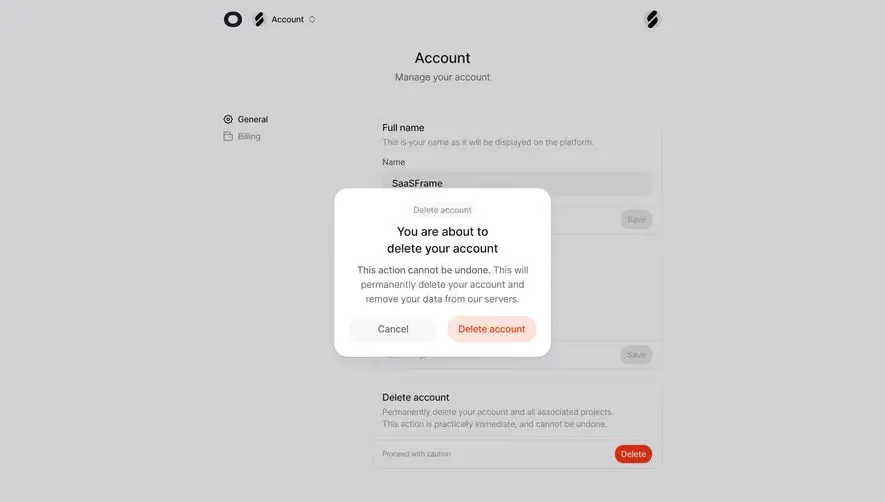
Generate a new design based on this screen using your own content.
Thank you! Your submission has been received!
Oops! Something went wrong while submitting the form.
# Design from Reference: Unkey Delete Key
Create an original, high-fidelity visual design inspired by the reference. Prioritize composition, typography, colors, spacing, and component styling over technical implementation.
## Reference
- **Product:** Unkey
- **Category:** Delete
- **Screenshot:** https://cdn.prod.website-files.com/5e9dc792e1210c5325f7ebbc/697b75f8cd83044f1a88e4d8_CECs57112DcozTAEJPjEzJRTwAZCuiqRc8verFzE4UQ.avif
Analyze the screenshot first. If inaccessible, request it rather than guessing.
## Content
{{content.instructions}}
{{content.data}}
Preserve essential messaging and factual accuracy. Adapt structure and copy length for visual balance; never invent product claims.
## Visual Design
Use this context to reproduce the reference's visual language: layout, typography, colors, spacing, borders, radii, and distinctive elements. The screenshot takes priority if descriptions conflict.
## Direction
{{preferences.fidelityInstructions}}
## Output
{{output.instructions}}
Deliver a polished, cohesive design with precise alignment, hierarchy, and spacing. Produce the requested visual artifact, not just a description. If unsupported, explain the limitation.
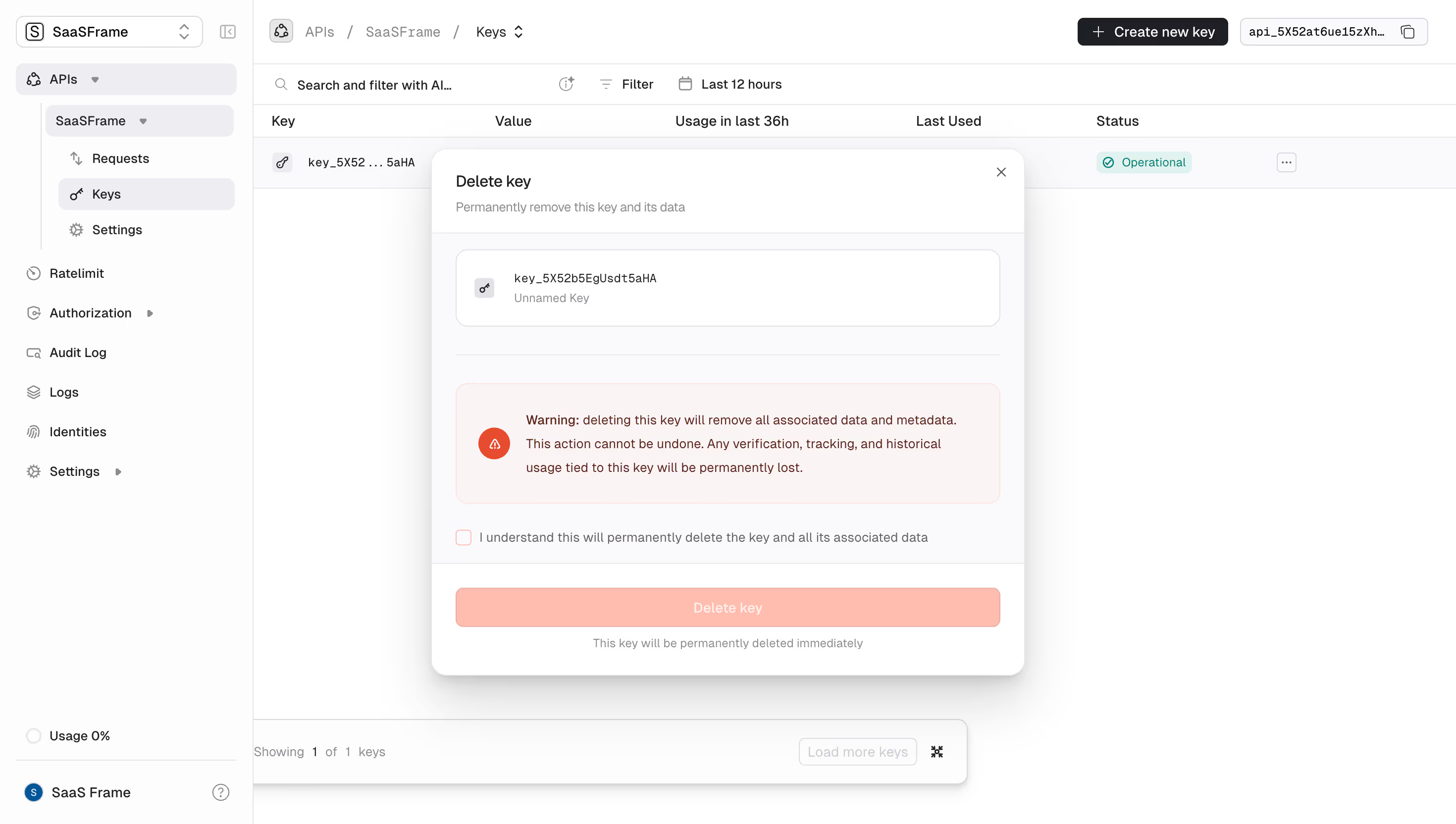
The warm coral-red delete button and warning banner instantly grab your attention. Unkey's dashboard nails the "are you sure?" moment with a clear visual hierarchy that doesn't let you accidentally nuke your API key. The warning block uses an orange alert icon paired with bold red text that spells out exactly what you'll lose. Verification, tracking, historical usage. Gone forever.
Clean Bones, Smart Structure
The left sidebar keeps things tight with a compact navigation tree. APIs, Keys, Settings, Ratelimit, Authorization. All readable at a glance. The modal itself sits on a slightly dimmed background, pulling focus right where it needs to be. Typography is restrained and functional. Monospaced font for the key identifier gives it that developer-tool credibility.
What Makes It Stand Out
That confirmation checkbox before the delete button is a smart friction pattern. The button appears intentionally muted, almost peachy, until you opt in. It's a small detail that shows real care for destructive actions. The whole page feels like it was designed by someone who's accidentally deleted production keys before.