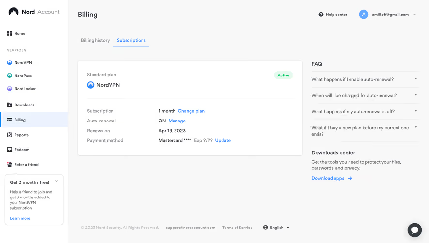
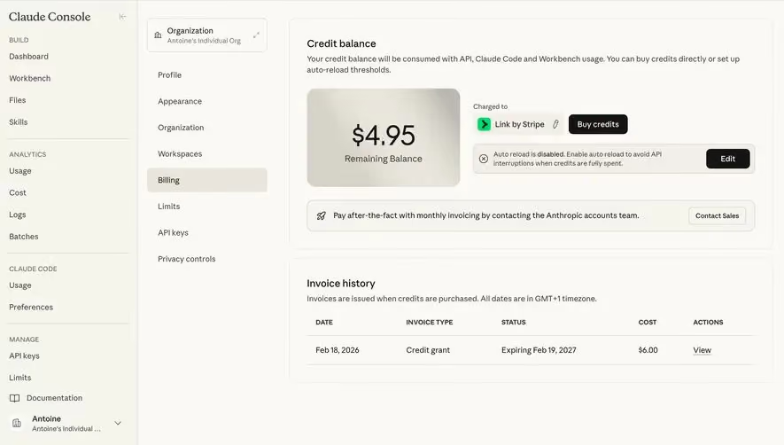
Generate a new design based on this screen using your own content.
Thank you! Your submission has been received!
Oops! Something went wrong while submitting the form.
# Design from Reference: Unkey Billing Settings
Create an original, high-fidelity visual design inspired by the reference. Prioritize composition, typography, colors, spacing, and component styling over technical implementation.
## Reference
- **Product:** Unkey
- **Category:** Billing
- **Screenshot:** https://cdn.prod.website-files.com/5e9dc792e1210c5325f7ebbc/697b75e9a3175b576c8a4ebb_K8ULOYBkoMZ3P9rqBcu5LZMsZYfQIgbT1WS8NgiRQYk.avif
Analyze the screenshot first. If inaccessible, request it rather than guessing.
## Content
{{content.instructions}}
{{content.data}}
Preserve essential messaging and factual accuracy. Adapt structure and copy length for visual balance; never invent product claims.
## Visual Design
Use this context to reproduce the reference's visual language: layout, typography, colors, spacing, borders, radii, and distinctive elements. The screenshot takes priority if descriptions conflict.
## Direction
{{preferences.fidelityInstructions}}
## Output
{{output.instructions}}
Deliver a polished, cohesive design with precise alignment, hierarchy, and spacing. Produce the requested visual artifact, not just a description. If unsupported, explain the limitation.
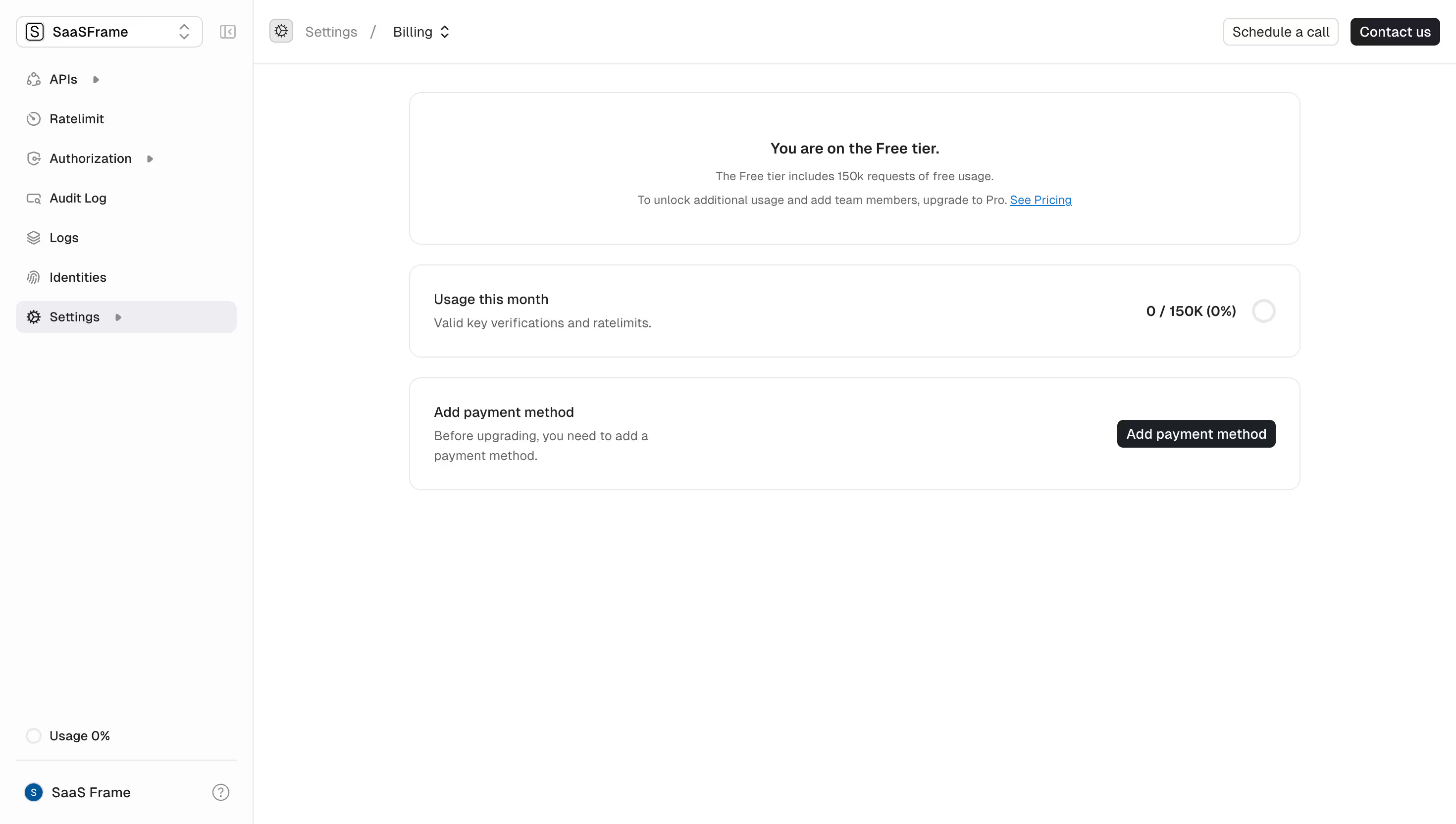
First thing you notice is how calm this page feels. Unkey's billing settings lean hard into whitespace and restraint. Three stacked cards, each doing one job. Status. Usage. Payment. That's it. No clutter, no upsell banners screaming at you.
Typography Doing the Heavy Lifting
The hierarchy here is tight. "You are on the Free tier." sits bold and centered, acting as the anchor for the whole page. Supporting text underneath is lighter gray, smaller, easy to scan but never demanding attention. The "0 / 150K (0%)" usage stat on the right pulls your eye naturally with its weight. Smart placement.
What Makes It Work
The left sidebar is dead simple. Icon + label, nothing fancy. That dark highlight on "Settings" with the chevron is a small but effective touch for orientation. The single black "Add payment method" button is the only real CTA on the page, and it earns that prominence by being the only thing you actually need to do here. Minimal palette. Black, white, gray, one blue link. Purposeful restraint.