
Thank you! Your submission has been received!
Oops! Something went wrong while submitting the form.
Get SaaSFrame Pro
Monthly
$18
Quarterly
$48
Yearly
$180
Upgrade to access this feature
Browse all screens & flows
Filter and search screens & flows
Access Figma files
Access mobile versions
Bookmark screens & flows
Join now


Unflow About Page

Unflow
Mobile app experiences, made without code
Designed by
No items found.

Bookmark
Bookmark

Design with AI
Thank you! Your submission has been received!
Oops! Something went wrong while submitting the form.
# Design from Reference: Unflow About Page
Create an original, high-fidelity visual design inspired by the reference. Prioritize composition, typography, colors, spacing, and component styling over technical implementation.
## Reference
- **Product:** Unflow
- **Category:** About Page
- **Screenshot:** https://cdn.prod.website-files.com/5e9dc792e1210c5325f7ebbc/62ee97d653f04d43866b4680_1659802906278-screenshot-device-602402198a52636620d5bab4597b37bc-1659802865220.webp
Analyze the screenshot first. If inaccessible, request it rather than guessing.
## Content
{{content.instructions}}
{{content.data}}
Preserve essential messaging and factual accuracy. Adapt structure and copy length for visual balance; never invent product claims.
## Visual Design
### Overall aesthetic
- **Style:** Airy company/careers page combining expressive serif headings, rounded sans-serif body copy and soft pastel-gradient panels.
- **Character:** A 3D jetpack character, large emoji-like benefit icons and playful cursor detail create a friendly product-team identity.
- **Capture:** The image measures 1440 × 5480 pixels. CSS estimates assume approximately 1:1 capture scale; browser scale and font identities are unverified.
### Page composition
- **Header:** Brand and a small hiring notice sit left; four compact navigation links align right.
- **Hero:** A wide rounded pastel panel pairs a large three-line mission heading and supporting copy left with a flying 3D character right.
- **About narrative:** A narrow centered column contains a small section label, two large serif paragraphs, a hiring link and an embedded stage-talk video.
- **Investors:** A centered statement and four large gray marks form a separate proof region.
- **Roles:** A centered careers heading precedes four pale stacked role cards.
- **Benefits:** Six icon-led benefits form a two-column, three-row grid with generous whitespace.
- **Closing:** A rounded pastel signup panel contains a large serif message and email/access form, followed by a rounded charcoal footer.
- **Support:** A circular chat launcher overlays the lower-right corner.
### Information hierarchy
- **Mission:** The hero heading dominates the opening, with a black open-roles pill beneath its explanation.
- **Narrative:** Large serif paragraphs communicate team experience and product motivation rather than using dense small copy.
- **Proof:** Investor statement and logos provide a pause before recruitment details.
- **Role listings:** Job names are bold and include external arrows; short descriptions explain each opening.
- **Benefits:** Small 3D icons precede serif labels and muted descriptions.
- **Product conversion:** The final access request is distinct from the careers content above it.
- **Footer:** Brand description and four link groups organize lower-priority destinations.
### Typography
- **Heading family:** A characterful serif is visible in hero, narrative and section headings; exact identity is unverified.
- **UI/body family:** A rounded sans-serif supports body copy and controls; exact identity is unverified.
- **Hero heading:** Approximately 56-pixel CSS size, bold-to-medium, with around 64-pixel line height.
- **Hero body:** Approximately 24 pixels with 36-pixel line height.
- **Narrative:** Approximately 36–40-pixel serif text with 42–46-pixel line height.
- **Section headings:** Approximately 40–44 pixels, serif, medium weight.
- **Role cards:** Titles around 16 pixels; descriptions around 14 pixels.
- **Benefits:** Serif labels around 24 pixels; body around 18–20 pixels with 28-pixel line height.
- **Footer and controls:** Approximately 14–16 pixels; small eyebrow labels around 12 pixels.
### Colors & surfaces
- **Measured base:** White #FFFFFF fills the main page.
- **Measured dark:** #18181A supports the footer; #111111 appears in dark text/action regions.
- **Measured pale surfaces:** #FAFAFA supports role cards; #F6F7FF appears in the closing pastel panel.
- **Measured warm gradients:** Samples include #FFE2F0, #FFE7ED, #FFDEF4 and #FFF7E1 across pink/cream hero areas.
- **Text treatment:** Black leads the hero and narrative; later sections use softer gray headings and descriptions.
- **Accent roles:** Purple marks small directional/cursor details, while colorful 3D artwork provides most saturation.
- **Depth:** Rounded panels remain largely flat; the hero character and emoji-style icons use dimensional shading.
### Components
- **Hiring notice:** A small gray pill and adjacent role link sit beside the logo.
- **Hero panel:** Approximately 1268 pixels wide, with roughly 32-pixel corners and large interior spacing.
- **Jetpack illustration:** A 3D person in yellow/red clothing rises above clustered white exhaust spheres.
- **Role action:** A black fully rounded pill with white text sits beneath hero copy.
- **Video embed:** A wide landscape thumbnail includes a central play icon and player-brand controls.
- **Investor row:** Four monochrome marks are widely spaced beneath a centered statement.
- **Job cards:** Four light-gray rounded rectangles contain title, description and a small circular emoji at right.
- **Benefit modules:** Compensation, location flexibility, hours, leave, health and home-office support use separate icon/title/paragraph groups without cards.
- **Access panel:** A large rounded pastel surface combines a two-line serif heading, decorative purple cursor tag, white email pill and black request button.
- **Footer:** A rounded charcoal container holds brand and link columns with muted gray text.
- **State scope:** No role detail, form submission, video playback or navigation menu is open.
### Visual rhythm
- **Outer grid:** Approximately 85-pixel desktop gutters align hero, closing panel and footer.
- **Narrative measure:** The about text and roles use a narrower central width than the broader benefits grid.
- **Vertical pacing:** Large whitespace breaks distinguish mission, investors, careers and benefits.
- **Benefit cadence:** Two-column rows use broad horizontal gutters and generous vertical separation.
- **Surface repetition:** Rounded pastel opening/closing panels bookend mostly white editorial content.
- **Footer contrast:** A dark rounded block provides a strong final boundary.
### Responsive
- **Recommendation — hero:** Stack copy and 3D artwork, scaling the large serif headline fluidly.
- **Recommendation — narrative:** Reduce oversized paragraph type while preserving readable line length.
- **Recommendation — benefits:** Stack the two-column grid and retain icon-label association.
- **Recommendation — form:** Stack email and access action when needed.
- **Recommendation — footer:** Wrap link groups and keep chat controls from covering content. No mobile layout is evidenced.
### Adaptation guidance
- **Preserve the company story:** Move from mission and team context to investor proof, roles and working benefits.
- **Reuse type contrast:** Pair expressive serif headings with clear sans-serif instructions and controls.
- **Keep artwork purposeful:** Use the jetpack and benefit icons to support ambition and work-culture themes.
- **Separate careers and product access:** Retain distinct role and signup routes.
- **Use consistent rounded panels:** Share corner and spacing tokens across hero, access panel and footer.
- **Define interactions separately:** Job navigation, video playback and access-request feedback are outside the captured state.
Use this context to reproduce the reference's visual language: layout, typography, colors, spacing, borders, radii, and distinctive elements. The screenshot takes priority if descriptions conflict.
## Direction
{{preferences.fidelityInstructions}}
## Output
{{output.instructions}}
Deliver a polished, cohesive design with precise alignment, hierarchy, and spacing. Produce the requested visual artifact, not just a description. If unsupported, explain the limitation.


Category
Patterns
No items found.
Tech Stack

Added on
August 6, 2022
Similar screens



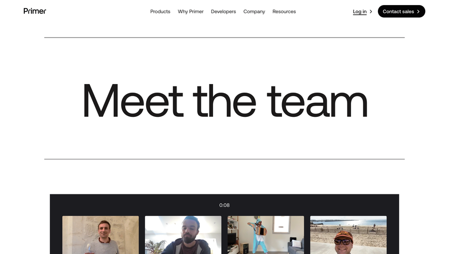
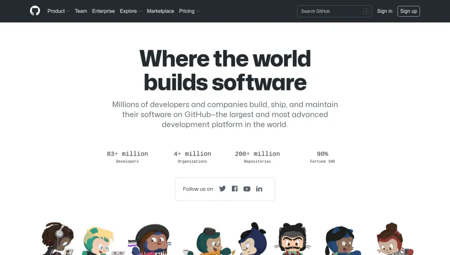

Upgrade to SaaSFrame Pro now to see similar examples.
Monthly
$18 /month
Billed $18 monthly
Browse all screens & flows
Filter and search screens & flows
Search text in screenshots
Access Figma files
Access mobile versions
Join now
Quarterly
$16 /month
Billed $48 quarterly
Browse all screens & flows
Filter and search screens & flows
Search text in screenshots
Access Figma files
Access mobile versions
Join now
Yearly
$15 /month
Billed $180 yearly
Browse all screens & flows
Filter and search screens & flows
Search text in screenshots
Access Figma files
Access mobile versions
Join now