Design with AI
Generate a new design based on this screen using your own content.
# Design from Reference: Tona User Onboarding
Create an original, high-fidelity visual design inspired by the reference. Prioritize composition, typography, colors, spacing, and component styling over technical implementation.
## Reference
- **Product:** Tona
- **Category:** User Onboarding
- **Screenshot:** https://cdn.prod.website-files.com/5e9dc792e1210c5325f7ebbc/6acb6451b206c0d3f8f0639f_6acb629e018523cfee29eda7_cms-433a1f9c082de6b466c714c1.webp
Analyze the screenshot first. If inaccessible, request it rather than guessing.
## Content
{{content.instructions}}
{{content.data}}
Preserve essential messaging and factual accuracy. Adapt structure and copy length for visual balance; never invent product claims.
## Visual Design
### Overall aesthetic
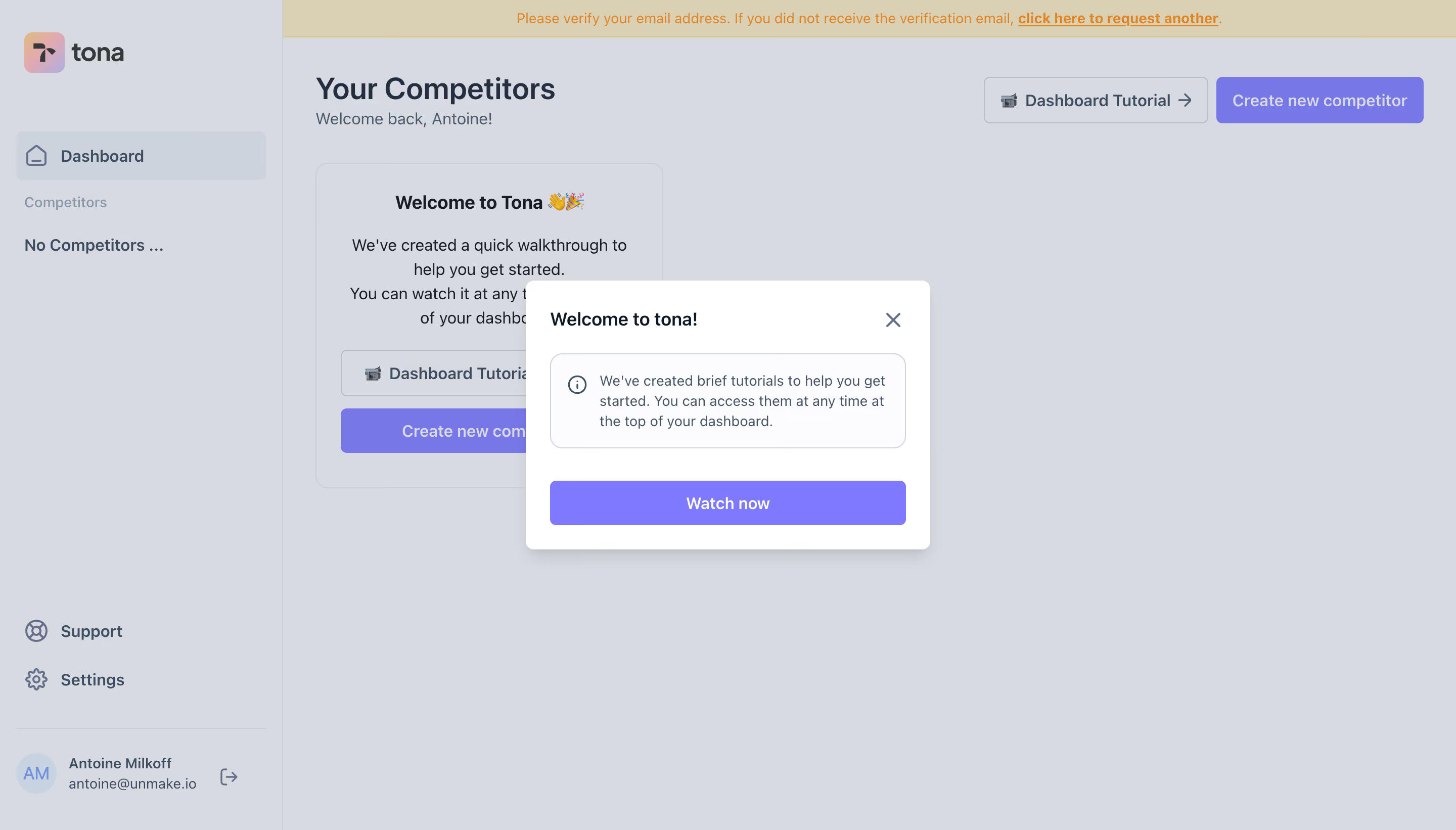
- **Character:** Gentle onboarding welcome modal with lavender actions over a dimmed competitor dashboard.
### Page composition
- **Canvas:** 2880 × 1642 screenshot px; CSS estimates assume 2× capture.
- **Structure:** Centered compact dialog with title/close, outlined informational note and full-width Watch now action; background shows sidebar, empty competitor state and email-verification banner.
### Information hierarchy
- **Priority:** Welcome title introduces tutorial availability; violet video action is the single primary control.
### Typography
- **Family:** Neutral sans serif, exact font unverified.
- **Scale:** Estimated CSS modal title 18 px bold, note/body 14 px and CTA 16 px.
### Colors & surfaces
- **Sampled palette:** Dimmed gray #D7DBE1, white #FFFFFF, banner #DAD0B3, note #FCFCFD, violets #7877E8/#7F79FF and selected background #CDD3DC.
### Components
- **Dialog:** Estimated CSS width 400 px, 8 px corners, 24 px padding and soft shadow.
- **Note:** Rounded fine outline with leading info icon and multiline explanation; close icon upper right.
- **Background:** Wide pale sidebar, prominent create-competitor action and verification notice; scrim lowers all background contrast.
### Visual rhythm
- **Spacing:** Approximately 24–32 CSS px separates heading, note and action; dialog is intentionally short.
### Responsive
- **Observed:** Desktop only.
- **Adaptation:** Fit dialog within 20 px gutters, keep dismissal reachable and avoid obscuring action with mobile keyboard/browser chrome.
### Adaptation guidance
- **Preserve:** One focused tutorial invitation and soft lavender emphasis.
- **Replace:** Use actual tutorial availability and dashboard context.
Use this context to reproduce the reference's visual language: layout, typography, colors, spacing, borders, radii, and distinctive elements. The screenshot takes priority if descriptions conflict.
## Direction
{{preferences.fidelityInstructions}}
## Output
{{output.instructions}}
Deliver a polished, cohesive design with precise alignment, hierarchy, and spacing. Produce the requested visual artifact, not just a description. If unsupported, explain the limitation.