Overall Style and Aesthetic
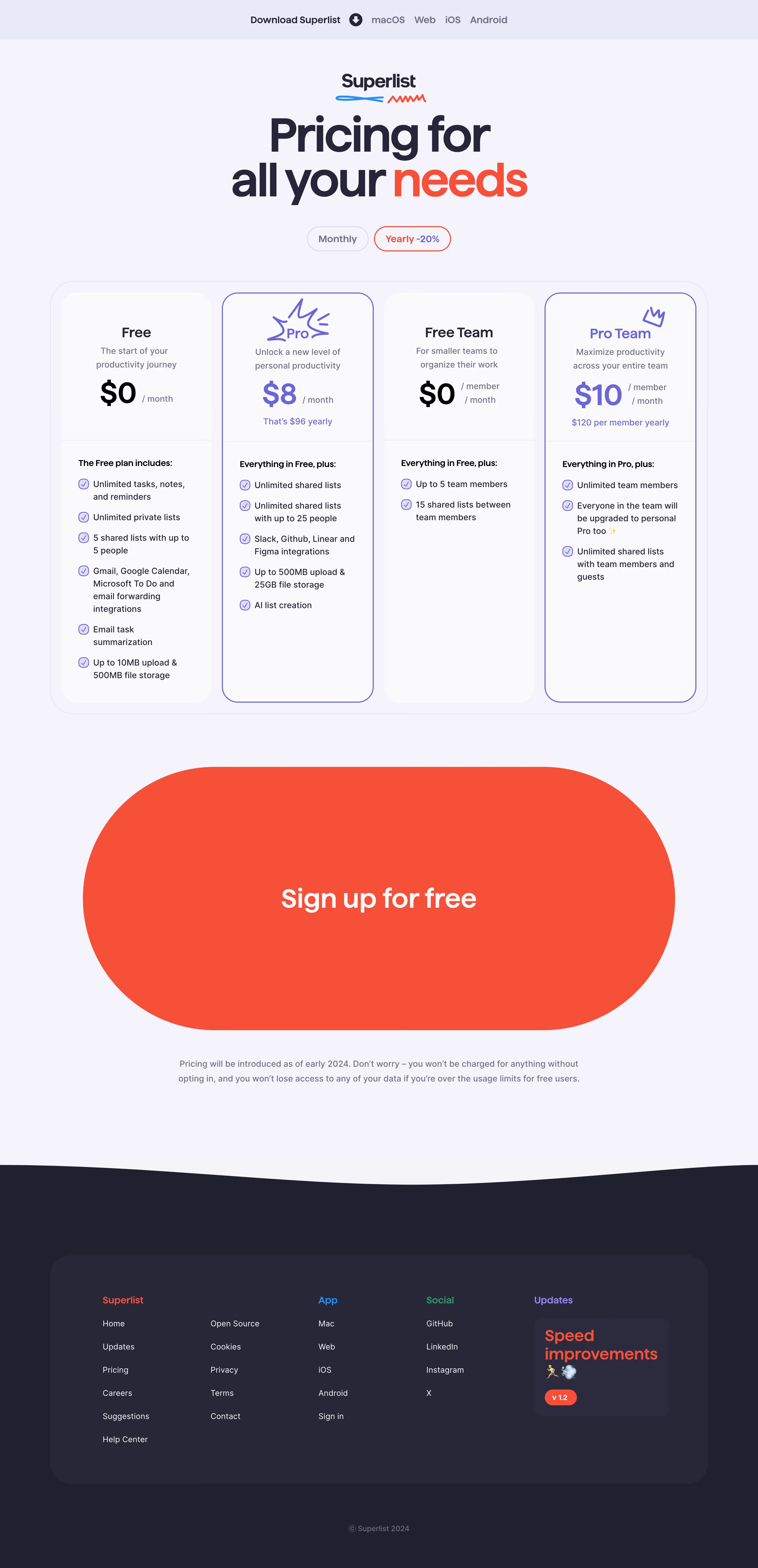
Superlist’s pricing page embodies a sleek, modern minimalism with playful, energetic touches. The interface feels airy and uncluttered, favoring generous white space and softly rounded cards. Subtle gradients and bursts of color inject vibrancy without overwhelming, marrying professionalism with a gently creative edge. The tone feels progressive and user-first, perfect for SaaS branding that values approachability and trust. Layout and Structure
The page follows a logical, user-centric flow: a sticky navigation bar leads into a concise header with a direct headline, swiftly followed by side-by-side pricing cards. Each plan is immediately visible and scannable, helping users compare value propositions at a glance. Below, a dedicated FAQ section eliminates last-minute hesitations, while a crisp, compact footer grounds the experience and gently invites further exploration. Visual Elements
Distinctive custom illustrations skirt each plan, conveying themes—collaboration, productivity—that reinforce the Superlist brand. Delicate, animated flourishes (like subtle plan highlights and interactive toggles) build engagement. Simple, monochrome icons illustrate features list items, blending clarity with charm, and lively micro-animations on CTAs add delightful moments of feedback. Color Palette and Typography
Superlist leverages a balanced color scheme: fresh whites dominate, punched with vibrant greens and purples for accent and calls-to-action. The primary sans-serif typeface is geometric and clean, ensuring perfect legibility. Hierarchy is crystal clear—bold plan names, generous feature spacing, and differentiated button colors steer users seamlessly through the page. User Experience Patterns + Unique Choices
Smart UI patterns abound: sticky headers, collapsible FAQs, and an ever-present “Start for Free” CTA remove friction. Plan pricing toggles (annual/monthly) reflow instantly, aided by snappy, non-distracting animation. The pricing tiers have playful copy and emoji, infusing personality uncommon on SaaS pages. Overall, the site projects energetic innovation, blending clear utility with a splash of joyful creativity—an inspiring template for SaaS design excellence.