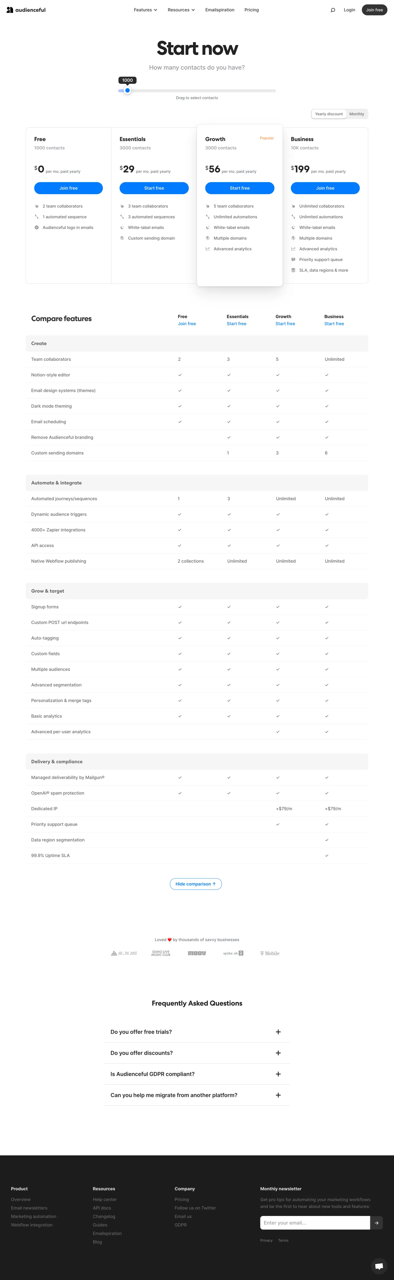
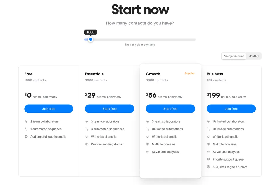
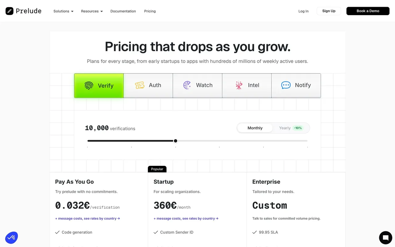
Audienceful’s pricing page showcases a minimalist, modern aesthetic that feels both approachable and professional. The design leans into white space and gentle visual contrasts, allowing each element room to breathe. Playful accents—like rounded buttons and soft shadows—add warmth, while restraint in ornamentation keeps the page focused and uncluttered.
Layout and Structure
The structure is intuitively organized: a simple header flows into a concise hero section that succinctly states the page’s purpose, followed by cleanly segmented pricing plans at the core. Each plan features a clear header, benefits list, and a strong call-to-action, making side-by-side comparison effortless. FAQs and a compact footer round out the page, providing utility without distraction.
Visual Elements
Subtle, friendly illustrations replace stock photography, reinforcing the brand’s accessible vibe. Minimal icons help clarify feature lists, and hover animations on call-to-action buttons inject gentle interactivity. There’s a distinct lack of visual noise, elevating clarity and conversion focus.
Color Palette and Typography
The palette relies on crisp whites and soft grays, punctuated by a vibrant, signature blue for CTAs and highlights. A single, geometric sans-serif font is used throughout, supporting a coherent hierarchy: bold headlines, straightforward subheaders, and highly readable body text.
User Experience Patterns
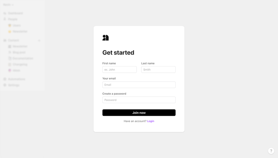
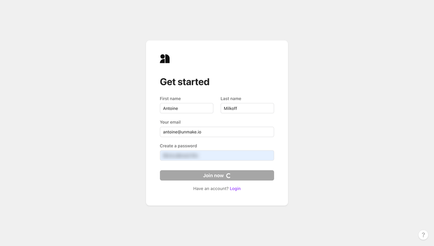
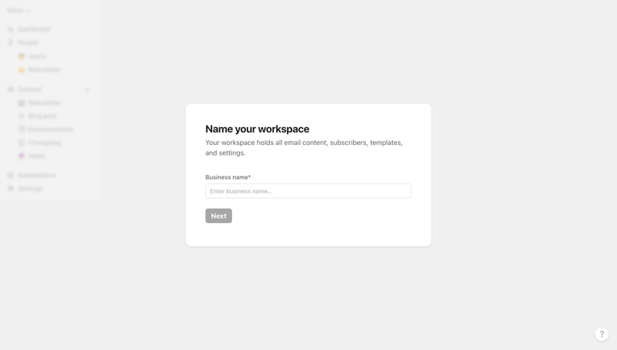
Navigation is straightforward—a sticky nav bar ensures users can jump quickly to other sections. Prominent CTAs repeat after each key section for frictionless conversion. Forms are streamlined and minimal. Responsive design and smooth scroll behavior make for a seamless experience across devices.
Unique or Notable Design Choices
A standout detail is the transparent, jargon-free feature descriptions in the pricing boxes, reducing cognitive load. The overall tone is trustworthy and innovative, with micro-interactions and clean visuals fostering confidence and a sense of ease, perfect for inspiring SaaS design.
 SaaSFrame