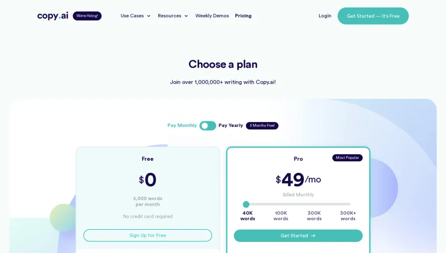
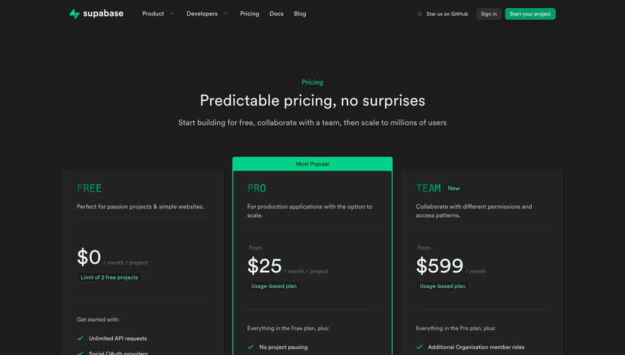
Overall Style and Aesthetic
Supernotes’ pricing page exudes a crisp, modern minimalism with a distinctly professional yet welcoming vibe. The visual environment is clean and airy, with generous whitespace and a refined simplicity that draws attention to key elements without clutter or distraction. Everything on the page feels intentional, supporting both clarity and ease of use. Layout and Structure
The structure is logical and user-focused. The page opens immediately with clear pricing plan cards, allowing users to compare options without excessive scrolling or searching. Supporting details, such as what’s included in each plan, are succinctly highlighted beneath. Additional FAQ and support sections reinforce transparency and trust near the page’s end, capped by a succinct footer containing essential links. Visual Elements
Illustrative icons, subtle animations, and soft drop shadows add warmth and dimension to the otherwise streamlined design. No stock photography or unnecessary illustrations are used, keeping the focus squarely on the content and product value. The icons are custom, playful, and visually consistent, contributing to both wayfinding and delight. Color Palette and Typography
Soft greens, calming neutrals, and accent blues build an approachable yet polished palette. Bold type—modern sans-serif fonts—lead the eye through a clear hierarchy, with plan names, prices, and CTAs distinct and instantly legible. User Experience Patterns
Navigation remains visible and non-intrusive via a sticky, simplified header. Primary CTAs (“Sign up,” “Start for free”) stand out with color contrast and placement, encouraging engagement. Responsive behaviors ensure effortless browsing on desktop or mobile, and comprehensive tooltips provide accessible plan details without overcrowding the layout. Unique or Notable Design Choices
Notable is the page’s non-traditional pricing card arrangement: vibrant yet understated, using light backdrops and floating shadows that hint at depth. The absence of “bestseller” ribbons or hard-sell tactics gives a trustworthy, user-centric tone, making it feel credible and refreshing—ideal for users seeking honesty and clarity.