





1. Header The top section of the page is dedicated to a header which includes the Station logo on the left and navigation bars on the right. The header bar features five clickable icons for Workspaces, Apps, System Preferences, Settings, and Support. 2. Hero Section The hero section contains a large image that highlights the features of the Station application along with the headline "The One Place for All Your Work." There is also a CTA button that prompts users to download the app. 3. Features Section This section outlines some of the key features of Station, including the ability to switch between multiple workspaces, search all applications from a centralized location, organize apps and tasks with filters and pinned items, and easy to access browser tabs. 4. Supported Apps Section Here, users can see a comprehensive list of all the apps that Station currently supports. They can also suggest apps that they would like to see integrated into the platform. 5. Pricing Section This section provides details on the pricing plans offered by Station. Users can choose from the free plan, solo plan, or team plan. 6. Testimonials Section This section features customer reviews and feedback about Station. Customers praise the ease of use, integration with various apps, and time-saving benefits. 7. FAQ The FAQ section provides answers to common questions about Station, including information about data security and privacy, supported operating systems, and plan details. 8. Footer The page ends with a footer that includes links to Station's social media accounts, contact information, and legal details.

Thank you! Your submission has been received!
Oops! Something went wrong while submitting the form.
Get SaaSFrame Pro
Monthly
$18
Quarterly
$48
Yearly
$180
Upgrade to access this feature
Browse all screens & flows
Filter and search screens & flows
Access Figma files
Access mobile versions
Bookmark screens & flows
Join now
Station Features Page

Station
One app to rule them all
Designed by
No items found.

Bookmark
Bookmark
Design with AI
Thank you! Your submission has been received!
Oops! Something went wrong while submitting the form.
# Design from Reference: Station Features Page
Create an original, high-fidelity visual design inspired by the reference. Prioritize composition, typography, colors, spacing, and component styling over technical implementation.
## Reference
- **Product:** Station
- **Category:** Features Page
- **Screenshot:** https://cdn.prod.website-files.com/5e9dc792e1210c5325f7ebbc/62eca42df0eb3d34797f8c91_1659674563065-62ec9c93c09ba3525a0c03ce_screenshot-device-64d29cb78bf6f39d28b6b7f89bbe8ec2-1659606759229.webp
Analyze the screenshot first. If inaccessible, request it rather than guessing.
## Content
{{content.instructions}}
{{content.data}}
Preserve essential messaging and factual accuracy. Adapt structure and copy length for visual balance; never invent product claims.
## Visual Design
### Overall aesthetic
- **Character:** A friendly feature catalog uses a cyan-to-deep-blue gradient header/footer, pale icy backgrounds, rounded white cards and simplified product illustrations.
- **Evidence:** The screenshot measures 1440 × 3203 pixels. All three portions were inspected; CSS dimensions assume an unverified 1× capture density.
### Page composition
- **Hero:** A white wordmark and compact navigation sit over a gradient band, with centered Features Overview heading and subtitle. A shallow curved lower edge leads into the catalog.
- **Catalog introduction:** A centered section heading, short cyan underline and five category pills precede the grid.
- **Feature grid:** Ten cards form three columns, with a single left-aligned final card. Each has a product illustration above title, short paragraph and category badge.
- **Closing action/footer:** A centered blue Download now pill precedes a gradient footer with three link groups, a download block, platform icons and small brand/social marks.
### Information hierarchy
- **Catalog focus:** The section title establishes browsing; color-coded category filters provide the next level.
- **Card sequence:** Illustration, bold feature title, muted explanation and small category tag repeat consistently.
- **Highlights:** Two diagonal yellow Popular ribbons emphasize selected cards; blue download actions supply the conversion path.
### Typography
- **Headings:** Hero title is approximately 42 pixels regular-to-medium; the catalog heading is about 34 pixels.
- **Card roles:** Titles are around 16–18 pixels bold; descriptions are approximately 14–15 pixels with 21-pixel leading.
- **Navigation/badges:** Header and footer links are around 16 pixels bold; category badges are roughly 11–13 pixels.
- **Family:** A condensed-looking sans-serif appears in much of the card and navigation text, but exact identity is unverified.
### Colors & surfaces
- **Measured surfaces:** ICC-to-sRGB sampling identifies #FFFFFF, #F6FCFF, #F8FCFF and #FCFEFF as dominant white/icy surfaces.
- **Gradient:** Cyan at the top transitions through medium blue into saturated deep blue near the bottom of hero/footer bands.
- **Category semantics:** Blue marks the selected All filter; lavender, mint, cyan and coral outlines identify four feature categories.
- **Elevation:** Rounded white cards use soft pale-blue shadows rather than strong outlines; artwork is intentionally faded around peripheral UI details.
### Components
- **Category pills:** Small fully rounded outlined controls are roughly 32 pixels tall, with text-dependent widths and generous horizontal gaps.
- **Feature cards:** Approximately 367 pixels wide, with about 30-pixel text padding and 16–18-pixel corner radii. Heights vary with paragraph length.
- **Artwork:** Cropped interface diagrams occupy roughly the upper 220 pixels, showing app rails, menus and related controls.
- **Badges/ribbons:** Tiny outlined category pills sit under descriptions; yellow corner ribbons cross the upper left of popular cards.
- **Download controls:** Rounded blue action near the catalog bottom is about 210 × 54 pixels; footer download uses white fill with blue text.
### Visual rhythm
- **Grid cadence:** Three equal columns have roughly 50-pixel gutters and similar vertical gaps; all card text starts at a consistent inset.
- **Whitespace:** Broad intervals separate hero, section heading, filters and cards, contrasting with compact card content.
- **Footer organization:** Link groups align on a common top baseline, with a vertical divider before the download block.
### Responsive
- **Observed scope:** One desktop All-filter state is shown; filtering results, hover and download behavior are not visible.
- **Recommended grid:** Use two columns at intermediate widths and one on phones, keeping the final row naturally left aligned.
- **Recommended controls:** Wrap category pills, collapse header links and stack footer groups while retaining a clear download target.
### Adaptation guidance
- **Catalog pattern:** Use consistent image/title/explanation/category cards and color-coded filters to organize a feature library.
- **Visual restraint:** Keep product diagrams legible at their intended size; do not reconstruct functional states from decorative faded UI.
- **Implementation:** Verify fonts and density, expose filter selection semantically and add keyboard focus to filters, cards and download links.
Use this context to reproduce the reference's visual language: layout, typography, colors, spacing, borders, radii, and distinctive elements. The screenshot takes priority if descriptions conflict.
## Direction
{{preferences.fidelityInstructions}}
## Output
{{output.instructions}}
Deliver a polished, cohesive design with precise alignment, hierarchy, and spacing. Produce the requested visual artifact, not just a description. If unsupported, explain the limitation.
Category
Patterns
No items found.
Tech Stack
Added on
June 10, 2020
Similar screens
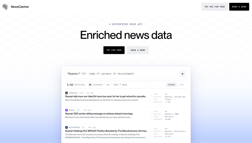


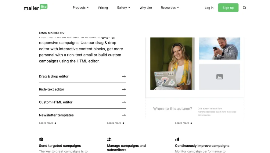

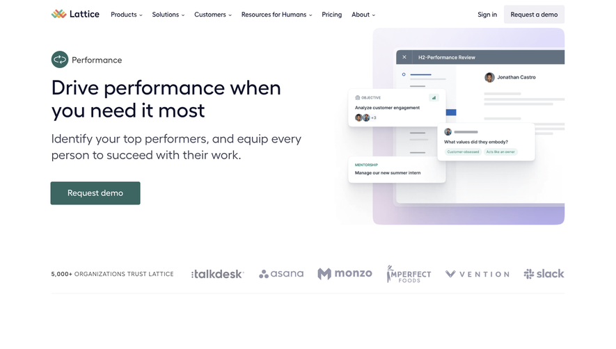

Upgrade to SaaSFrame Pro now to see similar examples.
Monthly
$18 /month
Billed $18 monthly
Browse all screens & flows
Filter and search screens & flows
Search text in screenshots
Access Figma files
Access mobile versions
Join now
Quarterly
$16 /month
Billed $48 quarterly
Browse all screens & flows
Filter and search screens & flows
Search text in screenshots
Access Figma files
Access mobile versions
Join now
Yearly
$15 /month
Billed $180 yearly
Browse all screens & flows
Filter and search screens & flows
Search text in screenshots
Access Figma files
Access mobile versions
Join now