Prompt 1,631 words Copy
# Design from Reference: MailerLite Features Page

Create an original, high-fidelity visual design inspired by the reference. Prioritize composition, typography, colors, spacing, and component styling over technical implementation.

## Reference

- **Product:** MailerLite
- **Category:** Features Page
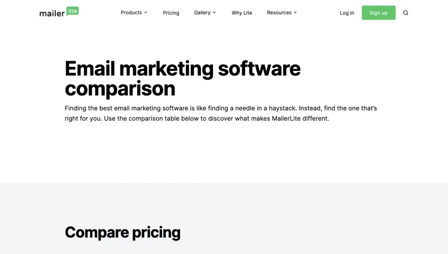
- **Screenshot:** attached to this message (also available at https://media.saasframe.io/o/dbcc0d7ee19d94eb426b.webp)
- **Source:** https://www.mailerlite.com/features

Analyze the attached screenshot first. If no image is attached, open the screenshot link; if neither is accessible, ask for it rather than guessing.

## Visual Design Context

### Overall aesthetic

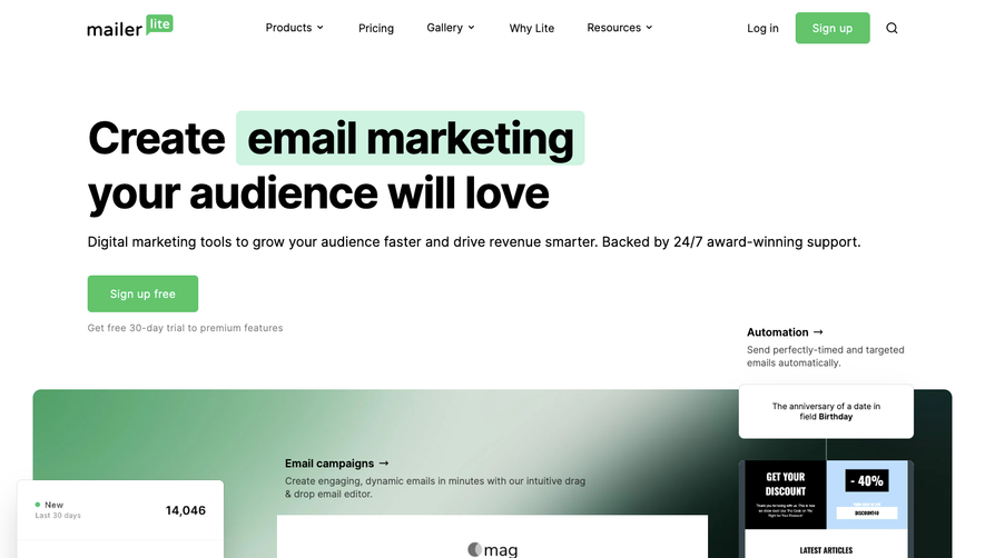
- **Style:** Spacious email-marketing product page built from bold black headings, open white layouts, green conversion actions, and large product illustrations.
- **Character:** Direct editorial typography, simple ruled feature links, pale neutral demo surfaces, and a mint pricing band.
- **Capture condition:** The screenshot contains abrupt horizontal joins, duplicated feature/pricing/footer material, clipped text, and a large blank tail. These are observed capture artifacts, not reliable design instructions.

### Page composition

- **Capture and scale:** 1440 × 10548 image px. CSS estimates assume approximately 1× capture; scale is unverified.
- **Header:** Brand at left, product/pricing/gallery/company/resource navigation across the middle, login, green signup button, and search at right.
- **Content width:** Broad centered outer container around 1180px; feature text typically begins near x=208px and uses approximately 460px columns.
- **Opening region:** Starts mid-feature beneath an Email marketing label, with editor text/link rows left and an email-editor illustration right; the beginning is visibly clipped.
- **Feature overview:** Three icon-led columns summarize targeting, subscriber management, and improvement, each with muted copy and a small learn-more link.
- **Detailed sections:** Campaign creation, monetization, automation workflows, subscriber management, and campaign analysis use alternating two-column arrangements or full-width headings.
- **Product visuals:** Newsletter editor with photos, commerce product block, branching automation diagram, promotional signup form, and a broad analytics dashboard.
- **Pricing:** Mint band with centered heading and explanatory paragraph above four white plan columns; an earlier partial copy of the pricing table also appears at a capture join.
- **Feature directory:** Broad heading and short introduction followed by grouped link rows with a left category label and two descriptive link columns.
- **Footer:** Pale-gray section with three navigation groups and a newsletter form/social block at right; a duplicated partial footer precedes the fuller instance.

### Information hierarchy

- **Section titles:** Large heavy headlines identify benefit areas before explanatory paragraphs.
- **Feature links:** Dark medium-weight labels with right arrows and strong bottom rules provide the recurring navigation pattern.
- **Illustrative evidence:** Large product mockups explain editing, automation, capture, and reporting functions alongside the copy.
- **Pricing decisions:** Plan names, large price figures, green signup/trial buttons, then compact limits and support details.
- **Directory hierarchy:** Bold task-group headings distinguish categories; individual feature titles precede shorter muted descriptions.
- **Closing conversion:** Newsletter title and email field form a quieter secondary action in the footer.
- **Content uncertainty:** Missing text at seams is not reconstructed; repeated content is not assumed to be intentional page hierarchy.

### Typography

- **Family:** Proportional sans serif with compact heavy headings and neutral body lettering; exact family is unverified.
- **Section headlines:** Approximately 48px bold with 58–60px line-height and slightly tight tracking, often wrapping over two lines.
- **Main body:** Approximately 20–22px with 32px line-height.
- **Feature links:** Approximately 18px medium or semibold; right arrows align at the far end of each row.
- **Overview blocks:** Around 18px bold titles and 16px gray body copy with 26px line-height.
- **Pricing:** Plan labels around 20px, prices around 36–40px bold, and limits/support details around 14px.
- **Footer:** Small uppercase gray group labels around 12px, links around 14px, and newsletter heading around 24px bold.
- **Precision:** All sizes, weights, line-height, and tracking are visual reconstruction estimates rather than extracted CSS.

### Colors & surfaces

- **Canvas and cards:** Sampled #FFFFFF.
- **Primary text and ruled links:** Sampled #000000.
- **Neutral illustration/footer surround:** Sampled #F3F5F7.
- **Pricing-band mint:** Sampled #CFF4E3.
- **Green action accent:** Sampled #64C46B.
- **Soft demo accents:** Sampled #FEF8E6 in the signup-form illustration and #E5F9EE in pale green areas.
- **Fine UI boundaries:** Sampled #E6E8EC in product mockup dividers; #F7F6F9 supplies another subtle neutral fill.
- **Image palette:** Photography and small chart/workflow accents provide local color, while the main page remains black, white, and green.
- **Sampling:** Hex values are measured flat screenshot colors after available profile handling; photos, antialiasing, and shadows introduce many additional shades.

### Components

- **Header signup:** Green rounded rectangle approximately 108 × 46px with white label and modest 4–5px radius.
- **Feature-link stacks:** Approximately 460px-wide rows at about 68px pitch, dark text and arrow, with 2px black dividing rules.
- **Overview items:** Small solid black icons above bold titles, gray descriptions, and compact downward learn-more links.
- **Editor illustration:** Light outlined content canvas with photographic blocks, circular gray editing controls, and dashed boundaries.
- **Commerce demo:** Product photo beside title, price, struck-through old price, and a pale blue action inside an outlined editor block.
- **Workflow demo:** Thin connecting lines branch from a trigger to two paths; green/red condition badges and small plus nodes mark the flow.
- **Signup illustration:** Rounded pale-yellow panel with photo strip left, centered offer heading, two white fields, black action, and a small close symbol.
- **Analytics illustration:** Large rounded gray surround with a white dashboard; upper metric cells, green and gray area lines, horizontal grid rules, and dark tooltip labels.
- **Plan grid:** Four adjoining white columns with vertical dividers, approximately 40px padding and compact feature summaries. Green filled actions contrast with the enterprise outlined action.
- **Directory rows:** Thin black section dividers, bold category labels, and two parallel feature-description columns.
- **Newsletter form:** White outlined email field with an inset green Subscribe button, muted privacy line, and a row of gray social icons.
- **State limits:** Demo controls and chart tooltips are part of static illustrations; live interaction, hover behavior, and form submission are not demonstrated.

### Visual rhythm

- **Section spacing:** Very broad white gaps separate benefit narratives, typically hundreds of pixels, although capture seams make exact page-wide intervals unreliable.
- **Two-column rhythm:** Text and illustration alternate sides, maintaining a stable reading width and balanced horizontal mass.
- **Link rhythm:** Repeated arrow rows create compact scanning zones beneath longer paragraphs.
- **Dashboard emphasis:** The broad analytics image interrupts the repeated half-width imagery before the mint pricing transition.
- **Directory rhythm:** Large category gaps and black dividers organize sparse descriptive link grids.
- **Artifact handling:** Abrupt overlaps, duplicated blocks, clipped headings, and blank final space should not be reproduced as intentional spacing.

### Responsive

- **Observed state:** Desktop capture only; mobile layouts and interactions are unverified.
- **Feature recommendation:** Stack text and matching illustration with consistent reading order; reduce large headings toward 32–36px.
- **Navigation recommendation:** Collapse header links while retaining login and a clear signup action.
- **Pricing recommendation:** Stack plans or use a deliberate comparison layout rather than squeezing four columns.
- **Directory recommendation:** Place category headings above their feature links and descriptions.
- **Footer recommendation:** Stack navigation groups and keep the email field/button usable with generous touch targets.
- **Illustration recommendation:** Scale mockups as images or simplified demos, without reducing real body copy below comfortable reading size.

### Adaptation guidance

- **Preserve:** Bold benefit headings, green actions, alternating text/product visuals, ruled feature links, and a distinct mint pricing region.
- **Starting geometry:** Approximately 1180px outer content width, 460px text columns, 48px headlines, 20px body copy, and 68px feature-link pitch under the unverified 1× assumption.
- **Capture cleanup:** Reconstruct a coherent nonduplicated sequence from confirmed supplied content; do not preserve screenshot joins or invent missing hero material.
- **Content fidelity:** Use actual supplied feature descriptions and plan conditions; historical screenshot prices and demo metrics are not verified current commercial claims.
- **Illustration adaptation:** Match each product visual to the adjacent capability, keeping placeholder/demo controls separate from real page actions.
- **Conversion hierarchy:** Reserve solid green buttons for signup/trial and keep informational feature links visually lighter.
- **Implementation recommendation:** Provide accessible navigation, labeled newsletter input, visible focus, and responsive image alternatives; static pixels do not establish these behaviors.

## Content

**Instructions:**

Generate realistic example content that fits the selected design reference.

Create appropriate headlines, descriptions, labels, buttons, and supporting copy based on the type of interface being designed.

If a product or business description is provided, use it to guide the content.

Otherwise, invent a plausible fictional SaaS product appropriate for the reference.

Keep the content concise, coherent, and visually balanced.

Do not present fictional statistics, customer names, or testimonials as verified facts.

## Design Direction

**Instructions:**

Use the reference screenshot as the main source of visual inspiration rather than a strict layout template.

Preserve its most distinctive design characteristics, such as typography, visual rhythm, color relationships, component treatments, and overall aesthetic.

Feel free to modify section arrangements, proportions, spacing, and individual components to better suit my content.

Introduce original design decisions where they improve usability, composition, or brand consistency.

The result should clearly reflect the reference's visual language without looking like a direct reproduction.

Follow the visual identity of the reference design.

Use its typography, color palette, component styling, and overall aesthetic as the primary design direction.

Do not introduce an unrelated visual identity.

## Output

**Instructions:**

Generate a high-fidelity visual mockup of the requested interface.

Present the design as a polished, realistic website or product UI screenshot.

Prioritize visual composition, typography, spacing, colors, alignment, and component details.

Use the available image-generation or visual-design capabilities.

Do not replace the mockup with source code, a written design specification, or a textual description.

If direct visual generation is unavailable, clearly explain the limitation.

## Constraints

- Use the actual screenshot as the primary visual reference.
- Preserve essential messaging and factual accuracy.
- Prioritize visual quality and consistency.
- Do not invent unsupported product claims.
- Adapt structure and copy length for visual balance.
Reference image Attach it to your message: assistants can’t open image links. Open in ChatGPT ↗ Open in Claude ↗
Build it in Lovable ↗ v0 ↗ Figma Make ↗
Opening a tool copies the screenshot so you can paste it with your prompt.
 SaaSFrame