Generate a new design based on this screen using your own content.
Thank you! Your submission has been received!
Oops! Something went wrong while submitting the form.
# Design from Reference: Spendesk Thank You Page
Create an original, high-fidelity visual design inspired by the reference. Prioritize composition, typography, colors, spacing, and component styling over technical implementation.
## Reference
- **Product:** Spendesk
- **Category:** Thank You Page
- **Screenshot:** https://cdn.prod.website-files.com/5e9dc792e1210c5325f7ebbc/6acad848b3daa04f542762dd_6acad7cb5a5fdf4c3031977f_cms-ce561c1f31fe2fc24d7235e3.webp
Analyze the screenshot first. If inaccessible, request it rather than guessing.
## Content
{{content.instructions}}
{{content.data}}
Preserve essential messaging and factual accuracy. Adapt structure and copy length for visual balance; never invent product claims.
## Visual Design
Use this context to reproduce the reference's visual language: layout, typography, colors, spacing, borders, radii, and distinctive elements. The screenshot takes priority if descriptions conflict.
## Direction
{{preferences.fidelityInstructions}}
## Output
{{output.instructions}}
Deliver a polished, cohesive design with precise alignment, hierarchy, and spacing. Produce the requested visual artifact, not just a description. If unsupported, explain the limitation.
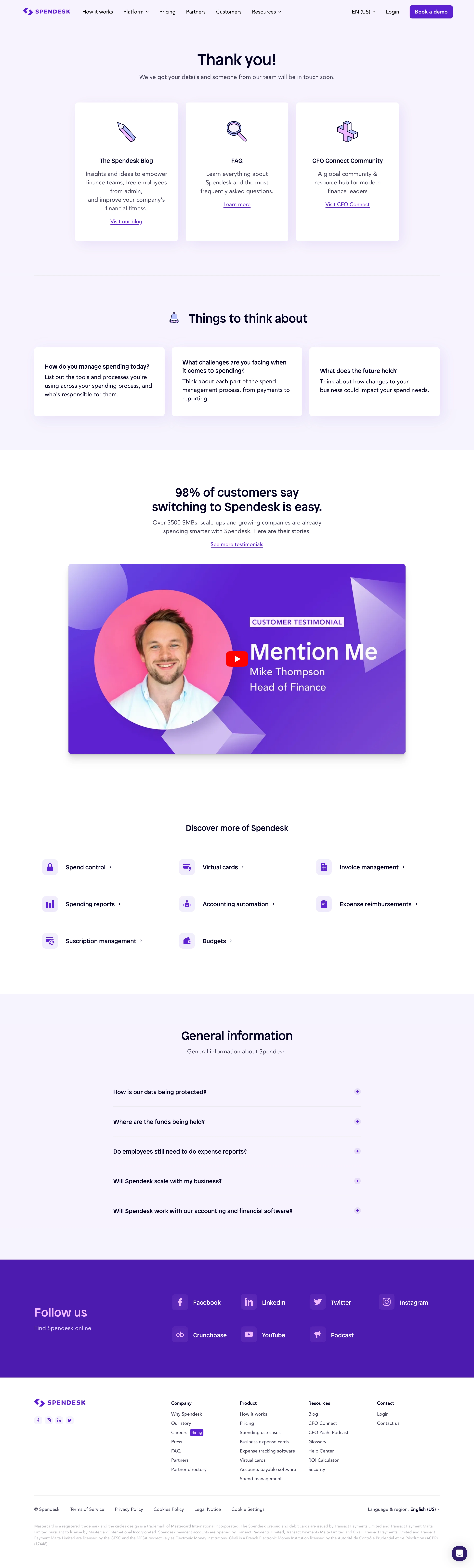
Spendesk's thank-you page embraces a distinctly minimalist and modern aesthetic, projecting clarity and professionalism without feeling sterile. The interface feels fresh, leveraging open space and understated elements to foster an immediate sense of trust and accomplishment for users at the pivotal post-signup moment.
Layout and Structure
The page structure is streamlined: a prominent hero section communicates gratitude and next steps, while supportive messaging below reinforces the user's journey. The hierarchy guides attention from the bold confirmation message, through subtle guidance text, down to helpful resources like blog entries or customer stories—without overwhelming or distracting from the primary purpose.
Visual Elements
Custom vector illustrations anchor the visual experience, integrating playful but polished graphics that echo Spendesk’s brand personality. Animations are gentle and purposeful—think subtle transitions and micro-interactions that add delight while reinforcing clarity. Icons are clean and consistent, aiding quick comprehension and reinforcing actions.
Color Palette and Typography
A refined color palette balances deep navy blues with vibrant accents of teal and yellow, making CTAs and key points instantly visible. Typographically, the site chooses a geometric sans-serif for headlines and a softer typeface for body text, establishing clear hierarchy and legibility throughout.
User Experience Patterns
Intuitive navigation and a clear ‘what’s next’ CTA demonstrate Spendesk's understanding of user flow, reducing uncertainty and keeping engagement high. The content is digestible and visually segmented, keeping the user oriented—no unnecessary friction or clutter.
Unique or Notable Design Choices
Spendesk stands out with its combination of playful illustrations and a mature, business-forward tone, making the experience both approachable and authoritative. The page exudes warmth and reliability—qualities that are crucial in fintech SaaS platforms—while delighting users with confident, visually compelling touches.