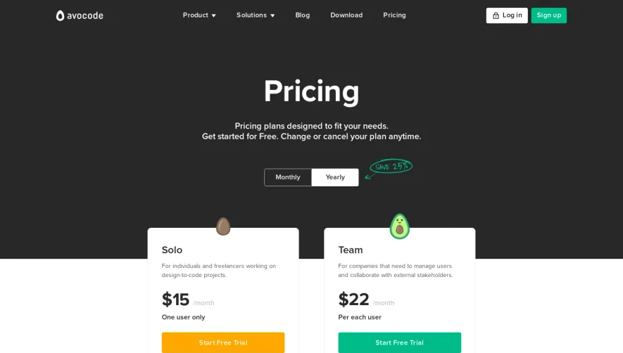
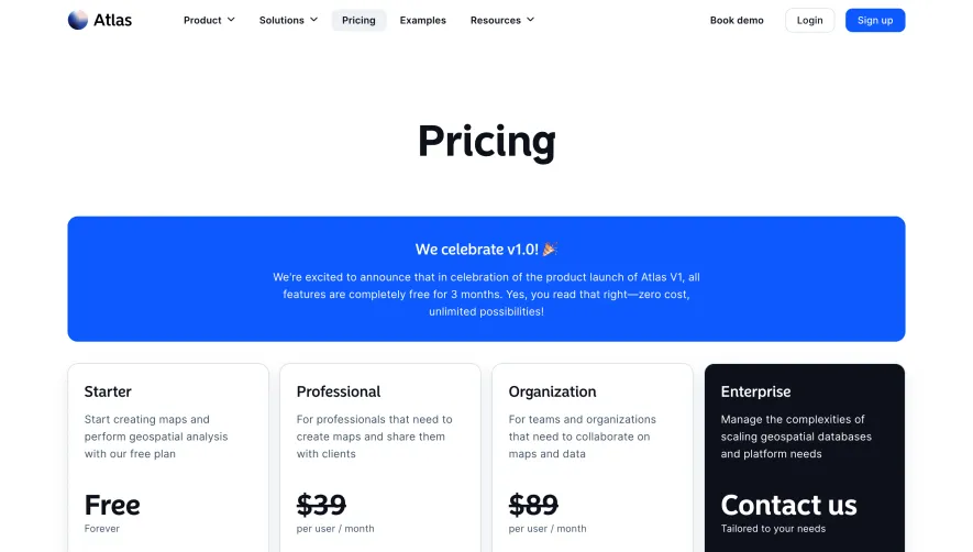
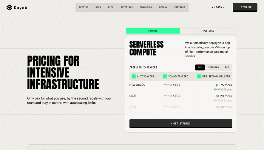
Generate a new design based on this screen using your own content.
Thank you! Your submission has been received!
Oops! Something went wrong while submitting the form.
# Design from Reference: Speakeasy Pricing Page
Create an original, high-fidelity visual design inspired by the reference. Prioritize composition, typography, colors, spacing, and component styling over technical implementation.
## Reference
- **Product:** Speakeasy
- **Category:** Pricing Page
- **Screenshot:** https://cdn.prod.website-files.com/5e9dc792e1210c5325f7ebbc/6acad410c910b3adf9e48da5_6acad1add05a3f53c0a5b8a1_cms-fb0b090181836f199d0a3bf0.webp
Analyze the screenshot first. If inaccessible, request it rather than guessing.
## Content
{{content.instructions}}
{{content.data}}
Preserve essential messaging and factual accuracy. Adapt structure and copy length for visual balance; never invent product claims.
## Visual Design
Use this context to reproduce the reference's visual language: layout, typography, colors, spacing, borders, radii, and distinctive elements. The screenshot takes priority if descriptions conflict.
## Direction
{{preferences.fidelityInstructions}}
## Output
{{output.instructions}}
Deliver a polished, cohesive design with precise alignment, hierarchy, and spacing. Produce the requested visual artifact, not just a description. If unsupported, explain the limitation.
``` Speakeasy’s pricing page embodies a sleek, contemporary aesthetic with a minimalist approach that feels both sophisticated and approachable. A balance of whitespace and structured content creates a light, unburdened atmosphere, instilling confidence while inviting exploration. The presentation exudes professionalism, yet it’s subtly playful, with animated microinteractions hinting at technical innovation. ```html
Layout and Structure
``` The page opens with a concise hero section, directly introducing the pricing context and core messaging. Pricing tiers are organized into clear, card-style sections, effortlessly scannable and visually separated for comparison. Each plan highlights primary features and a clear CTA, while an FAQ accordian and relevant resource links follow below. The well-defined footer wraps up the journey with a summary of essential links and compliance information. ```html
Visual Elements
``` Purposeful icons and crisp vector illustrations accompany plan features, adding vibrant accents without overwhelming the senses. Animations provide responsive feedback as users interact with cards and hover over buttons, contributing to a sense of interactivity. The absence of heavy photography keeps the focus sharply on product value. ```html
Color Palette and Typography
``` A modern palette of blues and purples dominates, punctuated by strategic use of highlight colors for CTAs and tier distinctions. Typography leans on a geometric sans-serif, applying bold weights for headlines and lighter styles for supporting text. Ample font sizing and spacing foster clear content hierarchy and readability. ```html
User Experience Patterns
``` Navigation is sticky and persistently visible, making plan switching seamless. CTAs are prominent yet unintrusive, with non-intrusive support links for assistance. Integrated forms and toggles allow easy plan comparison and engagement without disruptive modals. The scroll flow is intuitive, encouraging exploration and reducing cognitive friction. ```html
Unique & Notable Design Choices
``` Noteworthy: the toggle for monthly/annual pricing animates smoothly, offering instant plan recalculations. Microcopy within plan cards clarifies usage limits and add-ons. Every interaction is tuned for clarity, while subtle animations augment rather than distract. Overall, the tone lands on trustworthy and forward-thinking—perfect for SaaS inspiration.