
Thank you! Your submission has been received!
Oops! Something went wrong while submitting the form.
Get SaaSFrame Pro
Monthly
$18
Quarterly
$48
Yearly
$180
Upgrade to access this feature
Browse all screens & flows
Filter and search screens & flows
Access Figma files
Access mobile versions
Bookmark screens & flows
Join now

Span Customer Stories

Span
AI-native engineering automations
Designed by


Bookmark
Bookmark

Design with AI
Thank you! Your submission has been received!
Oops! Something went wrong while submitting the form.
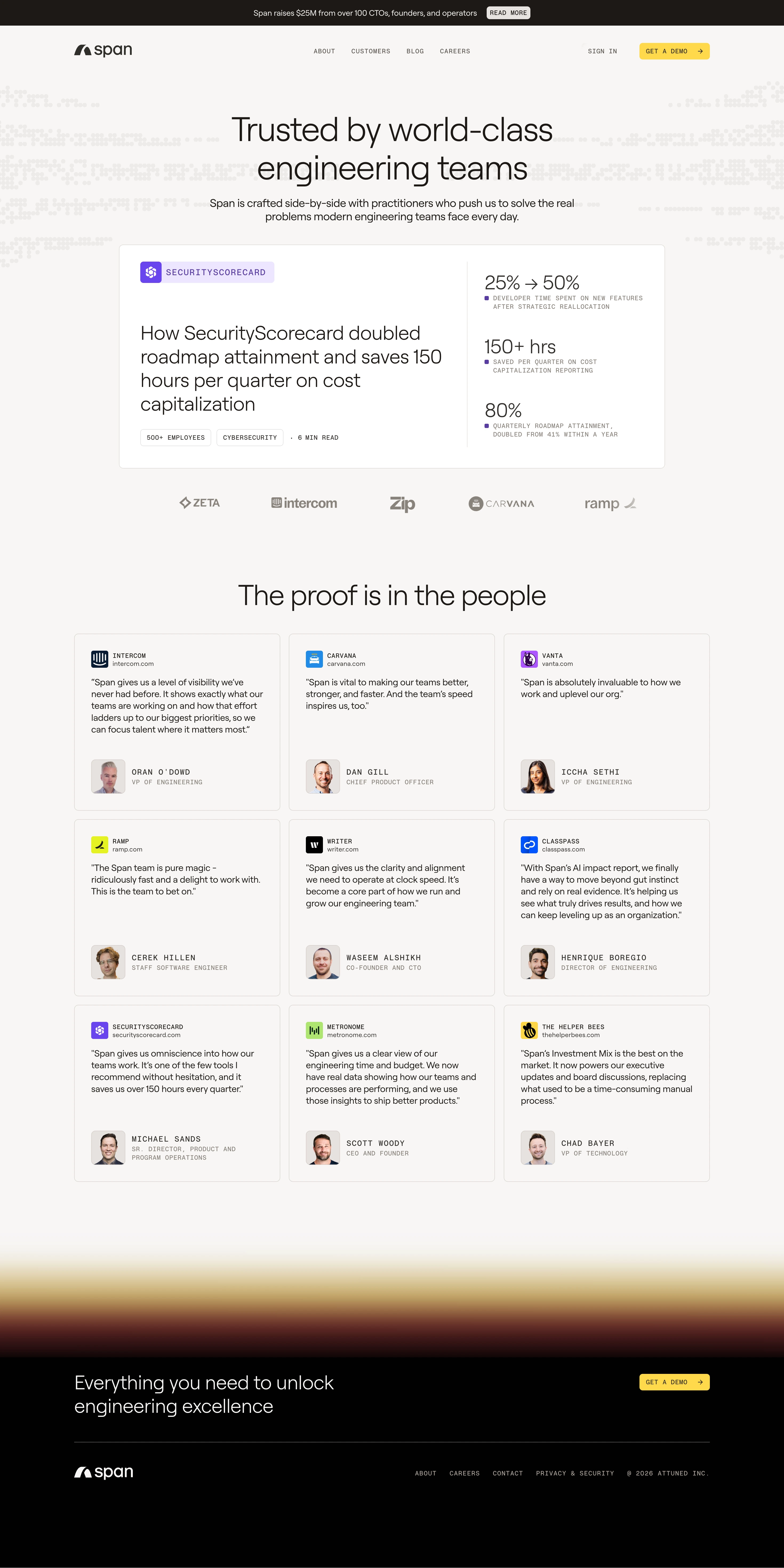
# Design from Reference: Span Customer Stories
Create an original, high-fidelity visual design inspired by the reference. Prioritize composition, typography, colors, spacing, and component styling over technical implementation.
## Reference
- **Product:** Span
- **Category:** Customer Stories
- **Screenshot:** https://cdn.prod.website-files.com/5e9dc792e1210c5325f7ebbc/6acad39cc2028efdec71aeb4_6acad14150cf4647822be45f_cms-a8742472f7022dc9bc355584.webp
Analyze the screenshot first. If inaccessible, request it rather than guessing.
## Content
{{content.instructions}}
{{content.data}}
Preserve essential messaging and factual accuracy. Adapt structure and copy length for visual balance; never invent product claims.
## Visual Design
### Overall aesthetic
- **Character:** A warm minimal customer-proof page uses light oversized sans-serif headings, small monospaced metadata, outlined testimonial cards, and yellow demo actions.
- **Evidence:** The source is 2940 × 5880 px, inspected across two readable crops at 1400 px width. Dimensions below use inspection pixels; actual CSS scale is unverified.
- **Identity:** Pale dotted wave patterns and a warm blurred footer transition add subtle atmosphere.
### Page composition
- **Announcement/header:** A dark promotional strip sits above a white/off-white header with logo, centered links, sign-in, and yellow demo action.
- **Hero:** A centered two-line heading and short description appear over faint dotted patterns entering from both sides.
- **Featured story:** A large white outlined panel pairs customer badge/title/tags left with three metrics right, separated by a vertical rule.
- **Logo row:** Five muted customer marks appear beneath the feature.
- **Testimonials:** A large centered heading precedes nine cards in a three-by-three grid.
- **Close:** A pale-gold-to-dark-red blurred band transitions into a black footer with white conversion copy, yellow demo action, divider, logo, links, and copyright.
### Information hierarchy
- **Hero:** Large light text introduces customer trust without heavy emphasis.
- **Featured case:** A colored customer badge and large story title dominate the left; large figures and small uppercase explanations dominate the right.
- **Proof cards:** Brand/icon and domain precede quote text; portrait/name/role anchor the bottom.
- **Conversion:** Yellow actions repeat at header and footer.
- **Metadata:** Monospaced uppercase labels distinguish company tags and author roles from prose.
### Typography
- **Families:** Rounded light sans serif is used for display text; small utility/metadata text is monospaced. Exact identities are unverified.
- **Hero:** Approximately 58–62 inspection px with 68 px leading.
- **Feature title:** Around 35–37 px with 43 px line-height.
- **Metrics:** Approximately 36 px regular/light.
- **Testimonials:** About 16 px with 21–22 px leading.
- **Metadata:** Around 11–13 px uppercase monospace with visible tracking.
### Colors & surfaces
- **Measured palette:** Source samples include off-white #F7F6F5, near-black #010101, white #FFFFFF, brown-black #1D1916, warm gray #EDEBE9, and #E7E2E0.
- **Semantic use:** Off-white grounds the page; white highlights the featured case. Black anchors announcement and footer.
- **Accents:** Yellow identifies demo controls; purple marks the featured customer badge/metric bullets.
- **Assets:** Customer logos and portrait thumbnails provide localized color.
- **Borders:** Thin warm-gray outlines define cards with minimal or no shadow.
### Components
- **Featured panel:** Approximately 975 × 400 inspection px, 8 px radii, generous 38 px padding, and roughly 60/40 text/metric split.
- **Metric column:** Three stacked figure/caption groups with small purple square bullets.
- **Tags:** Small outlined rectangular metadata chips beneath the featured title.
- **Testimonial cards:** Approximately 368 × 316 px, 8 px radii, 30 px padding, and consistent author alignment near the bottom.
- **Author blocks:** Small rounded-square portraits beside uppercase name/role text.
- **Demo controls:** Compact yellow rectangles with uppercase monospace labels and right arrows.
- **Footer:** Wide conversion row above a thin muted rule and compact identity/legal navigation.
### Visual rhythm
- **Container:** Wide content frame around 1135 inspection px; featured case is slightly narrower and centered.
- **Grid:** Approximately 16 px gaps between equal testimonial cards.
- **Spacing:** Large pauses separate hero, feature, logo strip, testimonial heading, and footer.
- **Consistency:** Quote lengths vary but portrait blocks share lower alignment.
- **Transition:** Broad blurred color band slows the shift from light proof content to black conversion footer.
### Responsive
- **Observed limit:** Only desktop is visible; mobile and case-link behavior are unverified.
- **Recommended layout:** Stack featured metrics beneath story copy and reduce testimonials to two and then one column.
- **Recommended text:** Scale light display headings fluidly and allow metadata to wrap.
- **Recommended footer:** Stack conversion copy/action and wrap small legal links.
- **Recommended contrast:** Verify muted logos and metadata remain readable at smaller sizes.
### Adaptation guidance
- **Preserve:** Keep the featured-case/metric contrast, repeated testimonial anatomy, warm minimal palette, and restrained yellow actions.
- **Build:** Use reusable case-study, metric, quote-card, and footer components with consistent spacing.
- **Assets:** Preserve authentic customer marks and portrait proportions.
- **Content:** Treat metrics and quotes as observed screenshot content rather than independently verified results.
- **Validate:** Confirm fonts, CSS scale, long quote wrapping, responsive author alignment, and accessible link focus. No case-detail state is shown.
Use this context to reproduce the reference's visual language: layout, typography, colors, spacing, borders, radii, and distinctive elements. The screenshot takes priority if descriptions conflict.
## Direction
{{preferences.fidelityInstructions}}
## Output
{{output.instructions}}
Deliver a polished, cohesive design with precise alignment, hierarchy, and spacing. Produce the requested visual artifact, not just a description. If unsupported, explain the limitation.


Category
Patterns
No items found.
Tech Stack


Added on
January 17, 2026
Similar screens




Upgrade to SaaSFrame Pro now to see similar examples.
Monthly
$18 /month
Billed $18 monthly
Browse all screens & flows
Filter and search screens & flows
Search text in screenshots
Access Figma files
Access mobile versions
Join now
Quarterly
$16 /month
Billed $48 quarterly
Browse all screens & flows
Filter and search screens & flows
Search text in screenshots
Access Figma files
Access mobile versions
Join now
Yearly
$15 /month
Billed $180 yearly
Browse all screens & flows
Filter and search screens & flows
Search text in screenshots
Access Figma files
Access mobile versions
Join now