Design with AI
Generate a new design based on this screen using your own content.
# Design from Reference: Reply Signup Page
Create an original, high-fidelity visual design inspired by the reference. Prioritize composition, typography, colors, spacing, and component styling over technical implementation.
## Reference
- **Product:** Reply
- **Category:** Signup
- **Screenshot:** https://cdn.prod.website-files.com/5e9dc792e1210c5325f7ebbc/6acbcd8c33302e716eaa4632_6acbcb267ce271b12873289d_cms-3458cf297bf8fcb6f6169078.webp
Analyze the screenshot first. If inaccessible, request it rather than guessing.
## Content
{{content.instructions}}
{{content.data}}
Preserve essential messaging and factual accuracy. Adapt structure and copy length for visual balance; never invent product claims.
## Visual Design
### Overall aesthetic
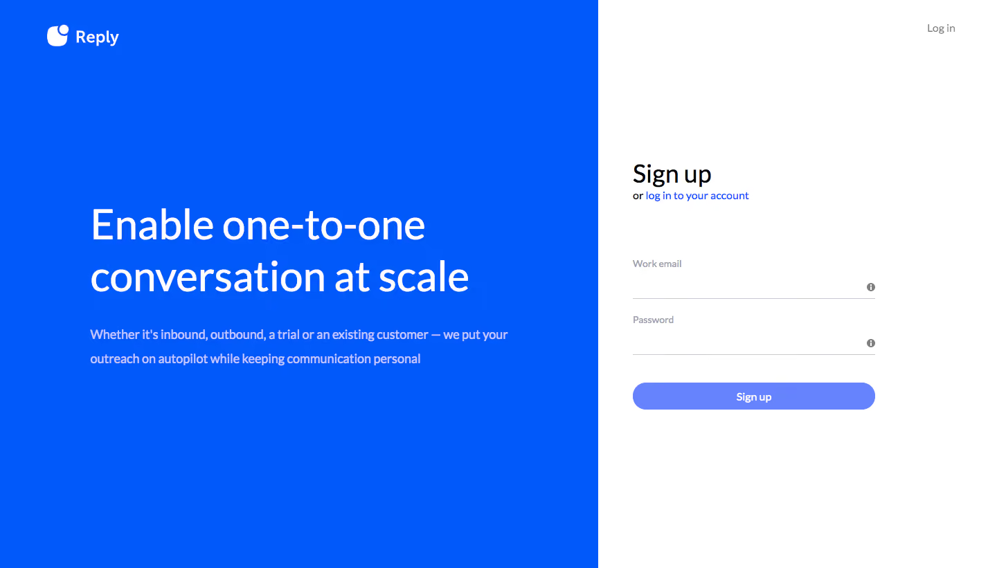
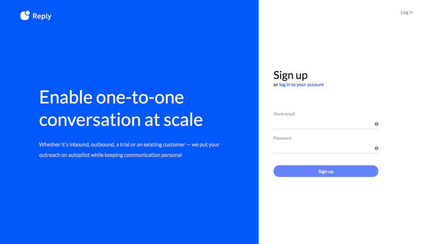
- **Character:** A stark split signup screen contrasts a saturated blue marketing panel with a minimal white form.
- **Restraint:** Typography carries the message; there are no photographs, cards or elaborate illustrations.
### Page composition
- **Capture:** The original is 1440 × 821 pixels. Measurements approximate image pixels; CSS scale is unverified.
- **Split:** The blue left region occupies 60% of the width; the white signup region fills the remainder.
- **Brand/message:** A white Reply mark sits upper-left, with a large two-line statement and supporting paragraph centered vertically below.
- **Form:** The right region contains signup heading, login link, two underlined fields and a wide capsule action. A separate login link sits at the top-right.
### Information hierarchy
- **Marketing:** Large white copy dominates the blue side.
- **Form task:** The signup heading precedes a small alternative-login line.
- **Action:** The wide periwinkle button is the strongest form element below two quiet fields.
### Typography
- **Family:** A humanist sans serif is visible; exact identity is unverified.
- **Statement:** Approximately 60 pixels, regular weight, with about 76-pixel leading.
- **Supporting copy:** Around 18 pixels with 34-pixel leading.
- **Form:** Heading around 36 pixels; field labels and button text around 14 pixels.
### Colors & surfaces
- **Measured blue:** #0259FB dominates the left panel.
- **Measured white:** #FFFFFF provides the form canvas and marketing text.
- **Measured action:** #6682FC appears in the signup-button palette.
- **Measured neutrals:** #C7CAD1 and pale #BFC7FD support muted form details; black #000000 contributes heading contrast.
### Components
- **Fields:** Approximately 350-pixel-wide underline-only inputs include small trailing information icons.
- **Button:** Roughly 350 × 40 pixels with fully rounded ends and centered white label.
- **Brand:** A compact white icon/wordmark sits with generous top/left padding.
- **Links:** Blue inline login text and a muted top-right login control offer alternative access.
### Visual rhythm
- **Whitespace:** Broad empty areas surround both message and form.
- **Alignment:** Form heading, field lines and button share a left edge.
- **Field spacing:** Approximately 80-pixel intervals separate field labels, while the action follows with a smaller gap.
### Responsive
- **Observed state:** Only desktop is shown; mobile behavior is unverified.
- **Recommended flow:** Stack or reduce the marketing panel and retain a fluid readable form.
- **Recommended type:** Scale the large statement without preserving forced desktop line breaks.
### Adaptation guidance
- **Preserve contrast:** Keep the 60/40 blue/white relationship as the desktop identity.
- **Maintain simplicity:** Use underline fields and one clear signup action.
- **State fidelity:** The fields are empty; do not infer validation or completed registration.
- **Accessibility:** Provide persistent labels, informative help text and visible focus states.
Use this context to reproduce the reference's visual language: layout, typography, colors, spacing, borders, radii, and distinctive elements. The screenshot takes priority if descriptions conflict.
## Direction
{{preferences.fidelityInstructions}}
## Output
{{output.instructions}}
Deliver a polished, cohesive design with precise alignment, hierarchy, and spacing. Produce the requested visual artifact, not just a description. If unsupported, explain the limitation.