Design with AI
Generate a new design based on this screen using your own content.
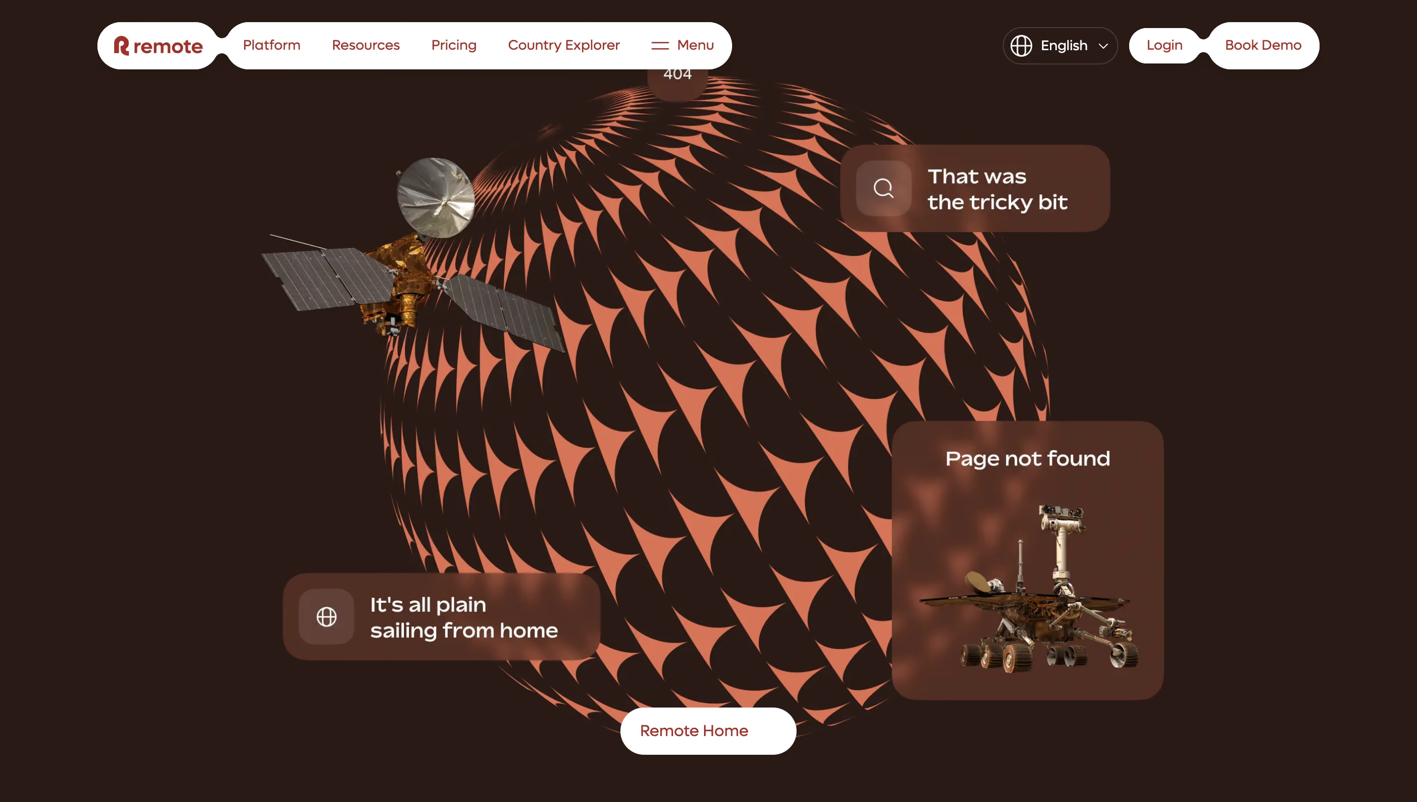
# Design from Reference: Remote 404 Page
Create an original, high-fidelity visual design inspired by the reference. Prioritize composition, typography, colors, spacing, and component styling over technical implementation.
## Reference
- **Product:** Remote
- **Category:** 404 Page
- **Screenshot:** https://cdn.prod.website-files.com/5e9dc792e1210c5325f7ebbc/6acad674d63d2caea65c64dc_6acad6095a5fdf4c30314262_cms-9baf3db3d225482d5845ac2e.webp
Analyze the screenshot first. If inaccessible, request it rather than guessing.
## Content
{{content.instructions}}
{{content.data}}
Preserve essential messaging and factual accuracy. Adapt structure and copy length for visual balance; never invent product claims.
## Visual Design
### Overall aesthetic
- **Character:** Immersive space-themed error screen with dark brown canvas, coral patterned globe and floating translucent cards.
### Page composition
- **Capture:** 2880 × 1630 screenshot pixels; estimated 2× CSS scale.
- **Structure:** White pill navigation along top, giant central patterned sphere, satellite at upper left, three floating message/rover cards and Remote Home action below.
### Information hierarchy
- **Priority:** Page not found card and small 404 establish the error; bottom white home button provides recovery.
### Typography
- **Family:** Rounded sans serif; exact family unverified.
- **Estimated CSS sizes:** Card messages 22–24px, navigation/action 16px and small error badge 16px.
### Colors & surfaces
- **Measured palette:** Canvas #2C1915, card brown #542C20/#582B20, coral #E56D4F, dark variation #2E1A16 and white #FFFFFF.
### Components
- **Elements:** Coral repeating globe pattern, photographic spacecraft/rover cutouts, glass-like message cards, language selector and white pill recovery button.
- **Estimated geometry:** Sphere roughly 680px diameter, card radii 24px, 48px pill controls and soft background blur.
### Visual rhythm
- **Spacing:** Overlapping orbit-like elements fill the viewport while dark margins keep the composition coherent.
### Responsive
- **Suggested adaptation:** Simplify spacecraft/card arrangement and keep error text/home action unobscured. Mobile behavior is not shown.
### Adaptation guidance
- **Transfer:** Preserve the immersive illustration and obvious recovery path; adapt decorative complexity to available space.
Use this context to reproduce the reference's visual language: layout, typography, colors, spacing, borders, radii, and distinctive elements. The screenshot takes priority if descriptions conflict.
## Direction
{{preferences.fidelityInstructions}}
## Output
{{output.instructions}}
Deliver a polished, cohesive design with precise alignment, hierarchy, and spacing. Produce the requested visual artifact, not just a description. If unsupported, explain the limitation.