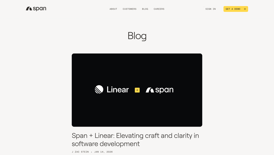
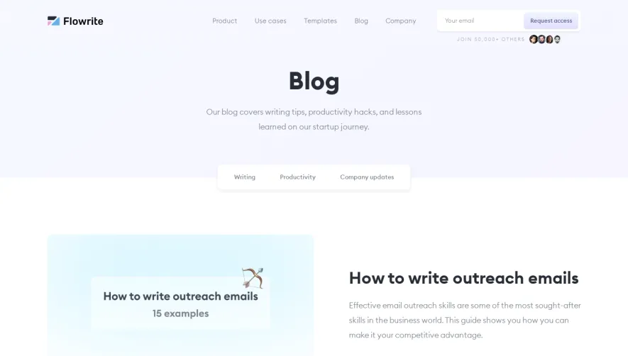
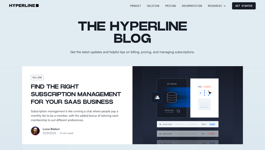
Generate a new design based on this screen using your own content.
Thank you! Your submission has been received!
Oops! Something went wrong while submitting the form.
# Design from Reference: Raycast Blog Feed
Create an original, high-fidelity visual design inspired by the reference. Prioritize composition, typography, colors, spacing, and component styling over technical implementation.
## Reference
- **Product:** Raycast
- **Category:** Blog Feed
- **Screenshot:** https://cdn.prod.website-files.com/5e9dc792e1210c5325f7ebbc/62ff1da4af0efc04da5de132_1660886308320-blog-Laptop%2520Medium-1660886211626.webp
Analyze the screenshot first. If inaccessible, request it rather than guessing.
## Content
{{content.instructions}}
{{content.data}}
Preserve essential messaging and factual accuracy. Adapt structure and copy length for visual balance; never invent product claims.
## Visual Design
Use this context to reproduce the reference's visual language: layout, typography, colors, spacing, borders, radii, and distinctive elements. The screenshot takes priority if descriptions conflict.
## Direction
{{preferences.fidelityInstructions}}
## Output
{{output.instructions}}
Deliver a polished, cohesive design with precise alignment, hierarchy, and spacing. Produce the requested visual artifact, not just a description. If unsupported, explain the limitation.
Raycast’s blog page embodies a crisp, modern minimalism with a professional yet approachable edge. Generous white space and precise alignment lend a feeling of clarity, while subtle gradients and well-placed accents keep the experience contemporary and vibrant.
Layout and Structure
The site’s structure is refreshingly straightforward. There’s no traditional hero banner; instead, the content takes center stage from the outset. A clean header with navigation sits atop a well-organized, masonry-like grid of blog tiles. Each tile features distinct visual cues, such as colorful tag pills and bold headlines, enhancing scannability. A sticky search/navigation bar follows the user, ensuring seamless exploration, and a minimalist footer ties the page together with essential links.
Visual Elements
Custom illustrations and subtle iconography punctuate the interface, adding personality without clutter. Blog imagery blends stylized vectors and crisp product screens, maintaining a sense of brand identity. Hover effects on articles create fluid motion, delivering tactile feedback that enlivens interaction.
Color Palette and Typography
A disciplined palette of black, white, and muted gray forms the foundation, energized by flashes of soft purple and blue for highlights and actions. Typography is clean and readable: sans-serif headings draw attention, supported by balanced body text with generous line height for comfortable reading.
User Experience Patterns
Sticky navigation, prominent CTAs (like “Subscribe”), and intuitive tag-based filtering create a seamless experience. Micro-interactions, such as hover-flourishes and card shadow transitions, guide engagement and keep the interface lively without distraction.
Unique or Notable Design Choices
The decision to foreground content while stripping away visual excess results in a page that feels innovative yet familiar. Dynamic search and persistent navigation elevate usability—delivering inspiration for those who value both design beauty and practical function.