Design with AI
Generate a new design based on this screen using your own content.
# Design from Reference: Prelude Region List
Create an original, high-fidelity visual design inspired by the reference. Prioritize composition, typography, colors, spacing, and component styling over technical implementation.
## Reference
- **Product:** Prelude
- **Category:** Table
- **Screenshot:** https://cdn.prod.website-files.com/5e9dc792e1210c5325f7ebbc/697b764cba92fcc119743d46_2XVWxi1Zdu5_73jpD1dNV8UoTPfuBEej-auSWi3B7ew.avif
Analyze the screenshot first. If inaccessible, request it rather than guessing.
## Content
{{content.instructions}}
{{content.data}}
Preserve essential messaging and factual accuracy. Adapt structure and copy length for visual balance; never invent product claims.
## Visual Design
### Overall aesthetic
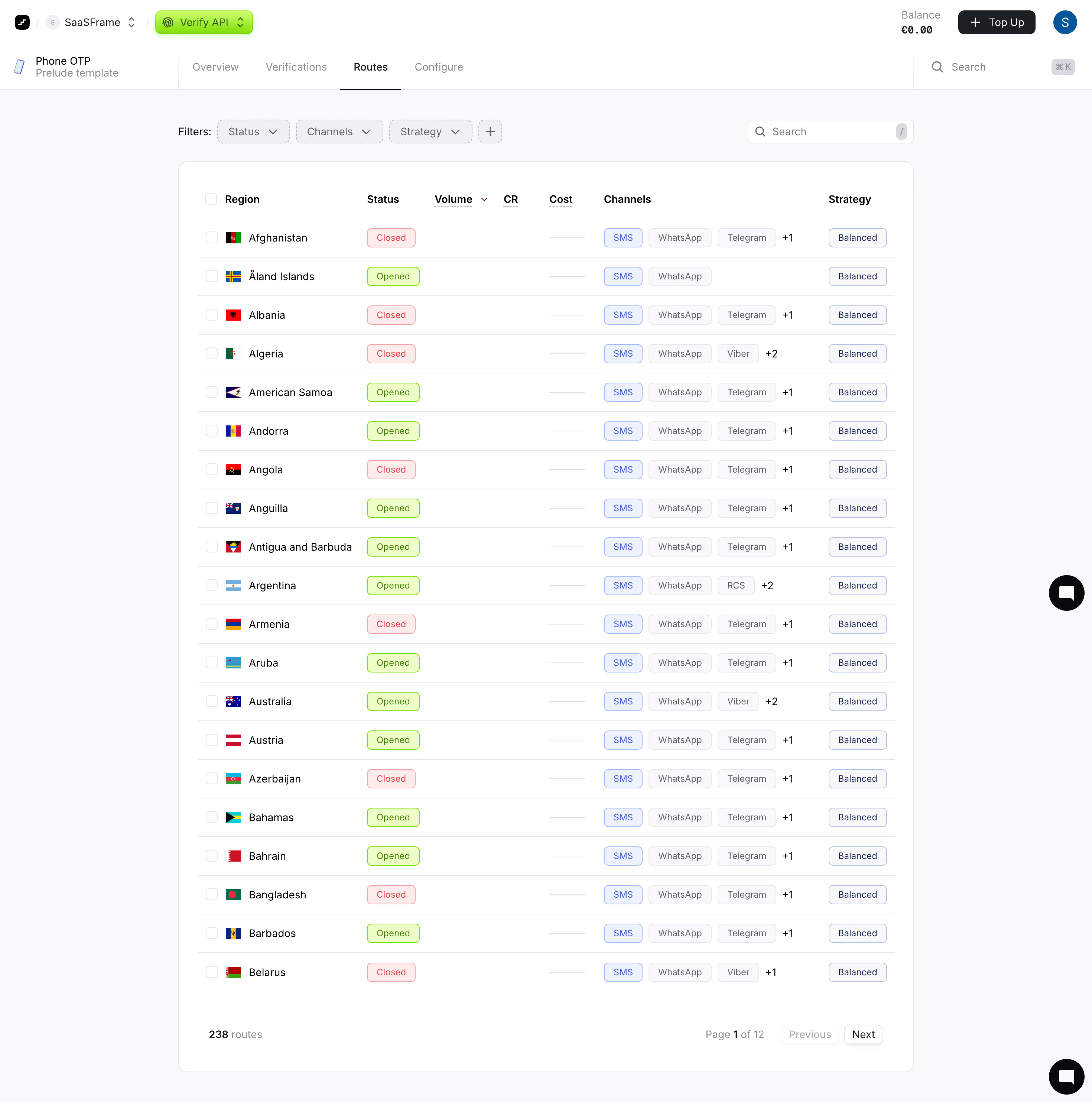
- **Character:** Light verification-routing dashboard with a long white data table, pale lavender-gray shell and vivid lime product selector.
- **Evidence and scale:** Screenshot measures 2940 × 2966 image pixels. Sizes estimate a 1470px CSS canvas at 2× capture scale; actual DPR and typeface are unverified.
### Page composition
- **Header:** Workspace/product selectors sit left; balance, top-up and account controls right.
- **Product navigation:** A second row shows phone-template context, four tabs and global search, with Routes selected.
- **Filters:** Status/channel/strategy controls and an add-filter square align left above the table; local search aligns right.
- **Table:** Centered white rounded shell contains twenty visible region rows and seven data columns, with checkboxes, flags, status chips, channels and strategy badges.
- **Pagination/support:** Route count and page controls sit at the table bottom; black chat controls appear along the right page edge.
### Information hierarchy
- **Current context:** Bright lime Verify API selector and dark underlined Routes tab establish product/view.
- **Rows:** Region names and flags lead each row; status and channel/strategy badges provide compact secondary structure.
- **Metrics:** Volume, CR and cost columns are mostly empty/dash-like in this capture; no performance data should be inferred.
- **Pagination:** Count and page indicator provide collection scope; previous is pale/inactive-looking and next remains outlined.
### Typography
- **Table:** Region names around 14px CSS; headers around 14px medium/semibold.
- **Badges:** Approximately 12px, compact regular text.
- **Navigation/filters:** Around 14px; product subtitle and pagination metadata smaller near 12–13px.
- **Family:** Neutral sans-serif; exact identity, weights and tracking remain unverified.
### Colors & surfaces
- **Measured foundation:** White #FFFFFF table/header with pale #F9F9FB shell and related #F8F8FA surfaces.
- **Measured boundaries:** #E8E8EC forms fine rules and outlines.
- **Measured status fills:** Pale green #EDFFC7 and pale red #FEEBEC support opened/closed chips.
- **Measured accents:** Lime #82DD05 and dark green #4C8606 appear in selected/status areas; blue #3F63DD supports channel/strategy emphasis and pale #EDF2FE selected fills.
### Components
- **Product selector:** Bright lime rounded control with fingerprint icon and small chevrons; subtle shadow/edge treatment.
- **Filter chips:** Light dashed-outline rounded rectangles with labels/chevrons and a small plus square.
- **Table shell:** Approximately 990px CSS wide, thin pale border, 12px radius and generous internal side padding.
- **Rows:** Approximately 51px high, fine horizontal separators, small square selection boxes and national-flag thumbnails.
- **Status/channel chips:** Green/red outlined status pills; SMS blue chip and neutral messaging-service chips with overflow counts.
- **Strategy badges:** Small blue-gray outlined rectangles aligned at the far right.
- **Pagination:** Small text count left and compact Previous/Next controls right.
### Visual rhythm
- **Column discipline:** Consistent checkbox/flag/name alignment and repeated chip positions make a long list scannable.
- **Spacing:** Roughly 24px separates filters from table; row padding remains compact and even.
- **Whitespace:** Broad pale outer margins and quiet metric columns keep the table from feeling crowded.
- **Hierarchy:** Thin rules and small colored chips provide structure without heavy grid borders.
### Responsive
- **Observed limit:** Desktop routes view only; filtering, sorting, selection, pagination and mobile layout are unobserved.
- **Recommended table:** Preserve key region/status data and use horizontal scrolling or an adaptive row detail pattern for remaining columns.
- **Recommended header:** Wrap filters/search and simplify top navigation on narrow screens.
- **Recommended controls:** Keep checkboxes, badge meaning and page actions accessible without relying on color alone.
### Adaptation guidance
- **Preserve clarity:** Use a stable table structure with concise status and channel chips, clear filters and visible collection scope.
- **Keep data honest:** Represent empty metrics explicitly rather than implying zero performance.
- **Implementation:** Provide semantic table headers, labeled selection/filter controls, focus and status text. Route availability and counts are one captured state, not verified current service coverage.
Use this context to reproduce the reference's visual language: layout, typography, colors, spacing, borders, radii, and distinctive elements. The screenshot takes priority if descriptions conflict.
## Direction
{{preferences.fidelityInstructions}}
## Output
{{output.instructions}}
Deliver a polished, cohesive design with precise alignment, hierarchy, and spacing. Produce the requested visual artifact, not just a description. If unsupported, explain the limitation.