Design with AI
Generate a new design based on this screen using your own content.
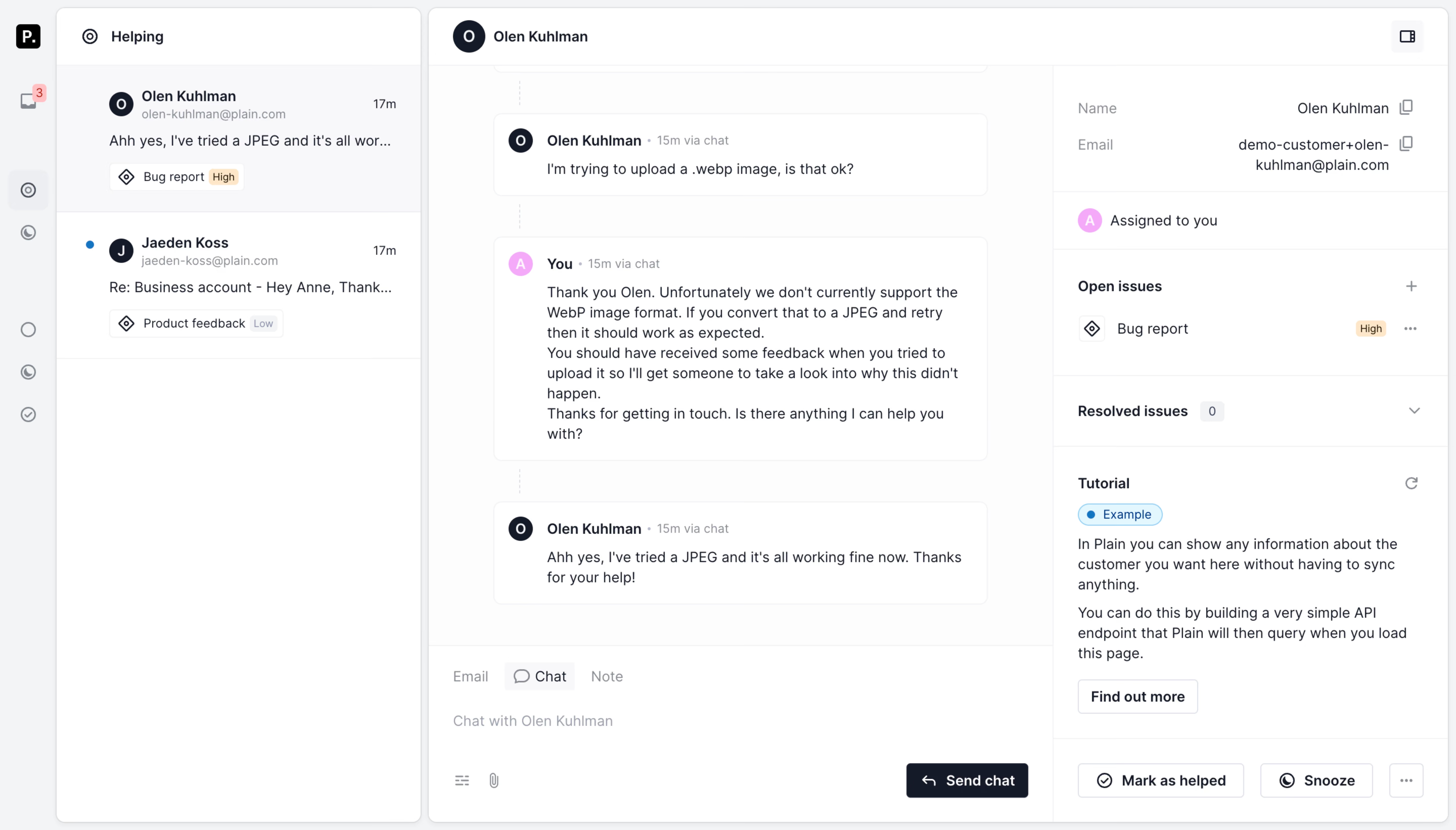
# Design from Reference: Plain Chat
Create an original, high-fidelity visual design inspired by the reference. Prioritize composition, typography, colors, spacing, and component styling over technical implementation.
## Reference
- **Product:** Plain
- **Category:** Chat
- **Screenshot:** https://cdn.prod.website-files.com/5e9dc792e1210c5325f7ebbc/6acbba9cd01e364847659b13_6acbb9675c8937341a54f991_cms-7ffdce71eab7877b9287c653.webp
Analyze the screenshot first. If inaccessible, request it rather than guessing.
## Content
{{content.instructions}}
{{content.data}}
Preserve essential messaging and factual accuracy. Adapt structure and copy length for visual balance; never invent product claims.
## Visual Design
### Overall aesthetic
- **Style:** Light, dense customer-support workspace with three information columns and a narrow utility rail.
- **Character:** Near-white surfaces, thin cool borders, small rounded message cards, and dark action buttons.
### Page composition
- **Canvas:** 5760 × 3284 image px. Layout proportions are directly observed; CSS estimates below use an unverified 4× reconstruction.
- **Utility rail:** Approximately 56 CSS px wide.
- **Conversation list:** Approximately 360 CSS px wide.
- **Center workspace:** Approximately 620 CSS px wide, including header, thread, and composer.
- **Right inspector:** Approximately 390 CSS px wide with customer metadata, issues, tutorial, and resolution controls.
- **Thread:** Vertically spaced message cards; composer fixed visually at the bottom of the center panel.
### Information hierarchy
- **Primary:** Active conversation and message content.
- **Secondary:** Conversation list previews with status labels and timestamps.
- **Context:** Customer properties and issue labels in the right panel.
- **Actions:** Send chat at bottom center; Mark as helped and Snooze at bottom right.
### Typography
- **Family:** Compact interface sans serif; exact family unverified.
- **Body:** Approximately 14 CSS px with 20px line-height under the assumed 4× scale.
- **Names and panel labels:** Approximately 14px, semibold.
- **Metadata:** Approximately 12px, muted.
- **Buttons:** Approximately 14px, medium or semibold.
- **Precision:** Font sizes and the 4× scale are reconstruction hypotheses, not verified source metrics.
### Colors & surfaces
- **Primary surfaces:** #FFFFFF.
- **Thread background:** #FCFCFD.
- **Outer surface and subtle states:** #F2F3F5.
- **Conversation preview surface:** #F8F8FA.
- **Primary dark text/buttons:** #151A27.
- **Subtle borders:** Near #F1F2F4 and #EFF0F2.
- **Accents:** Small blue unread indicators, pink avatar, and pale orange priority tag.
- **Precision:** Flat colors sampled from screenshot; accent exact tokens are unverified.
### Components
- **Conversation previews:** Avatar, semibold name, email, timestamp, truncated summary, and issue/priority chips.
- **Messages:** White bordered rectangles with approximately 6–8 CSS-px corner radius and 16px padding under assumed 4×.
- **Timeline:** Faint dashed vertical segments connect message groups.
- **Composer:** Email/Chat/Note tabs, quiet placeholder, attachment controls, and dark Send chat button.
- **Inspector:** Copy icons, assignment row, collapsible issue groups, tutorial copy, and small outlined CTA.
- **Bottom actions:** Outlined resolution and snooze buttons plus ellipsis.
### Visual rhythm
- **Spacing:** Compact 12–16 CSS-px insets for metadata; larger 24–40px gaps between message cards under assumed 4×.
- **Alignment:** Names, message text, and timestamps share repeated baselines.
- **Structure:** Thin dividers separate panels and inspector sections without strong shadows.
- **Emphasis:** Small colored state markers supply contrast within the neutral workspace.
### Responsive
- **Observed:** Wide desktop workspace only.
- **Recommendation:** Show one primary conversation pane on small screens, moving the list and inspector into drawers.
- **Composer:** Keep sending controls reachable and preserve comfortable touch targets.
- **Messages:** Allow text to wrap without reducing body size.
### Adaptation guidance
- **Preserve:** Conversation-first hierarchy, contextual inspector, neutral surfaces, and compact issue chips.
- **Privacy:** Replace personal names, email addresses, and message content with supplied examples.
- **Content:** Adapt issue taxonomy and actions to the intended workflow.
- **State fidelity:** Static screenshot does not establish resolution, snooze, or tab behavior.
Use this context to reproduce the reference's visual language: layout, typography, colors, spacing, borders, radii, and distinctive elements. The screenshot takes priority if descriptions conflict.
## Direction
{{preferences.fidelityInstructions}}
## Output
{{output.instructions}}
Deliver a polished, cohesive design with precise alignment, hierarchy, and spacing. Produce the requested visual artifact, not just a description. If unsupported, explain the limitation.