
Thank you! Your submission has been received!
Oops! Something went wrong while submitting the form.
Get SaaSFrame Pro
Monthly
$18
Quarterly
$48
Yearly
$180
Upgrade to access this feature
Browse all screens & flows
Filter and search screens & flows
Access Figma files
Access mobile versions
Bookmark screens & flows
Join now

ParityDeals Landing Page

ParityDeals
Pricing command center
Designed by
No items found.

Bookmark
Bookmark

Design with AI
Thank you! Your submission has been received!
Oops! Something went wrong while submitting the form.
# Design from Reference: ParityDeals Landing Page
Create an original, high-fidelity visual design inspired by the reference. Prioritize composition, typography, colors, spacing, and component styling over technical implementation.
## Reference
- **Product:** ParityDeals
- **Category:** Landing Page
- **Screenshot:** https://cdn.prod.website-files.com/5e9dc792e1210c5325f7ebbc/6acad3a2c2028efdec71af52_6acad149a43009b06fe4cd6f_cms-07019f490953200da907b43a.webp
Analyze the screenshot first. If inaccessible, request it rather than guessing.
## Content
{{content.instructions}}
{{content.data}}
Preserve essential messaging and factual accuracy. Adapt structure and copy length for visual balance; never invent product claims.
## Visual Design
### Overall aesthetic
- **Character:** A developer-oriented billing landing page uses a bright white canvas, fine technical grid lines, softly outlined feature cards, dark ink headings, and orange conversion accents.
- **Evidence:** The original screenshot is 1607 × 15539 image pixels, inspected across ten readable crops resized to 1400 px width. Dimensions below use inspection pixels; actual CSS scale and device pixel ratio are unverified.
- **Illustration language:** Miniature interfaces, connector diagrams, code samples, currency globes, charts, and floating icon chips explain the product. Soft glows and gradients add depth without making the overall page dark.
### Page composition
- **Header and hero:** A centered container bounded by faint vertical rails holds the logo, navigation, login, and orange free-start action. A small release badge, bold two-line headline, two-line explanation, and centered CTA form the hero.
- **Interactive-looking preview:** Five compact feature tabs sit on a horizontal boundary below a faint perspective-tile illustration. The displayed Targeting tab corresponds to a split text/rule-builder preview, followed by a muted customer-logo strip.
- **Monetization overview:** A dotted-background section contains a centered label/title/description and a varied card grid covering pricing models, metering, entitlements, code separation, and customer lifecycle.
- **Architecture and localization:** A centered how-it-works section shows a payment-platform-to-product diagram. A localization section pairs explanatory text with asymmetrical globe, currency, anti-abuse, and multi-device cards.
- **Proof and partners:** Three rows of founder portrait chips precede a partner section with copy left and two large partner panels right, then a purple quote band.
- **Developer and experiment sections:** Performance and SDK artwork flank a dark SDK banner, integration/customization panels, and a compact benefit strip. An experiments grid follows with test variants, implementation imagery, charts, and a dark photographic testimonial.
- **Lower page:** A pricing-table section includes a large blank region below its introduction, then three role-based columns. Two rows of capability chips, four testimonial cards, a hatched CTA band, and a tall rounded-top black footer finish the capture.
### Information hierarchy
- **Hero:** The headline is the largest live-looking text; a single orange word creates emphasis. The orange action is the clearest conversion target.
- **Section markers:** Small uppercase orange labels precede bold centered section titles and muted supporting paragraphs. Localization and partner headings align left.
- **Feature anatomy:** Large technical illustrations occupy the upper part of each card, with a bold title and two or three lines of muted copy below.
- **Proof rhythm:** Logos, founder chips, partner panels, colored quote strips, and testimonial cards separate dense product explanations.
- **Capture limitations:** The broad whitespace beneath the pricing-table introduction contains no visible table in this image. Do not invent missing content or infer loading behavior.
### Typography
- **Family:** A modern neutral sans serif carries navigation, headings, and descriptions. Code artwork uses a monospace face. Exact font identities are unverified.
- **Hero:** Approximately 60–64 inspection px, bold, with around 72 px line-height and slightly tight tracking.
- **Section titles:** Approximately 30–34 px bold with 40–44 px line-height; explanatory paragraphs are around 20 px with 30 px leading.
- **Cards:** Titles are approximately 19–21 px semibold; descriptions are about 15–16 px with 26 px line-height.
- **Utility:** Navigation and compact tabs are around 13–14 px. Uppercase section labels are approximately 14 px, semibold, with moderate tracking. Fine interface labels and code remain much smaller inside illustrations.
- **Footer:** Group headings use roughly 18 px bold white text; links use approximately 14 px muted blue-gray text with loose vertical spacing.
### Colors & surfaces
- **Measured foundations:** Most frequent sampled source pixels include white #FFFFFF, near-black #07080A, and subtle near-whites #FCFDFD, #FEFEFE, #FDFDFD, and #FCFCFC.
- **Semantic accents:** Bright orange marks CTAs, eyebrow labels, hero emphasis, and small connector details. Muted blue-gray is used for body text and pale outlines; exact accent hex values were not independently sampled.
- **Secondary artwork:** Purple, blue, mint, yellow, and pink distinguish diagram functions and embedded UI examples. The partner quote strip is saturated violet; the photographic testimonial and footer are dark.
- **Surface treatment:** Feature panels are white with thin cool-gray outlines and gentle diffuse shadows. Fine dotted or hatched patterns appear behind selected sections.
- **Dark regions:** The SDK banner blends slate into black. The footer uses near-black with a huge low-contrast wordmark at its bottom.
### Components
- **Main frame:** Approximately 1028 inspection px wide, bounded by fine vertical rails at x186 and x1214. Horizontal rules and small star-like intersections mark major boundaries.
- **Primary buttons:** Hero and closing orange actions are about 165–185 × 54 px, with 10–12 px radii, white labels, and subtle inset/shadow depth. The header version is smaller.
- **Feature tabs:** Five outlined pill-like chips use small line icons and compact labels. The active Targeting chip has a darker lower edge/shadow; other states are unverified.
- **Feature cards:** Mostly 24 px corner radii, thin pale borders, around 24 px padding, and varied spans. Some are equal two-column cards; others use a roughly 60/40 split with a tall right-hand lifecycle panel.
- **Diagrams:** Fine dotted paths connect service marks, function chips, globes, and product controls. Embedded dropdowns, chips, meters, and code blocks are visual examples, not verified working controls.
- **Social proof:** Founder chips pair circular grayscale portraits with names. Testimonial cards use rounded outlines, avatar/name/handle headers, and paragraph copy; four cards are distributed across three columns.
- **Role columns:** Product, Engineering, and Finance each have an icon, title, short description, and rounded illustration panel; Finance includes a small coming-soon badge.
- **Footer:** A large black region has strongly rounded top corners, a left brand/legal/social column, and three dense grouped-link columns. A giant dark wordmark fills the bottom.
### Visual rhythm
- **Section spacing:** Large vertical pauses separate major stories, while internal card grids use roughly 24 px gaps. The technical rails hold the long composition together.
- **Centered introductions:** Labels, headings, and descriptions form compact centered groups before broad illustration regions.
- **Asymmetry:** Unequal card spans, paired partner panels, and uneven testimonial heights prevent the page from becoming a single repeated grid.
- **Whitespace:** Some captured areas are exceptionally empty, especially the pricing-table region and space beside partner panels. Preserve this as an observation rather than filling it with imagined content.
- **Contrast breaks:** Violet, black, and photographic proof bands punctuate the otherwise white page and make the next light section feel distinct.
### Responsive
- **Observed limit:** Only desktop is supplied. Actual tab behavior, animations, breakpoint rules, and hidden content are unverified.
- **Recommended grids:** Collapse multi-column feature layouts to two and then one column, preserving heading-before-detail order and natural card heights.
- **Recommended diagrams:** Simplify connectors or provide stacked textual equivalents when labels would become too small. Keep code examples readable with contained horizontal scrolling if rendered as live text.
- **Recommended navigation:** Use a compact navigation pattern, reduce outer gutters to 20–24 CSS px, and scale headline type fluidly.
- **Recommended proof and footer:** Wrap portrait chips, stack role/testimonial columns, and reflow footer groups. Ensure rail and wordmark decoration cannot cause horizontal page overflow.
### Adaptation guidance
- **Preserve:** Retain the white technical frame, orange conversion cues, varied rounded-card grids, and tangible diagrams connecting billing concepts.
- **Build:** Use reusable section-intro, feature-card, diagram, proof-band, testimonial, and CTA components with shared type and spacing tokens.
- **Content discipline:** Keep illustrative code and dashboard values separate from functional UI. Treat partnership statements and performance numbers as screenshot content, not independently verified claims.
- **State design:** If tabs or previews are interactive, define accessible selected, focus, and keyboard behavior. Those behaviors cannot be determined from the capture.
- **Accessibility:** Check pale-text contrast, meaningful image alternatives, diagram equivalents, link focus, and reduced-motion settings if decorative effects animate.
- **Validation:** Confirm original font files, true CSS sizing, content in captured blank regions, responsive image cropping, and footer legibility before reproducing the design.
Use this context to reproduce the reference's visual language: layout, typography, colors, spacing, borders, radii, and distinctive elements. The screenshot takes priority if descriptions conflict.
## Direction
{{preferences.fidelityInstructions}}
## Output
{{output.instructions}}
Deliver a polished, cohesive design with precise alignment, hierarchy, and spacing. Produce the requested visual artifact, not just a description. If unsupported, explain the limitation.


Category
Patterns
No items found.
Tech Stack

Added on
January 13, 2026
Similar screens
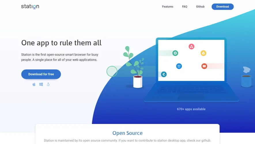


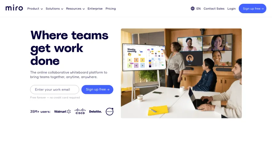

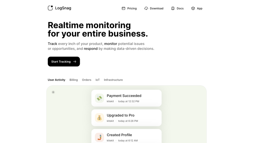

Upgrade to SaaSFrame Pro now to see similar examples.
Monthly
$18 /month
Billed $18 monthly
Browse all screens & flows
Filter and search screens & flows
Search text in screenshots
Access Figma files
Access mobile versions
Join now
Quarterly
$16 /month
Billed $48 quarterly
Browse all screens & flows
Filter and search screens & flows
Search text in screenshots
Access Figma files
Access mobile versions
Join now
Yearly
$15 /month
Billed $180 yearly
Browse all screens & flows
Filter and search screens & flows
Search text in screenshots
Access Figma files
Access mobile versions
Join now