
Thank you! Your submission has been received!
Oops! Something went wrong while submitting the form.
Get SaaSFrame Pro
Monthly
$18
Quarterly
$48
Yearly
$180
Upgrade to access this feature
Browse all screens & flows
Filter and search screens & flows
Access Figma files
Access mobile versions
Bookmark screens & flows
Join now

OpenAI About Page

OpenAI
Creating safe AGI
Designed by
No items found.

Bookmark
Bookmark

Design with AI
Thank you! Your submission has been received!
Oops! Something went wrong while submitting the form.
# Design from Reference: OpenAI About Page
Create an original, high-fidelity visual design inspired by the reference. Prioritize composition, typography, colors, spacing, and component styling over technical implementation.
## Reference
- **Product:** OpenAI
- **Category:** About Page
- **Screenshot:** https://cdn.prod.website-files.com/5e9dc792e1210c5325f7ebbc/65646f91af4e24b4babfc944_OQd9si59irmMQ21nJCF0bt6q70wsM72f3Ff0krh2XhM.webp
Analyze the screenshot first. If inaccessible, request it rather than guessing.
## Content
{{content.instructions}}
{{content.data}}
Preserve essential messaging and factual accuracy. Adapt structure and copy length for visual balance; never invent product claims.
## Visual Design
### Overall aesthetic
- **Character:** An editorial company page combining a pale-cyan/brown identity, monumental serif statements, plain sans-serif navigation and large workplace photography.
- **Evidence scale:** Original 1280 × 8646 pixels, inspected through all seven readable crops. Dimensions are image-pixel estimates; CSS scale and font identities are unverified.
### Page composition
- **Opening:** Pale-cyan full-width section with navigation, large About label left, a three-line company/mission statement right and a broad workplace photograph below.
- **Vision:** White two-column section with serif heading, short copy and underlined links left, abstract pastel artwork right.
- **Statement/photo:** A full-width large serif mission statement precedes a large edge-to-edge conversation photograph.
- **Work:** Our work introduces Research and Products subsections, each with left label, right description/link and four square-image content items.
- **Careers:** Split heading/copy/link row followed by a large full-width workplace photograph.
- **Structure:** Left serif heading, paragraph and two links sit beside a large magenta/pale-green radial graphic.
- **Closing:** Large serif recruitment statement above a full-width outlined View careers button.
- **Footer:** Pale cyan returns with logo, four link columns, legal/social/back-to-top rows and a decorative horizontal stripe field ending in solid brown.
### Information hierarchy
- **Display statements:** Very large serif text carries the editorial narrative between photo sections.
- **Opening identity:** Brown sans-serif About and mission text contrast with cyan.
- **Content grids:** Square images lead into compact bold titles and dates; cards have no enclosing boxes.
- **Actions:** Underlined inline links and one broad outlined careers action remain visually simple.
- **Footer:** Section labels and densely spaced text links use the same brown/cyan system as the opening.
### Typography
- **Opening label:** Unverified sans-serif, approximately 72 px regular with tight tracking.
- **Serif headings:** Approximately 48 px regular, 52–56 px line height for split sections.
- **Large statements:** Approximately 56–72 px serif with tight line spacing and natural multi-line wrapping.
- **Mission/section descriptions:** Sans-serif around 28 px, 34 px line height for larger statements; ordinary copy around 18 px, 24 px line height.
- **Grid metadata:** Around 18 px bold titles and 18 px regular dates; navigation/footer around 18 px.
- **Font identity:** Serif and sans-serif families are visually distinct but unverified.
### Colors & surfaces
- **Opening/footer:** Measured pale cyan #CAFEFF.
- **Brand ink:** Warm brown #823600, with antialiased neighboring brown pixels.
- **Main article:** White #FFFFFF and black #000000 type/rules.
- **Photography:** Warm sunlight, tan furniture, green plants and natural skin tones.
- **Artwork:** Pastel cyan/yellow/green vision image, vivid magenta/lime radial image and varied saturated research/product thumbnail colors.
### Components
- **Navigation:** Logo left, five main links, search/login and thin outlined Try ChatGPT action right; small chevrons and external-link arrows.
- **Hero photograph:** Approximately 1232 × 694 px, rectangular without rounding, inset 24 px from viewport edges.
- **Split sections:** Roughly equal columns with about 24 px gap; fine horizontal rules mark their starts.
- **Content grids:** Four approximately 290 px square images with 24 px gutters, compact titles and dates immediately below.
- **Full-width photos:** Large rectangular workplace images with no card border or radius.
- **Careers action:** Approximately 1232 × 88 px outlined white button, slight 4 px radius and centered large label.
- **Footer stripe motif:** Repeated brown horizontal bands progressively thicken toward a solid-brown bottom region.
### Visual rhythm
- **Page gutters:** Repeated 24 px horizontal insets establish a simple consistent grid.
- **Section pacing:** Roughly 96 px white intervals and thin rules separate major editorial regions.
- **Column alignment:** Left headings and right text/images repeatedly share a midpoint split.
- **Image rhythm:** Large photographic breaks alternate with text/artwork sections and four-item grids.
- **Footer:** Large empty cyan intervals contrast with tight link line spacing before the stripe pattern.
### Responsive
- **Observed limit:** Desktop page only; no mobile arrangement is verified.
- **Recommendation:** Stack split sections, reduce serif display sizes and collapse four-item grids to two or one column.
- **Images:** Preserve meaningful crops while keeping square grid thumbnails and broad photographic proportions distinct.
- **Footer/navigation:** Collapse or wrap link groups and retain readable account/search controls.
### Adaptation guidance
- **Retain:** Build a narrative through alternating large statements, photography, artwork and unboxed editorial grids.
- **Implement:** Use consistent thin rules, a simple half-page alignment grid and a recurring two-color identity at opening/closing.
- **Verify:** Confirm actual fonts, scale and responsive rules separately. This historical screenshot is visual evidence; its organization, product and mission copy is not verified current information.
Use this context to reproduce the reference's visual language: layout, typography, colors, spacing, borders, radii, and distinctive elements. The screenshot takes priority if descriptions conflict.
## Direction
{{preferences.fidelityInstructions}}
## Output
{{output.instructions}}
Deliver a polished, cohesive design with precise alignment, hierarchy, and spacing. Produce the requested visual artifact, not just a description. If unsupported, explain the limitation.


Category
Patterns
No items found.
Tech Stack



Added on
November 27, 2023
Similar screens
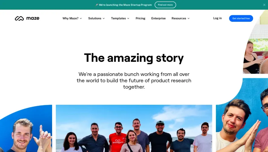


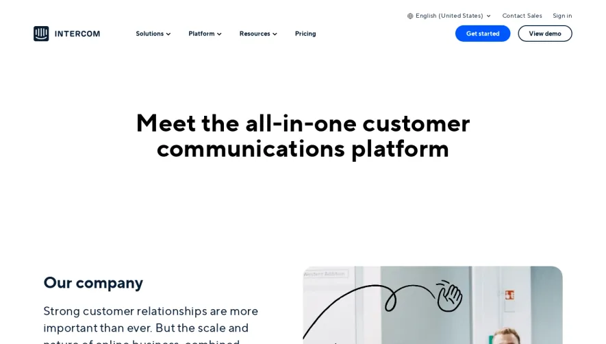

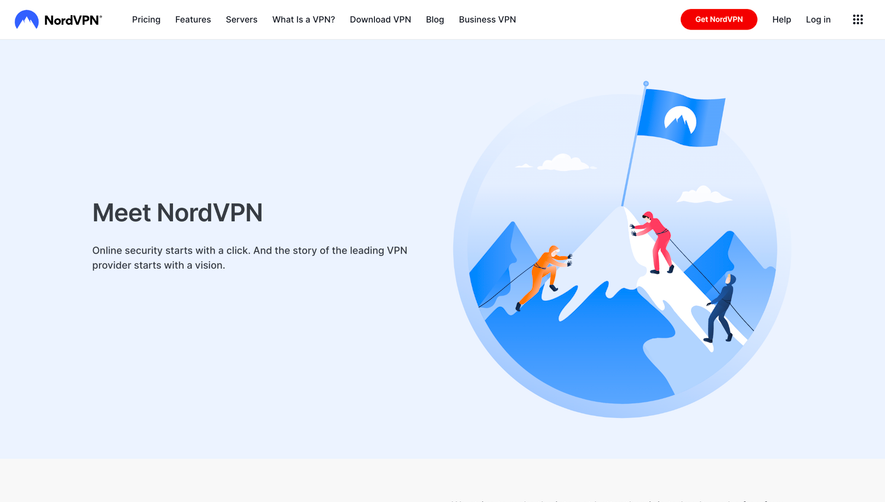

Upgrade to SaaSFrame Pro now to see similar examples.
Monthly
$18 /month
Billed $18 monthly
Browse all screens & flows
Filter and search screens & flows
Search text in screenshots
Access Figma files
Access mobile versions
Join now
Quarterly
$16 /month
Billed $48 quarterly
Browse all screens & flows
Filter and search screens & flows
Search text in screenshots
Access Figma files
Access mobile versions
Join now
Yearly
$15 /month
Billed $180 yearly
Browse all screens & flows
Filter and search screens & flows
Search text in screenshots
Access Figma files
Access mobile versions
Join now