Design with AI
Generate a new design based on this screen using your own content.
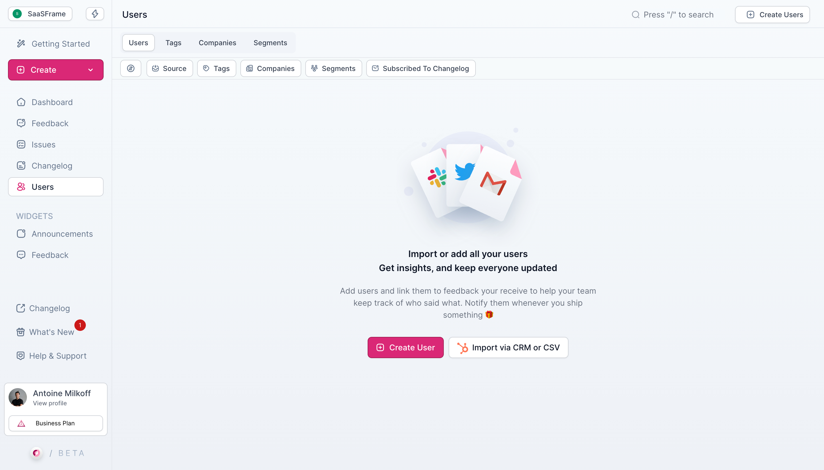
# Design from Reference: Olvy Empty State
Create an original, high-fidelity visual design inspired by the reference. Prioritize composition, typography, colors, spacing, and component styling over technical implementation.
## Reference
- **Product:** Olvy
- **Category:** Empty State
- **Screenshot:** https://cdn.prod.website-files.com/5e9dc792e1210c5325f7ebbc/6acc0c3052f808a00f52b0be_6acc0842c05a50e0f93047f9_cms-0b0082f8c8817708a7d83ddc-v3.webp
Analyze the screenshot first. If inaccessible, request it rather than guessing.
## Content
{{content.instructions}}
{{content.data}}
Preserve essential messaging and factual accuracy. Adapt structure and copy length for visual balance; never invent product claims.
## Visual Design
### Overall aesthetic
- **Character:** Soft, airy user-management empty state with pale blue-gray surfaces, bright magenta actions and a friendly integration illustration.
### Page composition
- **Canvas:** 2880 × 1642 screenshot pixels; CSS estimates assume approximately 2× scale.
- **Structure:** Narrow left navigation, top Users header/search/create control, tab strip and filter chips. A centered empty-state stack occupies the open main area.
### Information hierarchy
- **Priority:** Illustrated Slack/Twitter/Gmail cards, two-line import message, supporting copy and paired create/import actions.
- **Context:** Users is selected in sidebar and tabs; filters remain available above the empty state.
### Typography
- **Family:** Neutral sans-serif; exact font is unverified.
- **Scale:** Estimated CSS empty heading 16–18px medium, body 14px, navigation 14px and small metadata 11–12px.
### Colors & surfaces
- **Sampled palette:** Pale blue-gray variants #F2F7FA, #F3F8FB, #F1F6F9 and #EEF2F8.
- **Accents:** Magenta primary action/active icons, white outlined secondary controls and muted blue-gray navigation.
### Components
- **Empty illustration:** Three overlapping tilted message/integration cards with soft shadows and small surrounding dots.
- **Controls:** Magenta Create User, outlined CRM/CSV import, compact filter chips and segmented tabs.
- **Geometry:** Estimated 6px control radii, 36–40px primary action heights and fine pale borders; profile/plan card anchors sidebar bottom.
### Visual rhythm
- **Spacing:** Large blank main canvas frames the central stack; roughly 24–32px separates image, heading, copy and actions.
### Responsive
- **Guidance:** Mobile is not shown. Collapse sidebar, wrap filters and stack import/create actions while retaining the empty-state explanation.
### Adaptation guidance
- **Transfer:** Preserve the actionable empty-state pattern and import-versus-manual choice. Use supported integrations and relevant user-management copy.
Use this context to reproduce the reference's visual language: layout, typography, colors, spacing, borders, radii, and distinctive elements. The screenshot takes priority if descriptions conflict.
## Direction
{{preferences.fidelityInstructions}}
## Output
{{output.instructions}}
Deliver a polished, cohesive design with precise alignment, hierarchy, and spacing. Produce the requested visual artifact, not just a description. If unsupported, explain the limitation.