Design with AI
Generate a new design based on this screen using your own content.
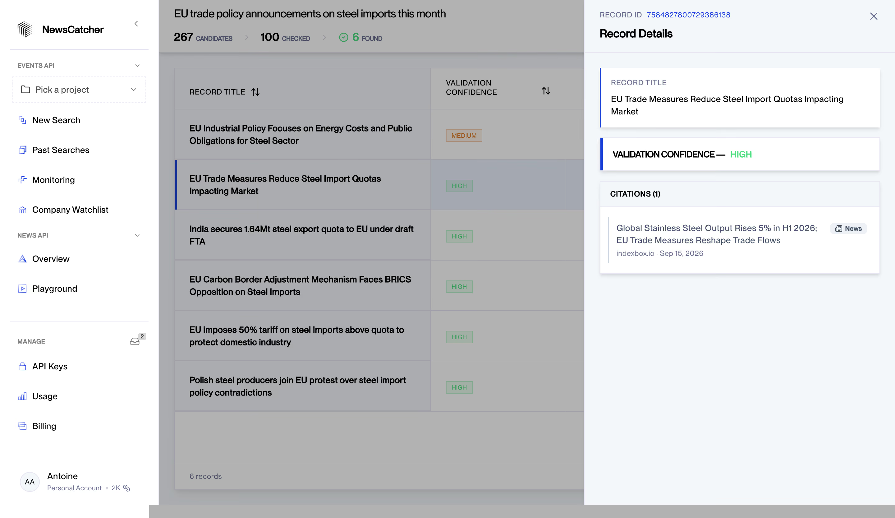
# Design from Reference: NewsCatcher Result Details
Create an original, high-fidelity visual design inspired by the reference. Prioritize composition, typography, colors, spacing, and component styling over technical implementation.
## Reference
- **Product:** NewsCatcher
- **Category:** Details
- **Screenshot:** https://cdn.prod.website-files.com/5e9dc792e1210c5325f7ebbc/6acad0e05af75170c4bbe274_6acad074610f0f51f4ed3f54_cms-35eeba5d9b9db89fe38f48cb.webp
Analyze the screenshot first. If inaccessible, request it rather than guessing.
## Content
{{content.instructions}}
{{content.data}}
Preserve essential messaging and factual accuracy. Adapt structure and copy length for visual balance; never invent product claims.
## Visual Design
### Overall aesthetic
- **Character:** A structured results dashboard with a light right-side detail drawer, blue selection markers and compact status labels.
- **Evidence scale:** Original 2880 × 1666 pixels. CSS estimates assume an unverified 2× capture scale; sampled backdrop grays include the visible overlay.
### Page composition
- **Sidebar:** Approximately 256 px white navigation rail with brand, project selector, grouped API links and account identity.
- **Results:** Search title/count summary and six-row table occupy the central area.
- **Drawer:** Approximately 500 px right panel overlays the results, with record metadata, title, confidence and citation cards.
- **Overlay:** The central results area is dimmed while the sidebar and drawer remain clearer.
### Information hierarchy
- **Selected record:** Blue vertical edge and pale row highlight identify the record behind the drawer.
- **Drawer title:** Record Details sits beneath a small ID label/value row.
- **Confidence:** Bold label and bright-green HIGH text make validation state easy to find.
- **Citation:** One source item has title, small type badge and smaller source/date metadata.
### Typography
- **Main/drawer headings:** Unverified sans-serif around 18 px semibold.
- **Table/body:** Approximately 14 px regular/medium with 20 px line height.
- **Metadata:** Around 12 px uppercase labels and smaller muted source details.
- **Counts:** Approximately 18 px bold numerals with compact uppercase descriptors.
### Colors & surfaces
- **Drawer:** Pale blue-gray #F4F7FA with white #FFFFFF cards.
- **Overlay:** Gray #B2B2B2 and #ABACAF are composited backdrop tones.
- **Ink:** Black #000000 headings and muted blue-gray metadata.
- **Accents:** Bright blue selection/ID details, green high-confidence labels and amber medium-confidence badge.
### Components
- **Drawer header:** Fine lower divider and unboxed close cross.
- **Title card:** White raised rectangle with a narrow blue left edge.
- **Confidence card:** Short matching raised strip with blue edge.
- **Citation group:** Light header bar above white source content, thin left rule beside text and small News pill.
- **Results table:** Large ruled rows, sortable headings and compact outlined confidence badges.
- **Sidebar:** Icon-led links, uppercase group labels and dashed project selector.
### Visual rhythm
- **Drawer padding:** Approximately 24 px outer inset and 16 px inner card padding.
- **Card gaps:** Around 16 px between title, status and citations.
- **Table rhythm:** Tall roughly 80 px rows support wrapped titles.
- **Alignment:** Drawer cards share consistent edges, distinct from the dimmed table grid.
### Responsive
- **Observed limit:** Desktop drawer only; mobile behavior is unverified.
- **Recommendation:** Use a full-screen detail view on narrow screens and retain clear return/close navigation.
- **Content handling:** Wrap titles and citation metadata without compressing status labels.
### Adaptation guidance
- **Retain:** Keep result context visible while exposing record evidence in a structured drawer.
- **Implement:** Use pale drawer surfaces, white cards and restrained blue/green state accents.
- **Verify:** Confirm font, scale and validation/citation semantics separately; screenshot news content is not independently verified.
Use this context to reproduce the reference's visual language: layout, typography, colors, spacing, borders, radii, and distinctive elements. The screenshot takes priority if descriptions conflict.
## Direction
{{preferences.fidelityInstructions}}
## Output
{{output.instructions}}
Deliver a polished, cohesive design with precise alignment, hierarchy, and spacing. Produce the requested visual artifact, not just a description. If unsupported, explain the limitation.