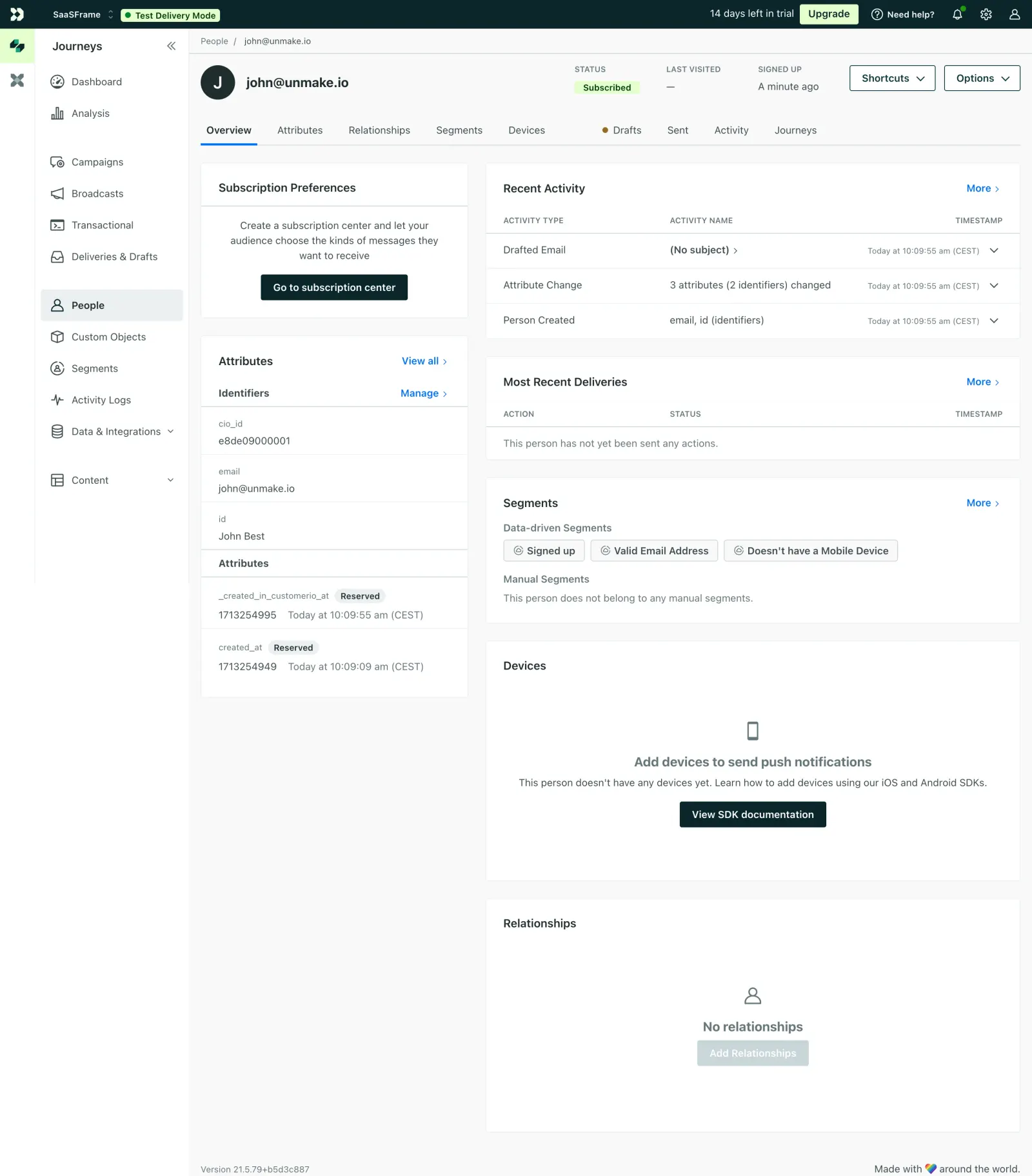
First thing you notice is how well the two-column layout organizes a ton of data without feeling cramped. Left side handles identity stuff like attributes and identifiers. Right side covers activity, segments, and devices. It's a smart split that mirrors how you'd actually think about a customer.
Restrained Color, Strong Hierarchy
The palette is mostly white and gray with that green "Subscribed" badge pulling your eye right to the status. The segment chips with their little checkmark icons are a subtle but effective touch. Typography is small and functional, nothing fancy, but the bold/regular weight contrast does the heavy lifting for scannability. Tab navigation up top with that orange dot on "Drafts" is a great way to signal pending items without being obnoxious.
What Makes It Stand Out
The empty states are genuinely helpful here. Instead of just saying "nothing to see," the Devices section offers a clear CTA to view SDK docs. That's thoughtful product design baked into the UI. The left sidebar's icon + label combo keeps navigation tight. Customer.io knows their audience and it shows.
 SaaSFrame
 Customer.ioCustomer engagement for tech-savvy marketers