
Thank you! Your submission has been received!
Oops! Something went wrong while submitting the form.
Get SaaSFrame Pro
Monthly
$18
Quarterly
$48
Yearly
$180
Upgrade to access this feature
Browse all screens & flows
Filter and search screens & flows
Access Figma files
Access mobile versions
Bookmark screens & flows
Join now
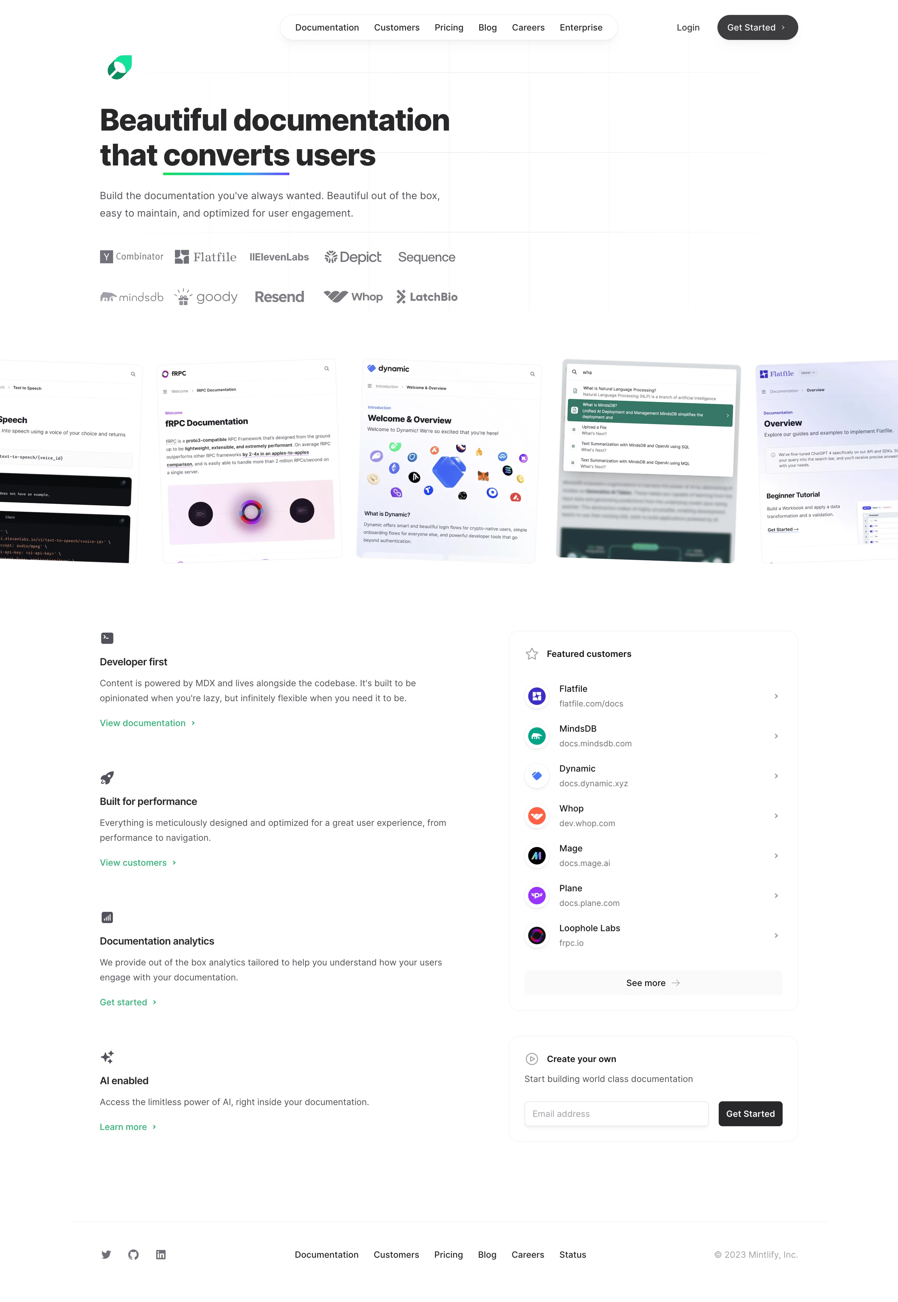
Mintlify Landing Page

Mintlify
Beautiful documentation that converts users
Designed by
No items found.

Bookmark
Bookmark

Design with AI
Thank you! Your submission has been received!
Oops! Something went wrong while submitting the form.
# Design from Reference: Mintlify Landing Page
Create an original, high-fidelity visual design inspired by the reference. Prioritize composition, typography, colors, spacing, and component styling over technical implementation.
## Reference
- **Product:** Mintlify
- **Category:** Landing Page
- **Screenshot:** https://cdn.prod.website-files.com/5e9dc792e1210c5325f7ebbc/6acad5ced05a3f53c0a6e4c0_6acad546a43009b06fe5f1c2_cms-fa4c852ab8d13a0c9c0fdcb1.webp
Analyze the screenshot first. If inaccessible, request it rather than guessing.
## Content
{{content.instructions}}
{{content.data}}
Preserve essential messaging and factual accuracy. Adapt structure and copy length for visual balance; never invent product claims.
## Visual Design
### Overall aesthetic
- **Character:** An exceptionally airy documentation-product landing page uses white space, faint grid lines, charcoal typography and small green accents.
- **Proof style:** A horizontal procession of tilted documentation screenshots provides the most colorful and detailed imagery.
### Page composition
- **Capture scale:** The source is 2880 × 4178 pixels; a 2× capture is plausible but unverified. Sizes below estimate CSS pixels at half source resolution.
- **Header:** A floating pill navigation centers six links, with Login and a dark Get Started capsule to the right. A small green brand mark sits below and left.
- **Hero:** A left-aligned two-line headline, short paragraph and two rows of customer logos occupy a subtly gridded area with extensive empty space to the right.
- **Showcase:** Five documentation examples span beyond both viewport edges, creating a slightly rotated gallery band.
- **Lower layout:** Four icon-led feature explanations stack in the left column. The right column contains a featured-customer list and a smaller email signup card.
- **Footer:** A thin rule precedes social icons, a horizontal link group and subdued copyright.
### Information hierarchy
- **Headline:** Large bold text and a short multicolor underline emphasize the conversion message.
- **Evidence:** Muted customer logos lead into detailed documentation examples before feature explanations.
- **Lower actions:** Green feature links offer contextual next steps; the dark signup button stands out within the right-hand form card.
### Typography
- **Family:** A modern sans serif appears throughout; exact identity is unverified.
- **Hero:** Approximately 48-pixel bold heading with about 56-pixel leading; supporting copy is around 16 pixels with 28-pixel leading.
- **Feature roles:** Small bold titles around 16 pixels sit above 14-pixel gray descriptions with roughly 24-pixel leading.
- **Navigation/list roles:** Header links, customer names and footer links use approximately 14 pixels; customer URLs are smaller and muted.
### Colors & surfaces
- **Measured base:** White #FFFFFF and nearby #FEFEFE dominate the page.
- **Measured ink:** Charcoal #27272A and deep #101217 provide primary contrast.
- **Measured soft surface:** #FAFAFA appears among faint panel/control backgrounds.
- **Accent relationships:** Bright green marks the logo and links; the headline underline shifts through green, cyan and purple. Customer examples retain their own branding colors.
### Components
- **Navigation capsule:** A white rounded pill with a fine border and soft shadow encloses evenly spaced links.
- **Gallery cards:** Tall cropped browser/documentation views have subtle borders and small radii; slight rotations create movement without a heavy frame.
- **Feature blocks:** Small monochrome icons precede title, paragraph and green arrow link, with no enclosing card.
- **Customer list:** A large outlined rounded card contains circular brand icons, name/URL pairs, trailing chevrons and a pale See more footer button.
- **Signup:** A smaller outlined card includes a brief heading, description, email field and dark rectangular Get Started button.
- **Footer:** Social marks and text links remain simple, without large background bands.
### Visual rhythm
- **Container:** Main text and lower columns align around a roughly 1120-pixel centered area.
- **Whitespace:** Large gaps separate hero, gallery and lower details; the blank right hero area is a visible compositional choice.
- **Lists:** Customer rows use repeated icon/text offsets; feature blocks use much larger vertical intervals than their internal text spacing.
### Responsive
- **Observed state:** Only a desktop capture is supplied; mobile arrangement is unverified.
- **Recommended flow:** Stack lower columns, wrap customer logos and replace the wide navigation pill with a compact menu when necessary.
- **Recommended gallery:** Preserve proportional screenshots with intentional overflow or horizontal scrolling, without making text content depend on tiny screenshot details.
### Adaptation guidance
- **Preserve restraint:** Keep the white canvas, faint grid and selective green links.
- **Maintain proof:** Retain customer marks and documentation imagery as separate evidence layers before the feature list.
- **Form resilience:** Allow the email field and button to stack on narrow screens and provide a persistent field label.
- **Implementation estimates:** Use a roughly 1120-pixel container, 48-pixel hero heading and thin rounded outlines, then tune against source pixels.
Use this context to reproduce the reference's visual language: layout, typography, colors, spacing, borders, radii, and distinctive elements. The screenshot takes priority if descriptions conflict.
## Direction
{{preferences.fidelityInstructions}}
## Output
{{output.instructions}}
Deliver a polished, cohesive design with precise alignment, hierarchy, and spacing. Produce the requested visual artifact, not just a description. If unsupported, explain the limitation.


Category
Patterns
No items found.
Tech Stack

Added on
November 22, 2023
Similar screens







Upgrade to SaaSFrame Pro now to see similar examples.
Monthly
$18 /month
Billed $18 monthly
Browse all screens & flows
Filter and search screens & flows
Search text in screenshots
Access Figma files
Access mobile versions
Join now
Quarterly
$16 /month
Billed $48 quarterly
Browse all screens & flows
Filter and search screens & flows
Search text in screenshots
Access Figma files
Access mobile versions
Join now
Yearly
$15 /month
Billed $180 yearly
Browse all screens & flows
Filter and search screens & flows
Search text in screenshots
Access Figma files
Access mobile versions
Join now