
Thank you! Your submission has been received!
Oops! Something went wrong while submitting the form.
Get SaaSFrame Pro
Monthly
$18
Quarterly
$48
Yearly
$180
Upgrade to access this feature
Browse all screens & flows
Filter and search screens & flows
Access Figma files
Access mobile versions
Bookmark screens & flows
Join now
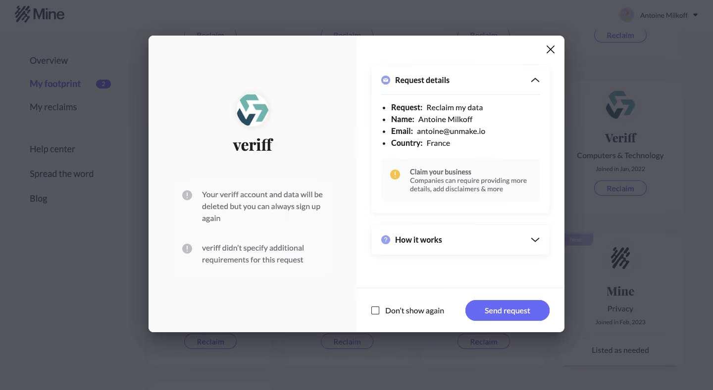
Mine Dashboard

Mine
Data ownership
Designed by
No items found.

Bookmark
Bookmark

Design with AI
Thank you! Your submission has been received!
Oops! Something went wrong while submitting the form.
# Design from Reference: Mine Dashboard
Create an original, high-fidelity visual design inspired by the reference. Prioritize composition, typography, colors, spacing, and component styling over technical implementation.
## Reference
- **Product:** Mine
- **Category:** Details
- **Screenshot:** https://cdn.prod.website-files.com/5e9dc792e1210c5325f7ebbc/6acbca398313d4c6c0cc40cd_6acbc83575891049b18253f8_cms-a529a06052280ce4fd4a7209.webp
Analyze the screenshot first. If inaccessible, request it rather than guessing.
## Content
{{content.instructions}}
{{content.data}}
Preserve essential messaging and factual accuracy. Adapt structure and copy length for visual balance; never invent product claims.
## Visual Design
### Overall aesthetic
- **Style:** A two-column request-confirmation dialog overlays a dimmed privacy dashboard.
- **Contrast:** White and near-white modal surfaces, dark text and violet action controls concentrate attention within the dialog.
### Page composition
- **Canvas:** Source 1440 × 789 pixels; measurements use the 1400 × 767 inspection view. CSS scale is unverified.
- **Backdrop:** A gray veil covers the app header, left navigation and company cards. My footprint appears selected behind the dialog.
- **Modal:** Approximately 816 × 584px, positioned near x292, y70, with roughly equal left/right halves.
- **Left:** A pale panel contains the company mark, wordmark and two warning-style explanatory rows.
- **Right:** White panel contains an expanded Request details card, collapsed How it works card and bottom action footer.
- **Close:** A small cross sits at the dialog’s upper right.
### Information hierarchy
- **Identity:** Company logo and wordmark establish which service the request concerns.
- **Consequences:** Two left-column notices explain account/data removal and the absence of additional requirements.
- **Request summary:** The expanded right card uses a bullet list with bold field labels and regular values. Personal values are visible but are not reproduced here.
- **Advisory:** An inset warning block follows the summary; a separate collapsed explanation row sits below.
- **Action:** Send request is the dominant violet pill; an unchecked Don’t show again control sits to its left.
### Typography
- **Dialog text:** Approximately 14–16px sans serif with 22–24px line height.
- **Card headings:** Around 16px bold; summary labels use matching bold weight.
- **Company wordmark:** A heavier serif treatment around 30px contrasts with the interface sans serif.
- **Action:** Approximately 14px semibold white. Font identities are unverified.
### Colors & surfaces
- **Measured modal surfaces:** #FFFFFF, #F9F9F9 and #FAFAFA.
- **Measured backdrop:** Gray-blue veil tones include #54555D, #55565E, #53545C, #53555D and #52535B.
- **Accents:** Violet primary action and small lavender information icons contrast with gray notice icons and a yellow warning icon.
- **Elevation:** Soft shadows beneath the white disclosure cards and a stronger broad modal shadow distinguish the nested layers.
### Components
- **Modal shell:** Approximately 9px corner radius, white outer shell and strong diffuse shadow; left panel shares the rounded outer corners.
- **Details card:** Roughly 350 × 292px, about 12px radius, subtle shadow and 20px padding. Header has a small circular icon and upward chevron.
- **Inset advisory:** Pale rounded rectangle with yellow exclamation icon, bold short label and smaller multiline explanation.
- **Collapsed disclosure:** Approximately 350 × 59px with matching shadow/radius, lavender question icon and downward chevron.
- **Footer:** Thin top divider, compact square checkbox and approximately 165 × 41px violet pill.
- **Captured state:** Details expanded, explanation collapsed, checkbox unchecked. No sent/success state is shown.
### Visual rhythm
- **Column balance:** Left identity is centered high in the panel; explanatory rows sit well below with large vertical separation.
- **Right stack:** About 23px separates disclosure cards; roughly 29px side insets frame them.
- **Footer spacing:** Actions sit within an approximately 87px-tall bottom band, aligned to one horizontal baseline.
- **Text:** Summary bullets use tight consistent vertical spacing, while notices use more open multiline spacing.
### Responsive
- **Observed scope:** Desktop dialog only; narrow layouts and disclosure behavior are unverified.
- **Recommended modal:** Stack company/consequence information above request details on small screens.
- **Recommended scrolling:** Constrain dialog height to the viewport and allow internal content scrolling while keeping actions reachable.
- **Recommended actions:** Preserve full action labels and readable summary values; allow footer controls to wrap.
### Adaptation guidance
- **Preserve:** Clear company identity, consequences before submission and a reviewable request summary.
- **Privacy:** Use supplied data and mask sensitive values in shared previews; avoid copying personal details into reusable design content.
- **Interaction:** Define disclosure, checkbox and request-submission states explicitly, including progress and success feedback.
- **Accessibility:** Use semantic dialog labeling, focus management, named close control and programmatic expanded states.
Use this context to reproduce the reference's visual language: layout, typography, colors, spacing, borders, radii, and distinctive elements. The screenshot takes priority if descriptions conflict.
## Direction
{{preferences.fidelityInstructions}}
## Output
{{output.instructions}}
Deliver a polished, cohesive design with precise alignment, hierarchy, and spacing. Produce the requested visual artifact, not just a description. If unsupported, explain the limitation.


Category
Patterns
Tech Stack


Added on
February 4, 2023
Similar screens
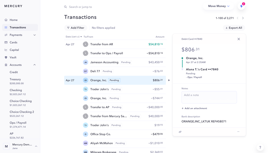


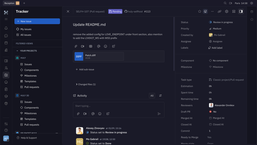



Upgrade to SaaSFrame Pro now to see similar examples.
Monthly
$18 /month
Billed $18 monthly
Browse all screens & flows
Filter and search screens & flows
Search text in screenshots
Access Figma files
Access mobile versions
Join now
Quarterly
$16 /month
Billed $48 quarterly
Browse all screens & flows
Filter and search screens & flows
Search text in screenshots
Access Figma files
Access mobile versions
Join now
Yearly
$15 /month
Billed $180 yearly
Browse all screens & flows
Filter and search screens & flows
Search text in screenshots
Access Figma files
Access mobile versions
Join now