Overall Style & Aesthetic
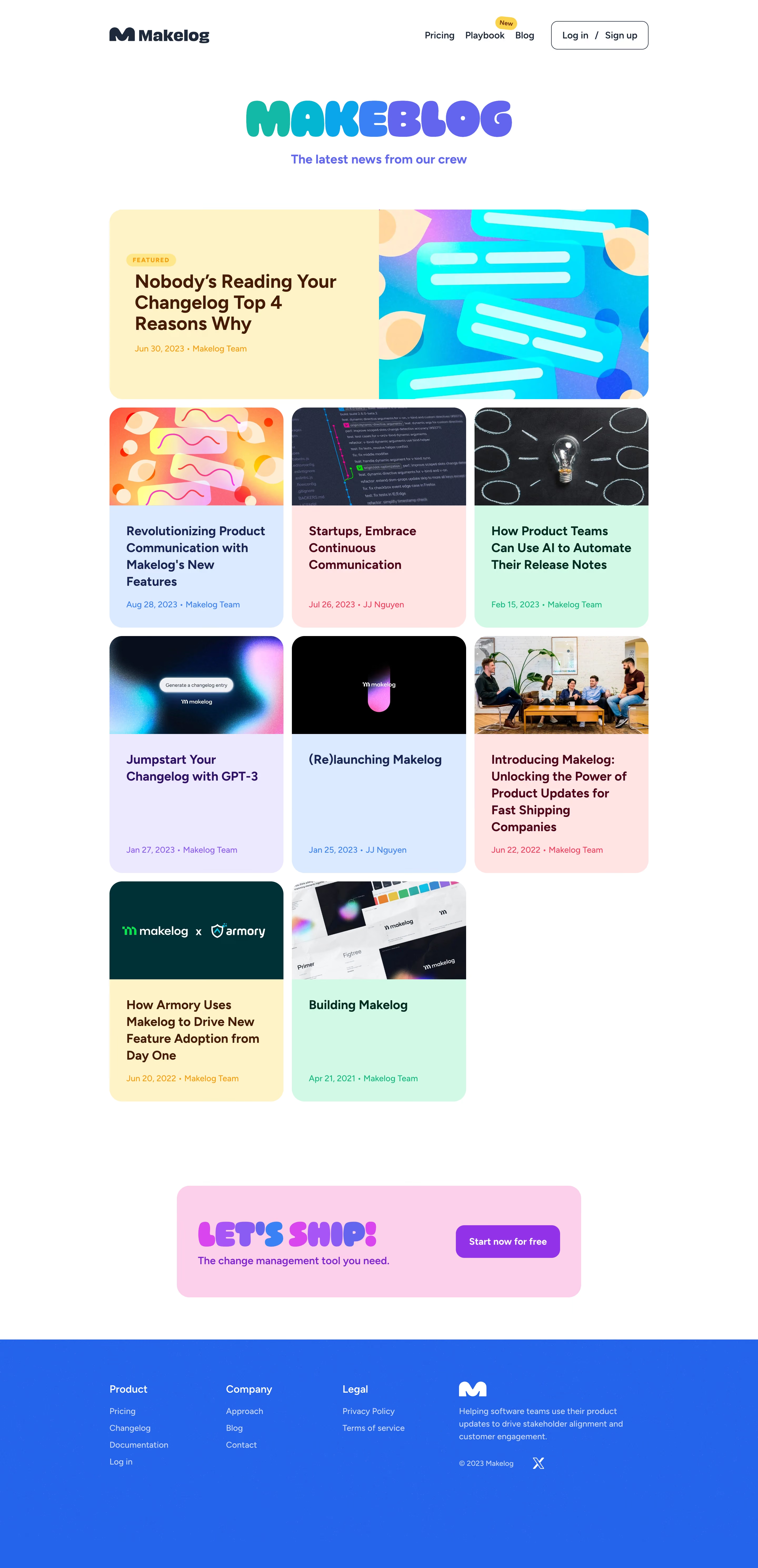
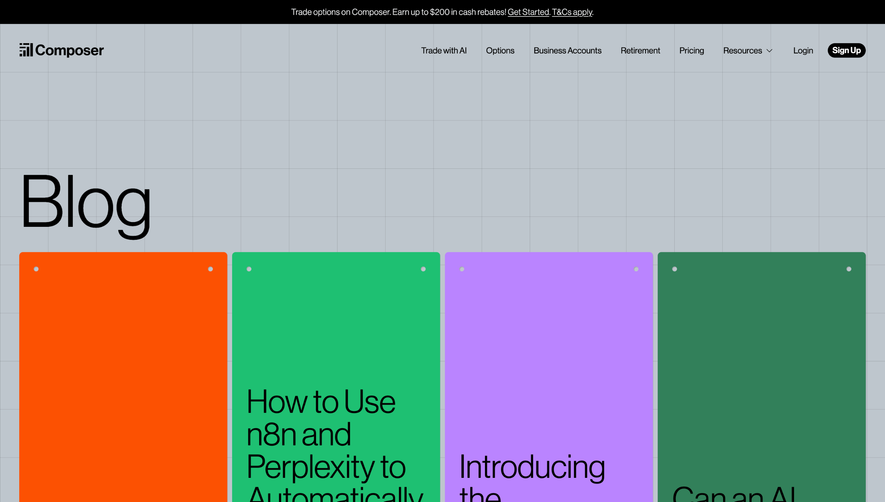
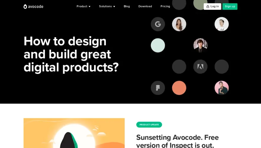
Makelog’s blog page exudes a sleek, modern professionalism. The design leans into minimalism, balancing generous whitespace with bold, colorful accent elements. The visual tone feels approachable yet technologically advanced—a blend perfect for SaaS, projecting trustworthiness and product maturity without feeling sterile. Layout & Structure
The structure is straightforward and highly scannable. A clean hero header with prominent branding sets the stage, followed by a grid of blog cards. Each card highlights featured posts with clear titles, dates, and author info, facilitating rapid browsing. The sticky sidebar navigation remains visible for easy topic filtering. There’s no clutter of side widgets, pop-ups, or distractions—just pure content focus, with a polished, compact footer anchoring the page. Visual Elements
Visuals are subtle yet effective: playful illustrations in article thumbnails, crisp SVG icons for navigation, and minimal photography ensuring uniformity. Consistent rounded corners and gentle drop shadows add depth without overwhelming the user. Smooth hover animations on links and cards give the interface a tactile, responsive feel. Color Palette & Typography
A crisp white background dominates, accentuated by a signature blue for calls-to-action and interactive states. Grayscale neutrals support legibility in body copy and metadata, while splashes of orange inject warmth. Typography is modern and geometric—likely an open sans-serif—featuring strong font hierarchy for headlines, subheads, and snippets. User Experience Patterns & Standout Features
Navigation is persistent but subtle, with filtering that encourages deep content exploration. Well-sized CTAs (“Subscribe,” “Read more”) are strategically placed. The overall tone is innovative and inviting, thanks to deft micro-interactions and smart layout choices, showcasing design restraint and SaaS sensibility that’s both engaging and user-centric.