Design with AI
Generate a new design based on this screen using your own content.
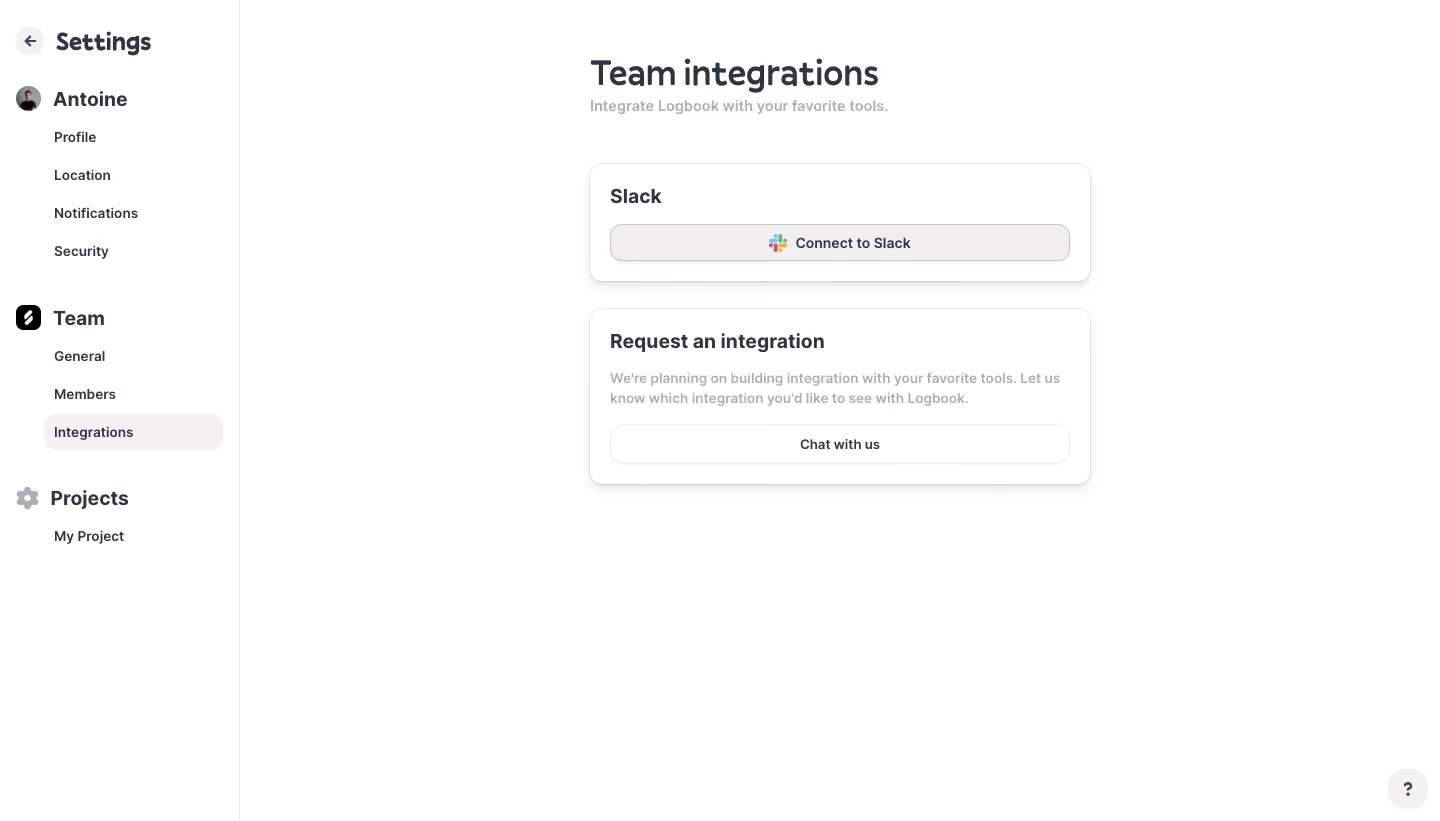
# Design from Reference: Logbook Integrations Settings
Create an original, high-fidelity visual design inspired by the reference. Prioritize composition, typography, colors, spacing, and component styling over technical implementation.
## Reference
- **Product:** Logbook
- **Category:** Integrations
- **Screenshot:** https://cdn.prod.website-files.com/5e9dc792e1210c5325f7ebbc/6acb6eaa2837b9f3168fb6f7_6acb6cae82df6283972aa423_cms-81739036d787b09c4b11bec0.webp
Analyze the screenshot first. If inaccessible, request it rather than guessing.
## Content
{{content.instructions}}
{{content.data}}
Preserve essential messaging and factual accuracy. Adapt structure and copy length for visual balance; never invent product claims.
## Visual Design
### Overall aesthetic
- **Style:** Quiet white settings interface with dark slate text, soft neutral selection fills and subtly elevated integration cards.
- **Character:** Rounded, slightly friendly typography and ample whitespace keep this small settings page approachable.
### Page composition
- **Canvas:** Source 1440 × 821 image pixels; measurements use the 1400 × 798 inspection rendering. CSS scale is unverified.
- **Sidebar:** A roughly 233px rail is divided from the main area by a pale vertical hairline. It contains a back/settings heading, personal settings, team settings and a project group.
- **Main column:** A roughly 488px-wide stack begins near x573. Heading at y57, subtitle directly below, first card at y159 and second at y300.
- **Support control:** A small rounded question-mark button sits at the bottom right, while most lower canvas remains empty.
### Information hierarchy
- **Page title:** Team integrations is the dominant heading, with a short muted explanatory subtitle.
- **Available integration:** The first card contains a Slack heading and a single full-width Connect to Slack control.
- **Request route:** The second card has a request heading, two-line supporting paragraph and a full-width Chat with us action.
- **Navigation:** Integrations is visibly selected under the Team group; larger group headings distinguish personal, team and project settings.
### Typography
- **Title:** Approximately 34px semibold with around 41px line height; exact rounded sans-serif family is unverified.
- **Card headings:** Approximately 20px semibold, around 25px line height.
- **Navigation:** Group headings around 20px bold, subordinate links around 14px medium with regular 37px vertical pitch.
- **Body and buttons:** About 14px, with supporting copy around 20px line height. Muted text has visibly lower contrast than action labels.
### Colors & surfaces
- **Measured base:** #FFFFFF dominates the page and cards.
- **Measured neutrals:** #F0EEEE and #F3F1F1 appear in soft gray surfaces; #323245 supplies dark slate text pixels.
- **Additional tones:** #FEFEFE, #FDFDFD, #F6F6F6 and #FCFCFC occur in subtle borders/shadow transitions rather than strong new surface layers.
- **Brand accent:** The multicolor Slack mark is confined to the integration button; the rest of the interface remains neutral.
### Components
- **Integration card:** Approximately 488 × 115px with around 12px radius, thin pale border, soft downward shadow and 20px padding.
- **Connect button:** Roughly 447 × 36px, pale warm-gray fill, slightly darker outline and about 12px radius. Slack icon and label form a centered inline group.
- **Request card:** Approximately 488 × 171px with matching shell treatment. Its white outlined action is around 447 × 39px.
- **Selected navigation:** A softly filled rounded rectangle about 174 × 35px sits behind the active link.
- **Icons:** Small avatar, team mark, gear and circular back arrow distinguish navigation groups. Help control is approximately 40px square.
- **States:** Only the unconnected Slack action and selected navigation item are visible; authorization, error and connected states are unverified.
### Visual rhythm
- **Card spacing:** Approximately 26px separates the cards; the first begins around 46px below the subtitle.
- **Internal spacing:** About 12–16px separates headings, body copy and actions. Card edges and all main text share a consistent left alignment.
- **Navigation grouping:** Large breaks separate the personal, team and project groups, while sublinks use an even vertical cadence.
### Responsive
- **Observed scope:** One desktop settings page is supplied; no narrow-screen layout is shown.
- **Recommended navigation:** Convert the sidebar into an accessible compact settings menu on small screens.
- **Recommended content:** Make the card stack fluid with 20–24px side padding; retain full-width buttons and allow explanatory copy to wrap naturally.
- **Touch targets:** Increase compact desktop controls toward comfortable mobile targets without changing their hierarchy.
### Adaptation guidance
- **Preserve:** Narrow main column, clear selected location, modest card shadows and one action per integration.
- **Extend:** Additional integrations can repeat the first card’s title/action pattern; keep the request route after available options.
- **Interaction:** Design connected status, disconnect confirmation, permission errors and loading feedback as explicit states.
- **Accessibility:** Maintain readable muted text, named icon controls and visible keyboard focus. These are implementation recommendations beyond the screenshot.
Use this context to reproduce the reference's visual language: layout, typography, colors, spacing, borders, radii, and distinctive elements. The screenshot takes priority if descriptions conflict.
## Direction
{{preferences.fidelityInstructions}}
## Output
{{output.instructions}}
Deliver a polished, cohesive design with precise alignment, hierarchy, and spacing. Produce the requested visual artifact, not just a description. If unsupported, explain the limitation.