
Thank you! Your submission has been received!
Oops! Something went wrong while submitting the form.
Get SaaSFrame Pro
Monthly
$18
Quarterly
$48
Yearly
$180
Upgrade to access this feature
Browse all screens & flows
Filter and search screens & flows
Access Figma files
Access mobile versions
Bookmark screens & flows
Join now
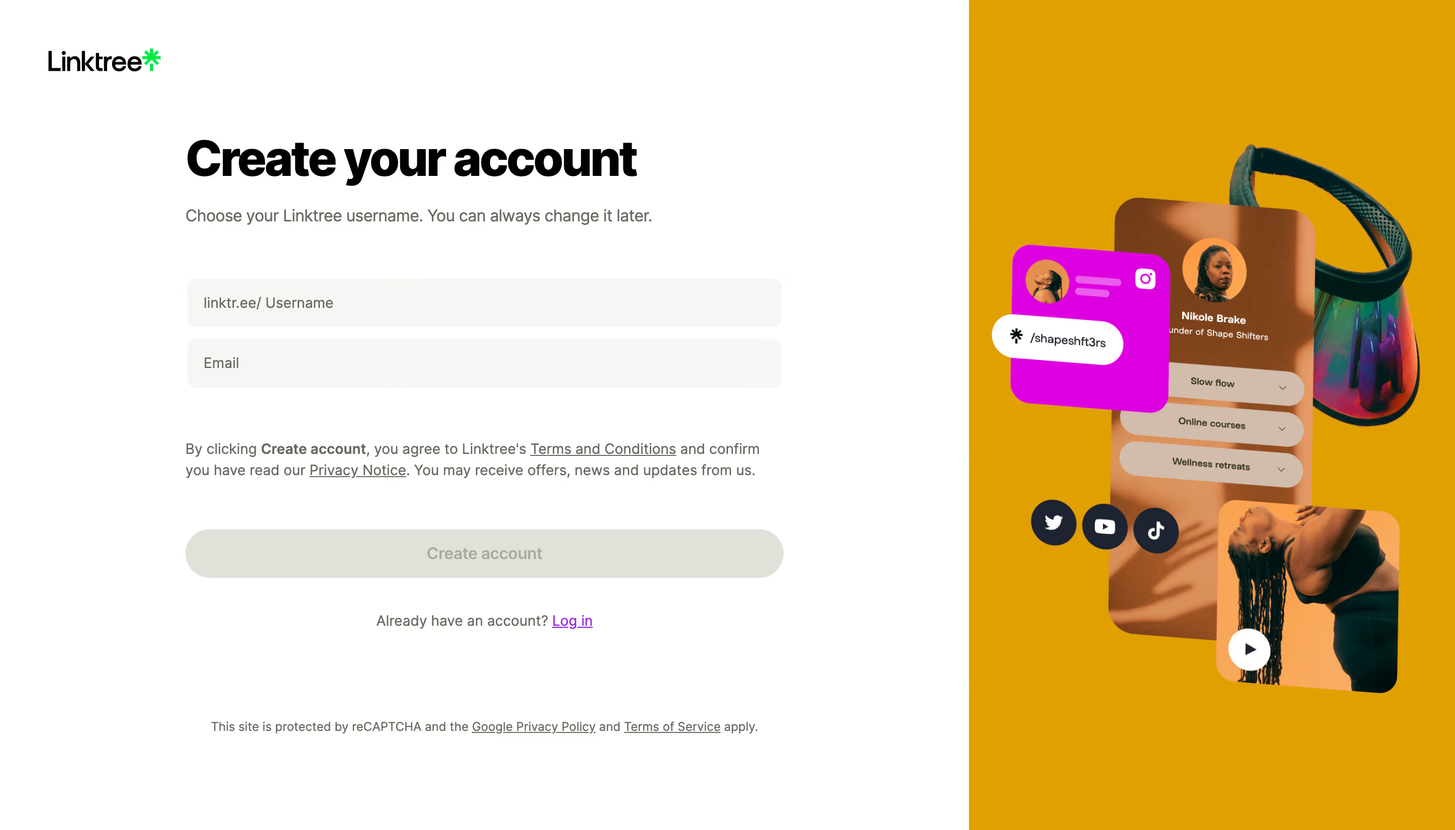
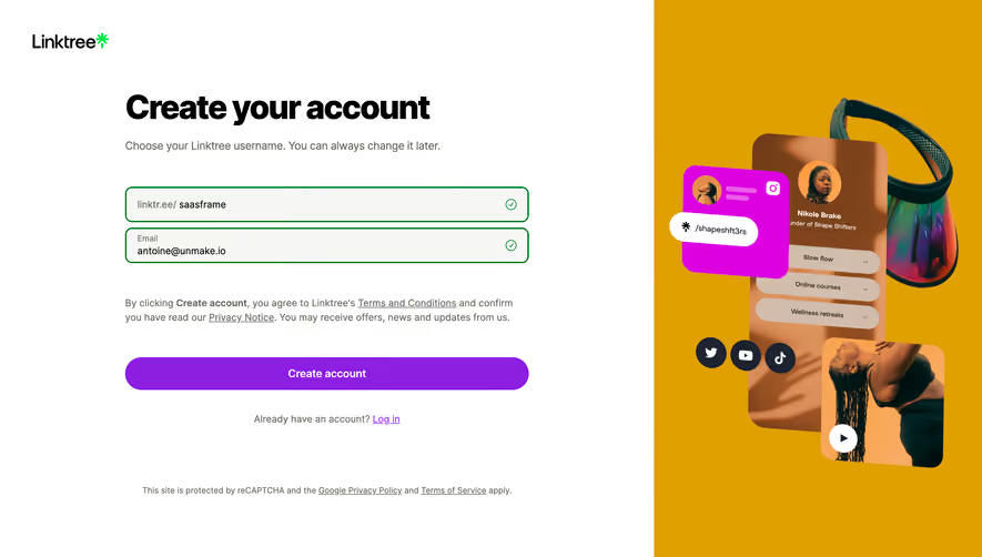
Linktree Signup

Linktree
Link in bio
Designed by
No items found.

Bookmark
Bookmark

Design with AI
Thank you! Your submission has been received!
Oops! Something went wrong while submitting the form.
# Design from Reference: Linktree Signup
Create an original, high-fidelity visual design inspired by the reference. Prioritize composition, typography, colors, spacing, and component styling over technical implementation.
## Reference
- **Product:** Linktree
- **Category:** Signup
- **Screenshot:** https://cdn.prod.website-files.com/5e9dc792e1210c5325f7ebbc/6acb6462b206c0d3f8f06609_6acb62d1baddc9f317de32b1_cms-e00532d3ce37991d151741db.webp
Analyze the screenshot first. If inaccessible, request it rather than guessing.
## Content
{{content.instructions}}
{{content.data}}
Preserve essential messaging and factual accuracy. Adapt structure and copy length for visual balance; never invent product claims.
## Visual Design
### Overall aesthetic
- **Character:** A split signup page combines a clean white form with a vivid ochre promotional collage.
- **Capture scale:** The screenshot measures 2880 × 1642 pixels. Approximate CSS dimensions assume a 1440 × 821 viewport at 2× density; this is unverified.
- **Tone:** Heavy black display text and pale controls keep registration clear, while the right-side artwork demonstrates a colorful creator profile.
### Page composition
- **Split:** The white form region occupies roughly two thirds of the width; an ochre image region fills the remaining third.
- **Brand:** A small Linktree wordmark sits upper left.
- **Form column:** A roughly 592px-wide centered stack contains the account heading, username explanation, two fields, legal copy and creation action.
- **Secondary links:** An account-login line sits below the action; small reCAPTCHA policy text appears near the bottom.
- **Artwork:** Overlapping creator profile, social card, product image and video preview form the right-side collage.
### Information hierarchy
- **Heading:** Create your account is the strongest text.
- **Instruction:** A short sentence explains choosing a username.
- **Fields:** Username with a visible domain prefix appears above Email.
- **Legal text:** Terms and privacy links sit between fields and the primary action.
- **Visible state:** Both fields are empty and Create account appears disabled.
- **Alternative path:** A purple login link follows the main action.
### Typography
- **Family:** A rounded geometric sans-serif is visible; exact identity is unverified.
- **Heading:** Approximately 48px CSS extra-bold with 56px line-height and tight tracking.
- **Instruction:** Approximately 16px regular, muted gray-green.
- **Fields:** Approximately 14px regular.
- **Legal text:** Approximately 14px with 22px line-height, with underlined links and selected bold wording.
- **Action:** Approximately 16px medium.
- **Fine print:** Approximately 12px near the bottom.
### Colors & surfaces
- **Main surface:** Sampled #FFFFFF supplies the form region.
- **Artwork background:** Sampled #DFA000 supplies the saturated ochre field.
- **Inputs:** Sampled #F6F7F5 supplies pale gray-green fields.
- **Disabled action:** Sampled #DEE2D8 supplies the muted creation button.
- **Artwork accents:** Sampled #DD00E0 supplies bright magenta; #D2BCAB contributes warm skin/profile tones.
- **Ink:** Sampled #000000 supplies the heavy title; #666B5E supplies secondary gray-green text.
### Components
- **Inputs:** Two approximately 590 × 48px CSS rectangles use pale fill, no strong border, 8px radii and 16px inset.
- **Username field:** A fixed linktr.ee/ prefix precedes the placeholder.
- **Creation action:** A matching-width pill around 48px high uses pale disabled fill and muted label.
- **Legal block:** Two compact lines include underlined terms/privacy destinations.
- **Creator collage:** A tall rounded profile panel overlaps a magenta social card, iridescent bag image and rounded video tile.
- **Social icons:** Three dark circular social buttons float across the profile collage.
- **Video mark:** A white circular play control appears on the lower image tile.
### Visual rhythm
- **Form spacing:** Large gaps separate instruction, fields, legal copy and action.
- **Input cadence:** Approximately 12px separates the two fields.
- **Alignment:** Heading, fields and legal copy share a left edge; action/login are centered.
- **Artwork density:** The right collage concentrates detail in the middle, leaving ochre margins around it.
- **Bottom space:** Fine print is separated from the main signup flow by a large blank region.
### Responsive
- **Evidence limit:** Only a desktop empty-form state is observed; validation and mobile behavior are unverified.
- **Layout recommendation:** Make the form full width and move or omit the collage on narrow screens.
- **Control recommendation:** Preserve readable field labels and domain-prefix behavior without horizontal overflow.
- **Action recommendation:** Keep disabled/enabled state clear and accessible.
- **Legal recommendation:** Allow policy copy to wrap naturally with adequate link targets.
### Adaptation guidance
- **Signup structure:** Preserve the concise two-field visible step and clear existing-account route.
- **Validation:** Define username availability, email errors and submission feedback separately.
- **Artwork:** Use authentic or representative creator assets without copying personal identifiers.
- **Accessibility:** Label both fields, expose the fixed username prefix meaningfully and provide keyboard focus.
- **Content scope:** The screenshot does not establish later password or verification steps.
Use this context to reproduce the reference's visual language: layout, typography, colors, spacing, borders, radii, and distinctive elements. The screenshot takes priority if descriptions conflict.
## Direction
{{preferences.fidelityInstructions}}
## Output
{{output.instructions}}
Deliver a polished, cohesive design with precise alignment, hierarchy, and spacing. Produce the requested visual artifact, not just a description. If unsupported, explain the limitation.


Category
Tech Stack

Added on
July 20, 2023




Similar screens







Upgrade to SaaSFrame Pro now to see similar examples.
Monthly
$18 /month
Billed $18 monthly
Browse all screens & flows
Filter and search screens & flows
Search text in screenshots
Access Figma files
Access mobile versions
Join now
Quarterly
$16 /month
Billed $48 quarterly
Browse all screens & flows
Filter and search screens & flows
Search text in screenshots
Access Figma files
Access mobile versions
Join now
Yearly
$15 /month
Billed $180 yearly
Browse all screens & flows
Filter and search screens & flows
Search text in screenshots
Access Figma files
Access mobile versions
Join now