Design with AI
Generate a new design based on this screen using your own content.
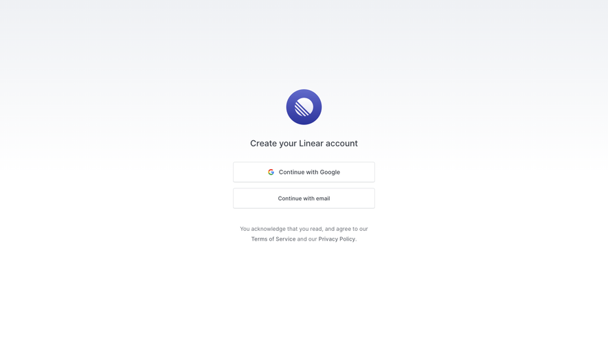
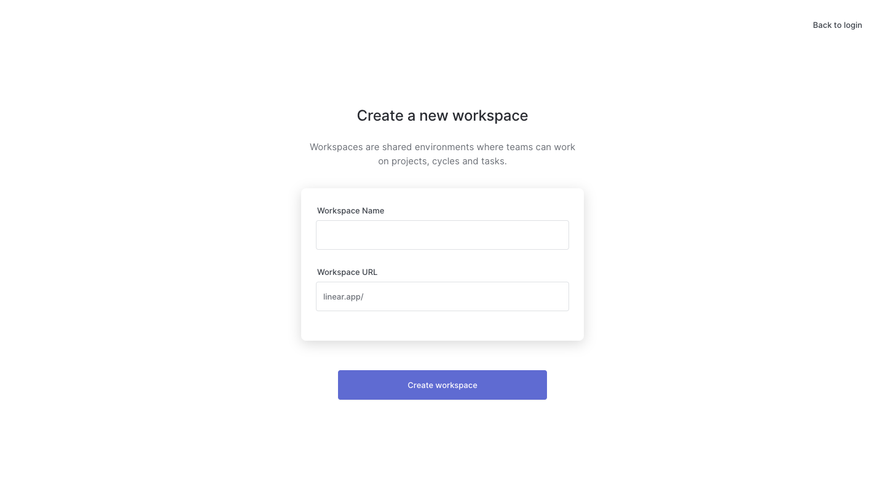
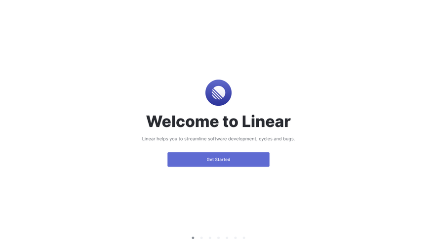
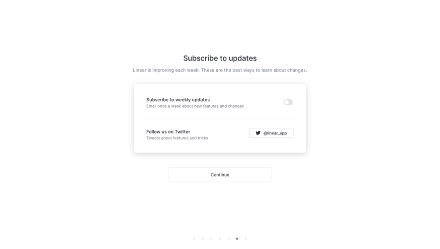
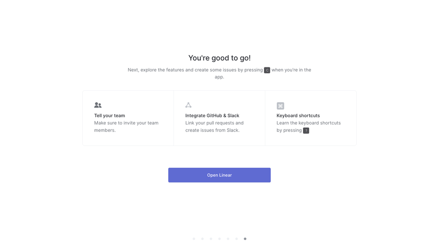
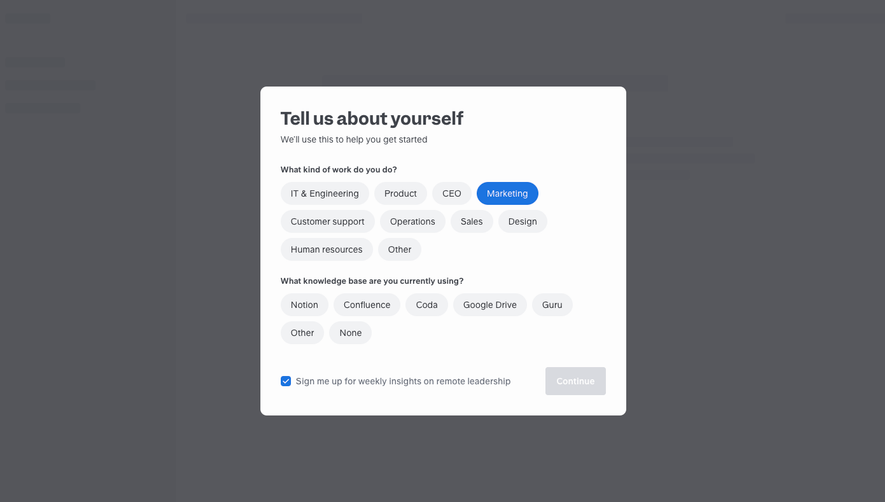
# Design from Reference: Linear Sign Up Flow
Create an original, high-fidelity visual design inspired by the reference. Prioritize composition, typography, colors, spacing, and component styling over technical implementation.
## Reference
- **Product:** Linear
- **Category:** Account Setup
- **Screenshot:** https://cdn.prod.website-files.com/5e9dc792e1210c5325f7ebbc/6acbca2f8313d4c6c0cc3f9d_6acbc81bad8ac5752786ab37_cms-f2d6f4d9a79694acc5d778d2.webp
Analyze the screenshot first. If inaccessible, request it rather than guessing.
## Content
{{content.instructions}}
{{content.data}}
Preserve essential messaging and factual accuracy. Adapt structure and copy length for visual balance; never invent product claims.
## Visual Design
### Overall aesthetic
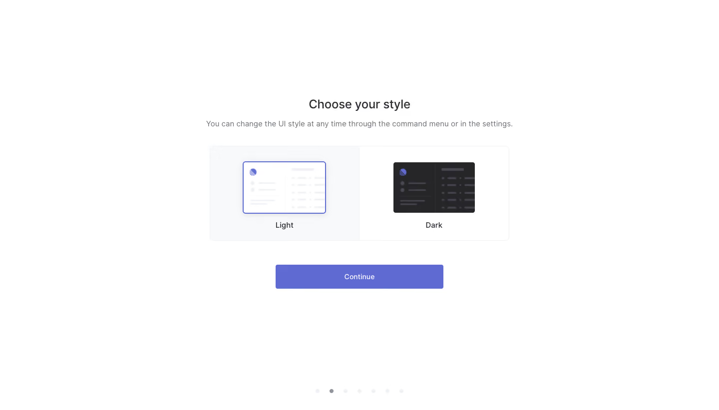
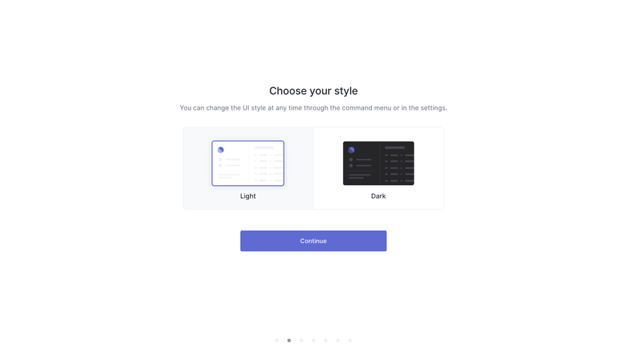
- **Character:** Sparse onboarding style selector with miniature interface previews and restrained periwinkle emphasis.
### Page composition
- **Canvas:** 1440 × 821 screenshot pixels; CSS estimates are near screenshot scale, with capture scale unverified.
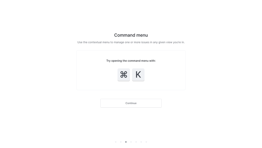
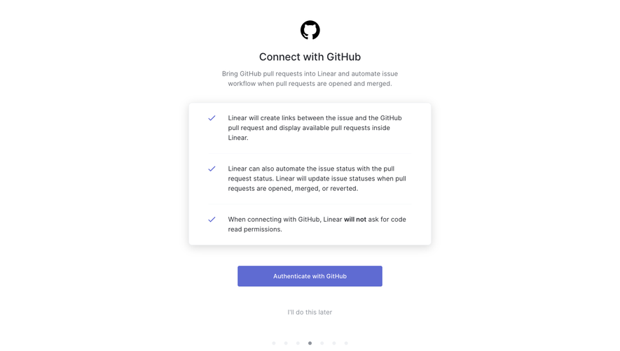
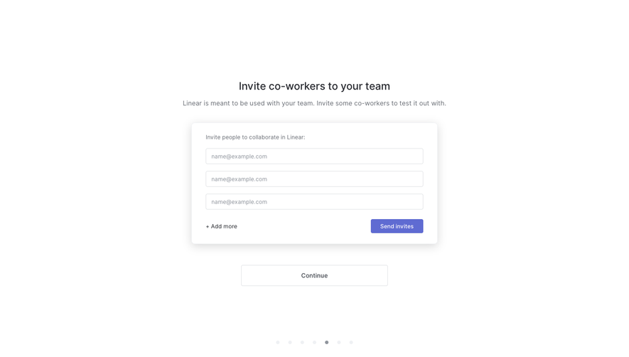
- **Structure:** Centered title/helper, two-part selection panel, Continue button and a low progress-dot row.
### Information hierarchy
- **Priority:** Choose your style introduces Light and Dark preview options. Light is visibly selected with a violet border/shadow.
### Typography
- **Family:** Neutral sans-serif; exact font is unverified.
- **Scale:** Estimated CSS title 24px medium, helper/option labels 14–16px and action 14px.
### Colors & surfaces
- **Sampled palette:** White #FFFFFF; light preview surface #F8F9FB; dark preview #262628; action periwinkle #5F6BD2; subtle rules #EFF1F4.
- **Contrast:** Dark text and muted gray helper copy keep the choice panel calm.
### Components
- **Selector:** Roughly 600px CSS-wide bordered rounded panel split into two equal halves; simplified app thumbnails above labels.
- **Action:** Approximately 336 × 48px CSS rectangle with 4px radius.
- **Progress:** Seven tiny dots with a darker second dot indicate the current captured step.
### Visual rhythm
- **Spacing:** Generous 32–48px gaps between helper, options and action; extensive blank page margins.
### Responsive
- **Guidance:** Mobile is not shown. Keep previews large enough to distinguish themes, stacking options if necessary.
### Adaptation guidance
- **Transfer:** Preserve preview-based theme choice and clear selection styling. Use target interface previews and accurate progress.
Use this context to reproduce the reference's visual language: layout, typography, colors, spacing, borders, radii, and distinctive elements. The screenshot takes priority if descriptions conflict.
## Direction
{{preferences.fidelityInstructions}}
## Output
{{output.instructions}}
Deliver a polished, cohesive design with precise alignment, hierarchy, and spacing. Produce the requested visual artifact, not just a description. If unsupported, explain the limitation.