Overall Style and Aesthetic
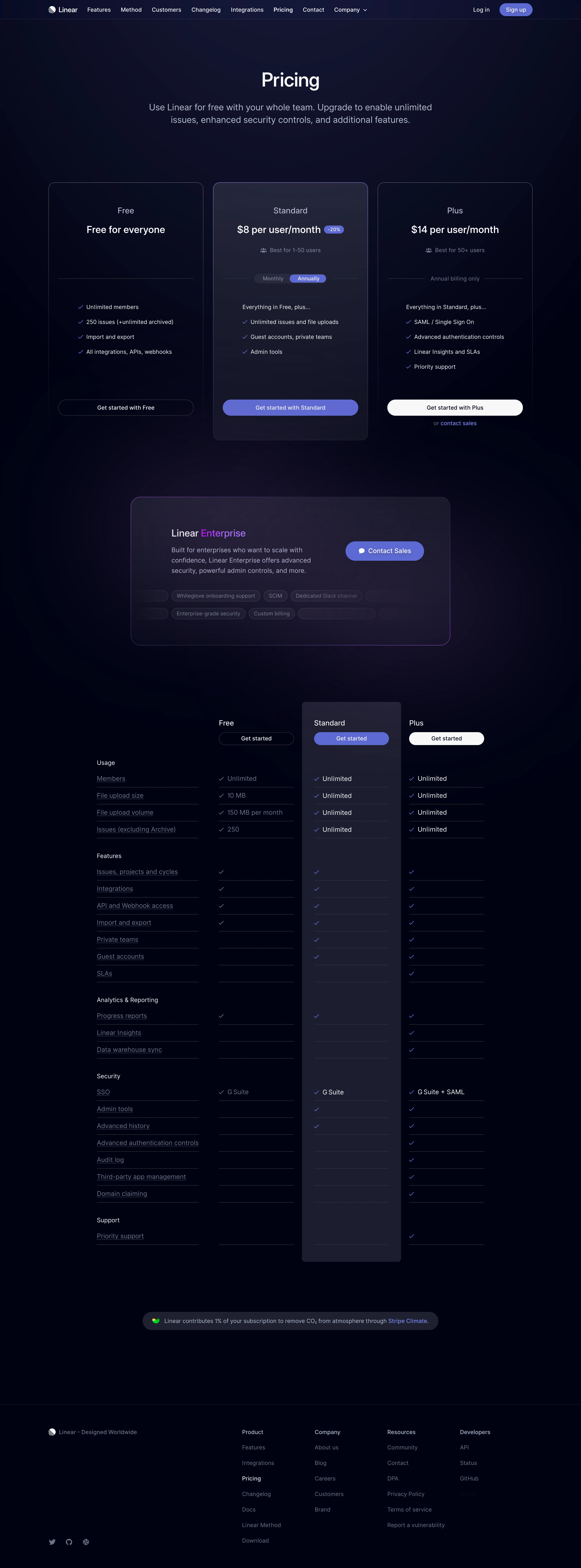
Linear’s pricing page embodies a minimalist and modern aesthetic, favoring clarity and sophistication over visual clutter. The interface is streamlined, with generous white space that channels attention toward essential information. The atmosphere is unmistakably professional, exuding calm confidence rather than loud exuberance. Layout and Structure
The layout is razor-sharp, beginning with a concise headline and a trio of pricing plans presented in parallel columns. Each plan is organized for easy scanning, with bold plan names, succinct summaries, and prominent call-to-action buttons. Just below, a side-by-side feature comparison leverages a clean grid, making it effortless to discern what’s included at each tier. Supplemental sections, like the FAQ and gentle footer, are neatly tucked to minimize scroll fatigue. Visual Elements
Linear eschews busy illustrations and distracting imagery, opting for refined iconography and purposeful line dividers. Brief, animated checkmarks reinforce selected features, adding subtle movement without overwhelming the user. Microinteractions, such as plan highlights when hovered, create a polished and interactive experience. Color Palette and Typography
The color palette is understated yet effective—anchored by deep, neutral grays and punctuated with energetic accents (like violet and electric blue) that guide the eyes to key actions. Typography is contemporary and functional: elegant sans-serif fonts establish hierarchy, using size and weight variations to emphasize plan names, prices, and features. User Experience Patterns
Navigation remains persistently accessible via a slim-top bar. Pricing CTAs are clear and placed for immediate access. Responsive design ensures seamless usability across devices. The entire page encourages swift comparison and informed decisions while removing visual friction. Unique or Notable Design Choices
Linear’s refusal to rely on conventional SaaS visuals (like stock images or “mascots”) sets it apart. Its acute focus on legibility and function, paired with subtle, innovative microinteractions, communicates both technical prowess and user empathy. The tone is quietly trustworthy and technically astute, inviting users to engage with confidence.