Design with AI
Generate a new design based on this screen using your own content.
# Design from Reference: Lightspark Choose Payout Recipient
Create an original, high-fidelity visual design inspired by the reference. Prioritize composition, typography, colors, spacing, and component styling over technical implementation.
## Reference
- **Product:** Lightspark
- **Category:** Add & Edit
- **Screenshot:** https://cdn.prod.website-files.com/5e9dc792e1210c5325f7ebbc/6aca263dfe95dabb920563f0_6aca232d0209e82432680918_cms-1fbf6238aba1f84362566a72.webp
Analyze the screenshot first. If inaccessible, request it rather than guessing.
## Content
{{content.instructions}}
{{content.data}}
Preserve essential messaging and factual accuracy. Adapt structure and copy length for visual balance; never invent product claims.
## Visual Design
### Overall aesthetic
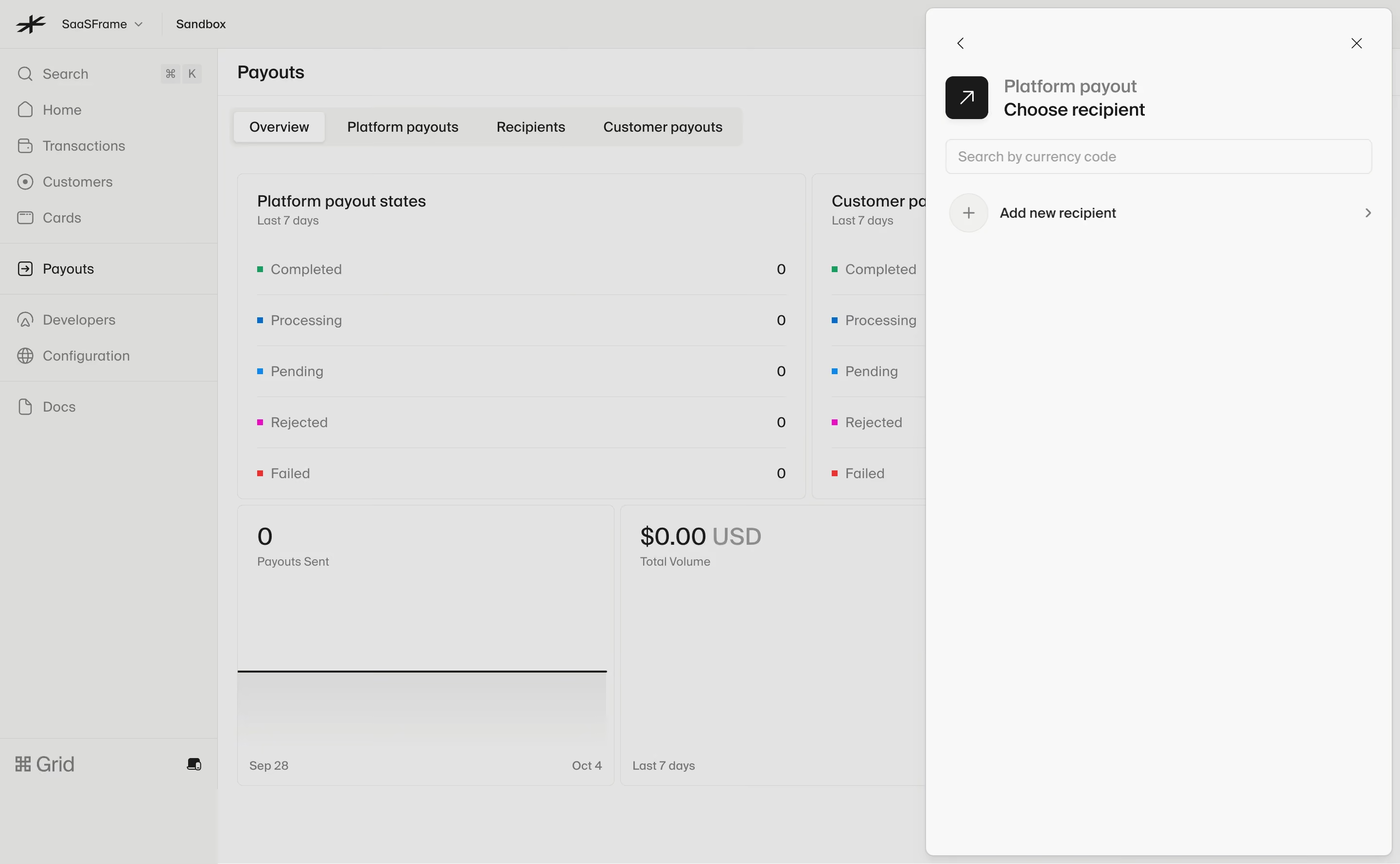
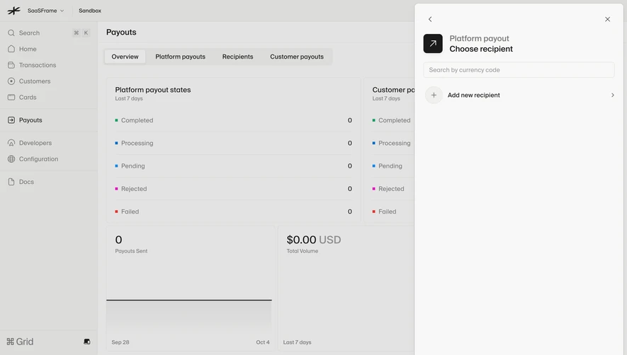
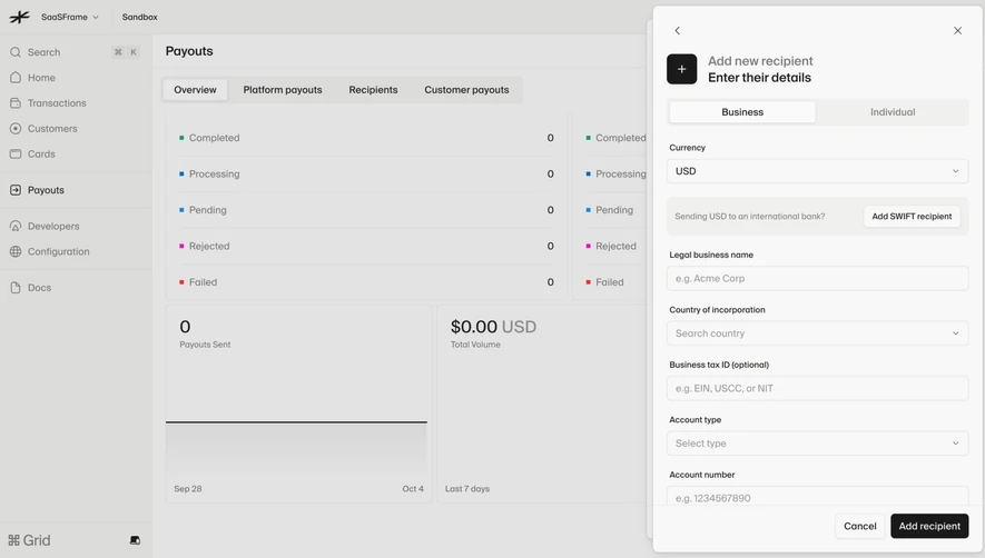
- **Character:** A quiet payout-recipient drawer over a dimmed financial dashboard, using warm grays and sparse controls.
- **Evidence scale:** Original 2880 × 1778 pixels; CSS estimates assume an unverified 2× capture scale.
### Page composition
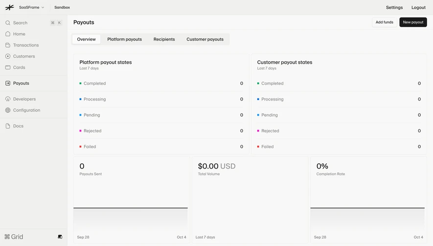
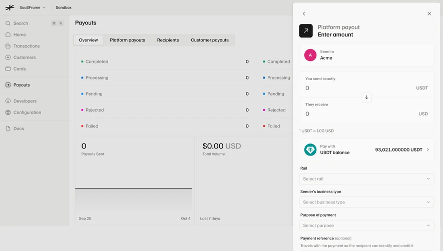
- **Background:** Sidebar and payout overview with tabs, status counts and metric cards.
- **Drawer:** Approximately 480 px wide panel aligned to the right with small outer gutter and almost full viewport height.
- **Content:** Back/close controls, icon/title stack, search field and one add-recipient row.
- **Empty area:** Most of the drawer remains blank; no existing recipients are visible.
### Information hierarchy
- **Task:** Platform payout is muted above darker Choose recipient.
- **Search:** Currency-code placeholder identifies the search purpose.
- **Next action:** Plus icon and Add new recipient row provide the only listed choice.
- **Context:** Payout overview remains visible beneath the scrim.
### Typography
- **Heading:** Unverified sans-serif around 18–20 px medium.
- **Body/control:** Approximately 14 px regular.
- **Background metrics:** Larger numerals with smaller labels.
- **Tracking:** Neutral and utilitarian.
### Colors & surfaces
- **Drawer:** Warm near-white #F8F8F7.
- **Overlay:** #E3E3E2 and #DCDCDA are composited background tones.
- **Text:** Near-black and medium gray.
- **Structure:** Thin warm-gray borders and pale plus-icon disc.
### Components
- **Drawer shell:** Approximately 8 px radius, fine border and soft shadow.
- **Task icon:** Black rounded square with diagonal arrow.
- **Search:** Full-width approximately 36 px outlined rounded field.
- **Recipient row:** Circular plus at left, text center-left and chevron right.
- **Utilities:** Small unboxed back and close icons.
- **Background:** Segmented tabs, ruled status lists and zero-value cards.
### Visual rhythm
- **Padding:** Approximately 20 px drawer inset.
- **Grouping:** Compact header/search/action stack at top, extensive whitespace below.
- **Alignment:** Search and row share consistent horizontal bounds.
### Responsive
- **Observed limit:** Desktop only.
- **Recommendation:** Use a full-screen recipient step on narrow screens.
- **Controls:** Keep search/add action visible and back/close targets accessible.
### Adaptation guidance
- **Retain:** Focus the payout flow on one recipient-selection task.
- **Implement:** Use a restrained drawer and clear empty/add path.
- **Verify:** Confirm font, scale and selection behavior separately; no recipient or payout was created.
Use this context to reproduce the reference's visual language: layout, typography, colors, spacing, borders, radii, and distinctive elements. The screenshot takes priority if descriptions conflict.
## Direction
{{preferences.fidelityInstructions}}
## Output
{{output.instructions}}
Deliver a polished, cohesive design with precise alignment, hierarchy, and spacing. Produce the requested visual artifact, not just a description. If unsupported, explain the limitation.