
Thank you! Your submission has been received!
Oops! Something went wrong while submitting the form.
Get SaaSFrame Pro
Monthly
$18
Quarterly
$48
Yearly
$180
Upgrade to access this feature
Browse all screens & flows
Filter and search screens & flows
Access Figma files
Access mobile versions
Bookmark screens & flows
Join now
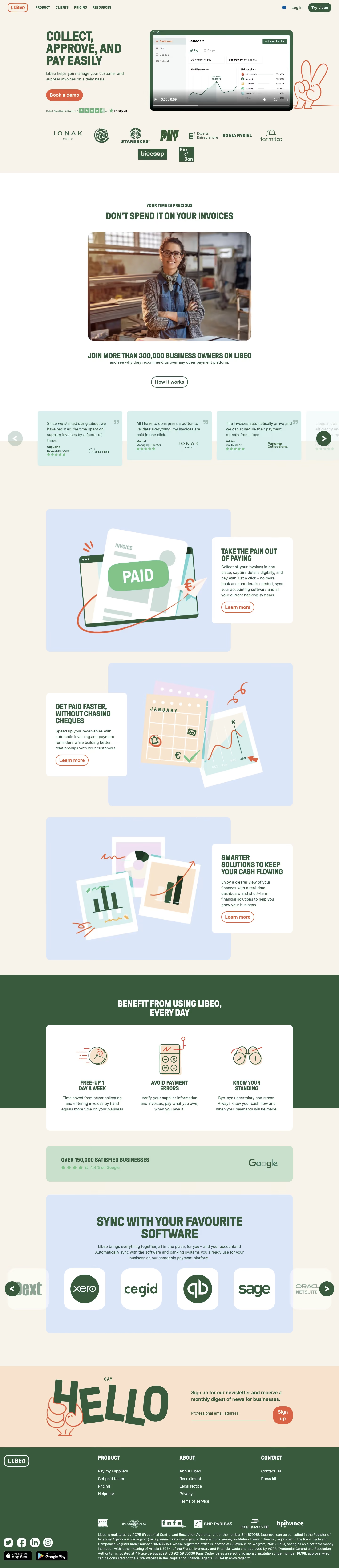

Libeo Landing Page
Libeo
Collect, approve, and pay easily
Designed by


Bookmark
Bookmark

Design with AI
Thank you! Your submission has been received!
Oops! Something went wrong while submitting the form.
# Design from Reference: Libeo Landing Page
Create an original, high-fidelity visual design inspired by the reference. Prioritize composition, typography, colors, spacing, and component styling over technical implementation.
## Reference
- **Product:** Libeo
- **Category:** Landing Page
- **Screenshot:** https://cdn.prod.website-files.com/5e9dc792e1210c5325f7ebbc/6acb72be018523cfee2da2c4_6acb704797c01f02a0fa6634_cms-315068fa03946917df221a3c.webp
Analyze the screenshot first. If inaccessible, request it rather than guessing.
## Content
{{content.instructions}}
{{content.data}}
Preserve essential messaging and factual accuracy. Adapt structure and copy length for visual balance; never invent product claims.
## Visual Design
### Overall aesthetic
- **Character:** Warm, approachable financial-software landing page combining cream backgrounds, forest-green typography, coral actions and hand-drawn illustrations.
- **Evidence and scale:** Screenshot measures 1440 × 6662 image pixels. Dimensions estimate 1× CSS scale; exact capture ratio and font identities are unverified. All sections through the footer are visible.
### Page composition
- **Header/hero:** A cream header places an outlined brand mark left, compact product links next and login/trial controls right. The hero pairs a bold uppercase statement and demo action left with a large video preview right.
- **Trust and customer story:** A customer-logo strip sits under the hero. A white section introduces a large rounded customer photograph, social-proof statement and outlined action, followed by a horizontal testimonial carousel.
- **Feature storytelling:** Three large alternating feature compositions use pale blue illustration panels and overlapping white copy cards against cream ground.
- **Benefits/integrations:** A forest-green section supports an overlapping white three-column benefits card. A pale green review band and large pale-blue software-logo carousel follow.
- **Newsletter/footer:** A peach newsletter band pairs oversized playful HELLO lettering with an email signup. The dark green footer contains brand, three navigation groups, social/store badges, partner marks and dense legal copy.
### Information hierarchy
- **Display voice:** Tall condensed uppercase headings provide a strong identity across hero, features and section introductions.
- **Action pattern:** A filled coral hero demo button leads; outlined coral feature links and green outlined informational actions are secondary.
- **Proof sequence:** Customer logos, portrait, testimonials and review strip appear at separate points, reinforcing trust without one dense block.
- **Feature relationships:** Alternating illustration/copy positions distinguish paying invoices, receivables and financial visibility.
### Typography
- **Hero:** Condensed heavy uppercase sans-serif around 52–56px CSS with tight leading near 52px, arranged in three lines.
- **Section/feature headings:** Approximately 28–36px uppercase heavy type; smaller benefits headings are around 22–24px.
- **Body:** Neutral sans-serif around 16px with 24px leading. Testimonial copy uses similar scale, with smaller attribution roles below.
- **Utilities:** Header labels are compact uppercase bold around 14px; footer links are around 16px. The logo has a stamped monospaced-looking treatment; exact font families are unverified.
### Colors & surfaces
- **Measured foundation:** Warm cream #F7F3EA and white #FFFFFF form the main grounds; forest green #3A5A3D dominates text and large footer/benefits surfaces.
- **Measured pastels:** Pale blue #DCE6F9 and #DBE6F9 support illustration stages; peach #F8E4CE fills newsletter/artwork areas; pale cyan #D7EFEE supports testimonials.
- **Measured accent:** Coral #D96245 appears prominently in buttons and line-art strokes.
- **Surface treatment:** Most large panels are flat and softly rounded. Overlapping white feature cards rely on placement and color contrast more than strong shadows.
### Components
- **Hero video:** Approximately 610 × 344px CSS, dark green outer frame, rounded corners near 16px and visible paused video controls over a dashboard thumbnail. Playback is not observed.
- **Actions:** Coral filled and outlined pill buttons use approximately 20px labels and 44–48px heights. The header trial pill is smaller and green.
- **Testimonial cards:** Pale cyan rectangles around 360px wide with small radii, quote marks, short copy, attribution, brand mark and star row. Circular previous/next arrows sit at the carousel edges; adjacent items fade/crop.
- **Feature compositions:** Large pale-blue rounded illustration stages around 785px wide overlap white copy cards roughly 345px wide with 16px radii and about 40px padding.
- **Benefits card:** Broad white rounded panel with three equal centered icon/title/body columns; hand-drawn stopwatch, calculator and binocular motifs retain green/coral strokes.
- **Integration carousel:** White rounded square logo tiles run across a pale blue panel, with green circular arrows and partially cropped outer tiles.
- **Newsletter:** Underline-style email input and a coral rounded signup control sit beside a large expressive illustration. Footer app badges and social icons are grouped near the lower-left.
### Visual rhythm
- **Container:** Most major content uses a centered region around 1050px CSS, with generous side gutters near 195px; some carousels extend toward the edges.
- **Alternation:** Cream, white, green, pale blue and peach regions distinguish the long page's narrative phases.
- **Spacing:** Broad 80–120px section gaps contrast with 16–24px local text/action gaps. The three feature stages use consistent scale and alternating overlap direction.
- **Illustration rhythm:** Loose coral doodles and paper/document motifs recur across feature and benefit art, keeping a recognizable visual voice.
### Responsive
- **Observed limit:** Only desktop is shown; carousel interaction, newsletter validation and mobile behavior are unobserved.
- **Recommended layout:** Stack hero/video and feature compositions, remove copy-card overlap when space is narrow and keep text before its related illustration.
- **Recommended repeated content:** Use one testimonial or logo tile at a time with clear controls, and stack the benefits columns.
- **Recommended footer/type:** Scale condensed headlines carefully to avoid cramped lines, collapse navigation and footer groups, and keep legal text readable rather than shrinking it.
### Adaptation guidance
- **Preserve the identity:** Combine forest green, warm cream and coral with condensed uppercase headings and informal hand-drawn finance imagery.
- **Organize persuasion:** Separate product explanation, customer proof, practical benefits, integrations and newsletter conversion into distinct visual regions.
- **Implementation:** Provide accessible video/carousel controls, labeled email input, focus states and image alternatives. Ratings, business counts, partner logos and regulatory text are captured visual content and require separate verification before reuse.
Use this context to reproduce the reference's visual language: layout, typography, colors, spacing, borders, radii, and distinctive elements. The screenshot takes priority if descriptions conflict.
## Direction
{{preferences.fidelityInstructions}}
## Output
{{output.instructions}}
Deliver a polished, cohesive design with precise alignment, hierarchy, and spacing. Produce the requested visual artifact, not just a description. If unsupported, explain the limitation.


Category
Patterns
No items found.
Tech Stack

Added on
March 8, 2023
Similar screens







Upgrade to SaaSFrame Pro now to see similar examples.
Monthly
$18 /month
Billed $18 monthly
Browse all screens & flows
Filter and search screens & flows
Search text in screenshots
Access Figma files
Access mobile versions
Join now
Quarterly
$16 /month
Billed $48 quarterly
Browse all screens & flows
Filter and search screens & flows
Search text in screenshots
Access Figma files
Access mobile versions
Join now
Yearly
$15 /month
Billed $180 yearly
Browse all screens & flows
Filter and search screens & flows
Search text in screenshots
Access Figma files
Access mobile versions
Join now