Overall Style and Aesthetic
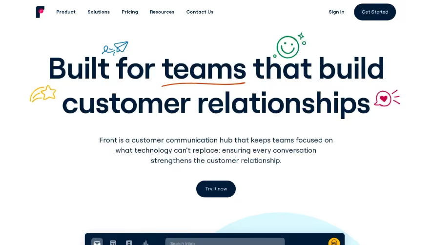
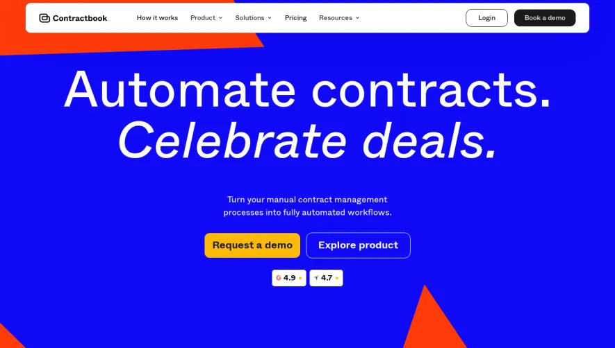
Lemon Squeezy’s homepage delivers a vibrant, modern, and inviting visual identity. Playful flourishes—like juicy gradients, rounded shapes, and subtle bounce animations—add character to a minimalist layout. The design communicates approachability while still feeling polished and professional, merging fun with credibility—a sweet spot for growth-focused SaaS. Layout and Structure
The page unfolds in a well-paced, linear journey: a bold hero section with concise headline and vivid CTA, followed by horizontally-scrolling feature highlights with eye-catching visuals. Trust-building elements—like recognizable customer logos and testimonials—appear mid-scroll, leading into clear, modular pricing panels. The footer is clean and information-dense, with organized links and social icons. Visual Elements
Custom illustrations and playful UI mockups dominate, each drenched in the brand’s signature citrus yellow and energetic purples. Micro-animations add dynamic interest as users scroll, while crisp icons reinforce clarity. The absence of traditional stock photography keeps the look focused and uniquely branded. Color Palette and Typography
The palette champions a dominant zesty yellow, balanced by purple and deep blue accents for contrast and hierarchy. Typography is modern, bold, and highly readable, with ample white space amplifying each message. Headings stand tall and approachable, while body copy is neutral and unobtrusive. User Experience Patterns & Unique Choices
Navigation is sticky, minimalist, and intuitively grouped. CTAs stand out via high-contrast buttons and inviting language. Interactive elements—like scroll-triggered feature carousels—encourage exploration. The overall tone is energetic, optimistic, and trustworthy, achieved through clever visual storytelling and seamless user flows. The design celebrates product personality while driving conversions, making it a standout inspiration for anyone crafting a SaaS website.