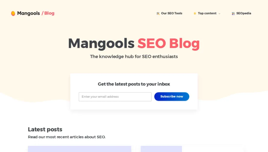
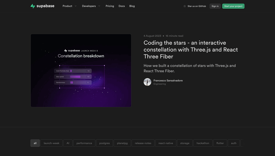
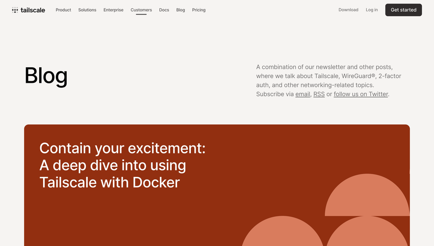
Overall Style and Aesthetic
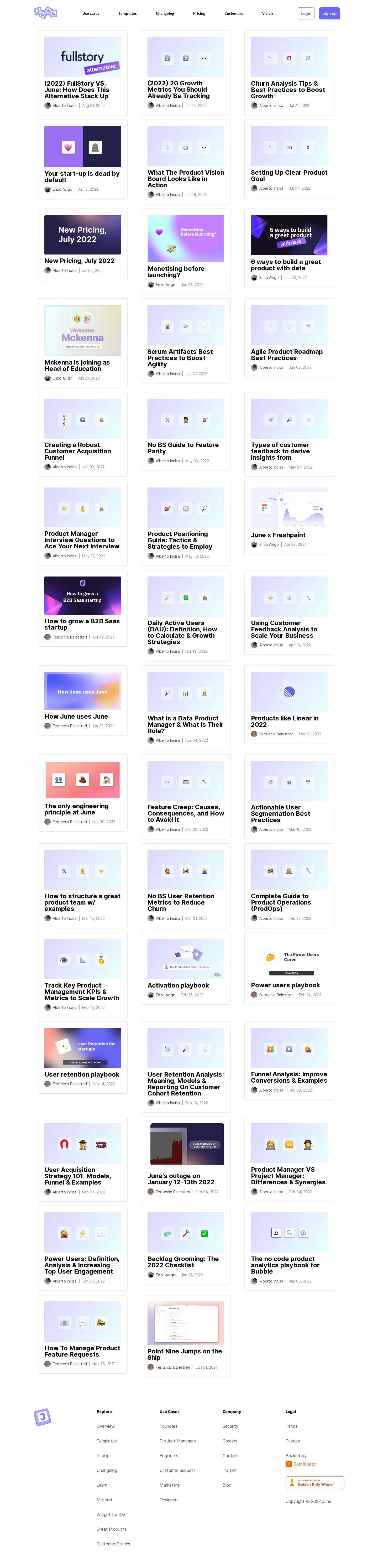
June’s blog page embodies a crisp, modern aesthetic grounded in minimalism. The interface feels spacious, airy, and approachable, using ample white space to foreground its content. There’s an understated professionalism here that lets the typography and subtle iconography shine, creating a welcoming vibe without feeling sterile or overly playful. Layout and Structure
The layout is intuitively structured: an understated top navigation flows into a no-frills hero header, forgoing oversized banners to put immediate focus on educational blog cards. Posts are presented in a uniform grid, each entry clearly displaying title, summary, date, and author—making browsing effortless. The sticky navigation remains visible as you scroll, enhancing usability. The footer is streamlined, echoing the site’s core navigation and adding essential links. Visual Elements
Rather than relying on flashy imagery, June employs tasteful icons and elegant post thumbnails—most showcasing product UI snippets or abstract illustrations that reinforce its SaaS DNA. There are subtle hover effects to signal interactivity while maintaining the serenity of the page; no aggressive animations or superfluous visuals distract from content discovery. Color Palette and Typography
A restrained palette—crisp whites, gentle grays, and occasional splashes of blue and purple—enhances readability and product brand recall. Typography is modern and geometric, with clear hierarchy: bold sans-serif headers guide the eye, balanced by personable, readable body text for immersive scanning. User Experience Patterns
Navigation is sticky and unobtrusive; CTAs are subtly integrated into blog intro cards, ensuring the user journey feels organic. There’s a clear sense of flow—scrolling is smooth, and clickable elements are signposted with gentle visual feedback, ensuring an intuitive experience from landing to engagement. Unique or Notable Design Choices
June’s restraint in both content framing and animation stands out; every design decision elevates clarity and trust. The consistent use of product-inspired visuals underscores SaaS authenticity, while the absence of clutter or aggressive marketing lets thought leadership take center stage. The tone is fresh, credible, and quietly innovative, making it both memorable and inspiring for SaaS design enthusiasts.