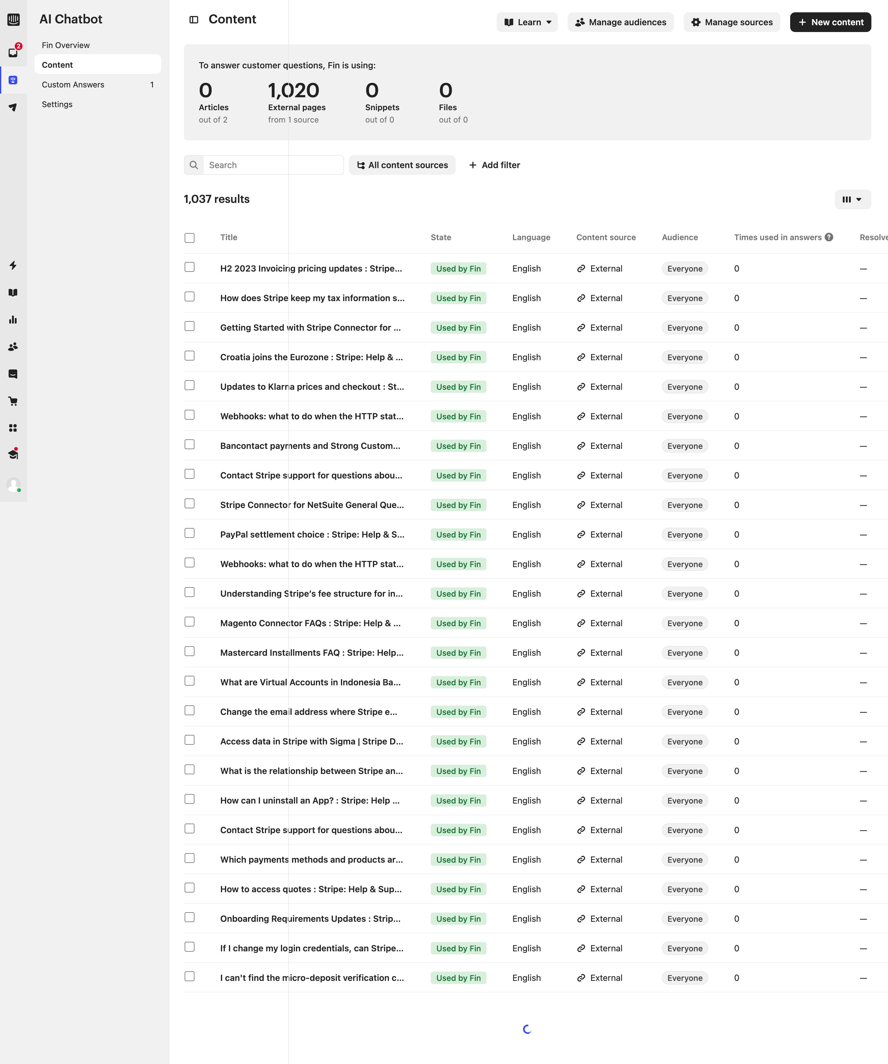
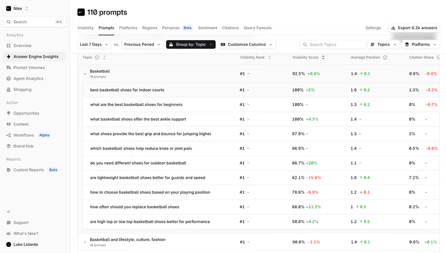
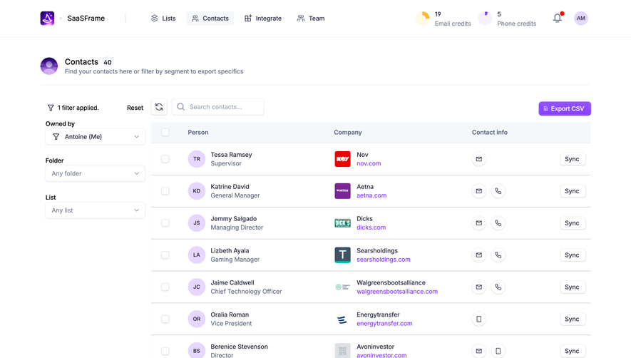
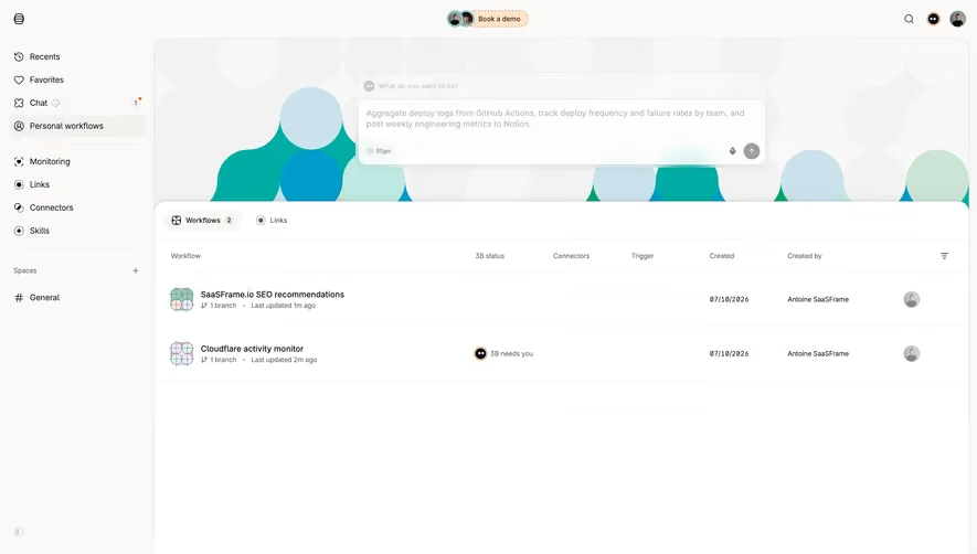
Generate a new design based on this screen using your own content.
Thank you! Your submission has been received!
Oops! Something went wrong while submitting the form.
# Design from Reference: Intercom Content Table
Create an original, high-fidelity visual design inspired by the reference. Prioritize composition, typography, colors, spacing, and component styling over technical implementation.
## Reference
- **Product:** Intercom
- **Category:** Table
- **Screenshot:** https://cdn.prod.website-files.com/5e9dc792e1210c5325f7ebbc/6acad61cfef6904ce0090cc2_6acad55dbf4db4ed68054c09_cms-932c36f624e9ed1a0c641fd2.webp
Analyze the screenshot first. If inaccessible, request it rather than guessing.
## Content
{{content.instructions}}
{{content.data}}
Preserve essential messaging and factual accuracy. Adapt structure and copy length for visual balance; never invent product claims.
## Visual Design
Use this context to reproduce the reference's visual language: layout, typography, colors, spacing, borders, radii, and distinctive elements. The screenshot takes priority if descriptions conflict.
## Direction
{{preferences.fidelityInstructions}}
## Output
{{output.instructions}}
Deliver a polished, cohesive design with precise alignment, hierarchy, and spacing. Produce the requested visual artifact, not just a description. If unsupported, explain the limitation.
Intercom’s AI Chatbot page exemplifies a modern, minimalist SaaS design with a laser focus on professionalism and clarity. The interface feels open and clean, leveraging generous white space to give every element room to breathe. The atmosphere is inviting and trustworthy, instilling confidence in potential users through a well-balanced blend of sophistication and approachability.
Layout and Structure
The page follows a streamlined structure: an engaging hero section showcasing the product’s core value, concise feature highlights, and action-oriented sections encouraging users to start building. Content is laid out in digestible blocks, with logical progressions that make browsing both intuitive and engaging. Absent are cluttered testimonials or lengthy pricing tables, creating a focused journey entirely around the chatbot experience.
Visual Elements
Distinctive custom illustrations and subtle animated icons inject a sense of innovation throughout. The visuals are thoughtfully integrated, complementing rather than overwhelming the content. Micro-animations serve as cues, reinforcing interactivity and signaling where the user’s attention should go. There is minimal reliance on stock photography, instead favoring product-centric screens that anchor the experience in real utility.
Color Palette and Typography
A restrained color palette centers around crisp whites, deep navy, and the signature Intercom blue, punctuated by lively button accents to drive CTAs. Typography is pragmatic and elegant, using clear sans-serif type at multiple weights to establish hierarchy and ensure effortless reading flow.
User Experience Patterns & Unique Design Choices
Navigation is straightforward—a persistent sidebar ensures visitors are never lost, while primary CTAs remain heroically visible. Subtle hover states, seamless transitions, and an overall frictionless flow underscore the SaaS commitment to usability. The unique, context-driven microcopy and real chatbot previews distinguish the offering, creating a tone that feels both cutting-edge and reliable.