Generate a new design based on this screen using your own content.
Thank you! Your submission has been received!
Oops! Something went wrong while submitting the form.
# Design from Reference: Huly Cards
Create an original, high-fidelity visual design inspired by the reference. Prioritize composition, typography, colors, spacing, and component styling over technical implementation.
## Reference
- **Product:** Huly
- **Category:** Table
- **Screenshot:** https://cdn.prod.website-files.com/5e9dc792e1210c5325f7ebbc/6acad3fec910b3adf9e48a77_6acad17bc910b3adf9e361cf_cms-8e6037baeeef125db63a1364.webp
Analyze the screenshot first. If inaccessible, request it rather than guessing.
## Content
{{content.instructions}}
{{content.data}}
Preserve essential messaging and factual accuracy. Adapt structure and copy length for visual balance; never invent product claims.
## Visual Design
Use this context to reproduce the reference's visual language: layout, typography, colors, spacing, borders, radii, and distinctive elements. The screenshot takes priority if descriptions conflict.
## Direction
{{preferences.fidelityInstructions}}
## Output
{{output.instructions}}
Deliver a polished, cohesive design with precise alignment, hierarchy, and spacing. Produce the requested visual artifact, not just a description. If unsupported, explain the limitation.
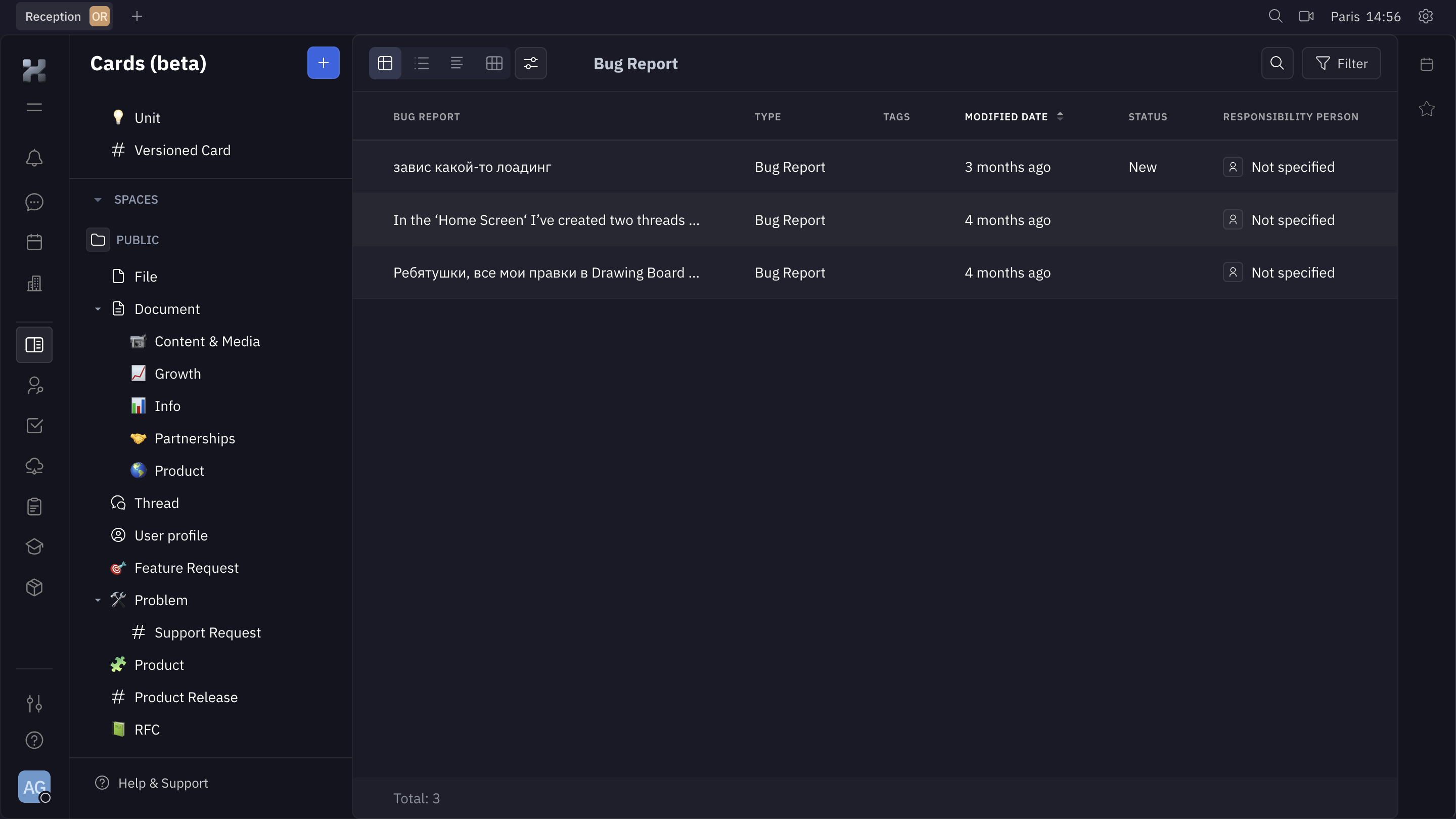
This is Huly's Cards view, and it immediately feels like a proper tool for people who actually work in it all day. The dark background with muted grays and soft white text is easy on the eyes. Nothing screams for attention, which is exactly what you want in a project management UI.
Sidebar That Actually Helps
The left nav is dense but organized. You've got a clear hierarchy: Spaces, then nested categories like Document, Problem, Product. Each one gets a tiny colored emoji-style icon that adds just enough personality without cluttering things. The tree structure feels familiar if you've used Notion or Linear. It works.
Table Layout With Breathing Room
The main content area shows a Bug Report table with columns for type, tags, modified date, status, and responsibility. Rows are generously spaced. The "New" status badge in blue is the only real color pop on the page, and your eye goes right to it. Smart.
What Stands Out
The filter and search buttons top-right are minimal but findable. Total count at the bottom is a small touch that shows respect for the user's context. Solid, functional design.